|
|
Post by spaceman on Dec 6, 2009 16:02:31 GMT
The difference between ignorance and stupidity is in ignorance you don't know, stupidity is I tell you and you still persist. The conversation started out with how you could tell man made co2 from natural. You said you could by the isotopes. You also said most of the rise in co2 was due to burning of fossil fuels. I said they don't add up because of the amount of JUST the fires alone have put out which dwarfs burning of fossil fuels. They amount of fires that burned during the time from 2004 to 2007 increased from 30 to 50% and yet you still maintain that the huge increase in total co2 is caused by burning fossil fuels. So either the co2 released by burning forest is at the same ratio as fossil fuel or it is natural and you have the amounts wrong. You can't minimize the impact by saying it's land use etc, etc.. It is what it is. The range of forest fires also come in go in cycles as well. Some years being less and some more. I don't think you understand the impact that they have or you are just into denial. In addition, because of the impact, there should be variations from time to time which isn't shown Besides it is the other people who read this that is important as it does refute what you maintain.
|
|
|
|
Post by magellan on Dec 6, 2009 17:10:31 GMT
Does anyone dispute this?  |
|
|
|
Post by nautonnier on Dec 6, 2009 17:15:00 GMT
I thought it was time for a thread summary so from earlier in this thread... 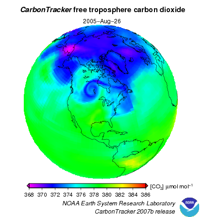 You will note that from this NOAA satellite there is NO huge amount of CO 2 being produced in the USA the great Satan with all those SUVs and coal fired power stations. There *is* a hotspot over central South America. This needs to be explained I am sure that Steve and SoCold will be able to explain how it is.  This is a second NOAA picture in more detail and finer granularity focused on the Great Satan - and strangely most CO 2 seems to be emitted by open country in the North West, Montana or even Canada, and in the Rockies - perhaps this may be due to the volcanism in those areas? It is definitely higher than the industrial 'heartland'. 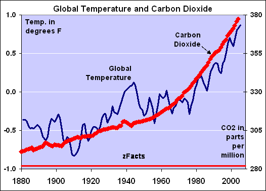 Now moving onto the monotonic rise in CO 2 graph above Steve has claimed that the huge Indonesian peat fire in 1997 that put >2gt of CO 2 into the atmosphere (more than 3 times that due to aviation) shows on the graph - I cannot see it. Perhaps Steve will produce another graph that does. This does raise ones doubts especially after seeing that AGW proponent scientists have no qualms about fixing the raw data to support their hypotheses. That leads to the graph below  This graph is based on figures produced before there was a reason to massage CO 2 concentrations. It shows that atmospheric concentrations were higher in the 1800s than they are now - a central plank of the AGW 'hypothesis' appears to be falsified by this. Note also no Indonesia hump in the Mauna Loa figures for 1997. Also interesting is that the graph is based on proxy ice-core data until the 60's - now look at the NOAA image of the Earth again - you will note that the pole is really low compared to the rest of the Earth - is this a sensible place to use proxies that then MAGICALLY run straight onto the other sensed metrics on an island in the mid Pacific. One wonders how many 'tricks' were used to get such an accurate match.... perhaps the arbitrary 83 year move of date was used to hide a decline??? Then there is some concern in the thread about the way the CO 2 levels due to anthropogenic activity are actually being calculated. If this was a financial institution with this level of disagreement with external financial numbers in a company figures there would be calls for an immediate INDEPENDENT audit NOT a quick rubber stamp peer review by another member of the AGW 'team'. |
|
|
|
Post by thingychambers69 on Dec 6, 2009 17:15:03 GMT
Does anyone dispute this? Are you saying that 5% of the 11% increase of CO2 is due to man? I have come across figures suggesting it could be as little as 3%. |
|
|
|
Post by steve on Dec 6, 2009 17:59:52 GMT
The difference between ignorance and stupidity is in ignorance you don't know, stupidity is I tell you and you still persist. The conversation started out with how you could tell man made co2 from natural. You said you could by the isotopes. You also said most of the rise in co2 was due to burning of fossil fuels. I didn't say that at all. I didn't even imply it. Although I think fossil fuel CO2 is higher than CO2 from land use change! I see even Magellan's plot agrees with me even if the plot seems designed to mislead by including emission without absorption. It could increase 100% but that doesn't tell you whether it is larger or smaller than the fossil fuel emissions unless you know what the original ratio was  As it happens, it is still smaller. I haven't minimised the impact of land use change. They're both important, I just chose at the time to discuss fossil fuels. Choosing to focus on one thing to make a simple point does not imply that one thinks all other things are irrelevant. |
|
|
|
Post by magellan on Dec 6, 2009 18:07:41 GMT
The difference between ignorance and stupidity is in ignorance you don't know, stupidity is I tell you and you still persist. The conversation started out with how you could tell man made co2 from natural. You said you could by the isotopes. You also said most of the rise in co2 was due to burning of fossil fuels. I didn't say that at all. I didn't even imply it. Although I think fossil fuel CO2 is higher than CO2 from land use change! I see even Magellan's plot agrees with me even if the plot seems designed to mislead by including emission without absorption. It could increase 100% but that doesn't tell you whether it is larger or smaller than the fossil fuel emissions unless you know what the original ratio was As it happens, it is still smaller. I haven't minimised the impact of land use change. They're both important, I just chose at the time to discuss fossil fuels. Choosing to focus on one thing to make a simple point does not imply that one thinks all other things are irrelevant. So what did Reid Bryson mean when he said "You can go outside and spit and have the same effect as doubling carbon dioxide". Also steve, what percentage of the increase per year of CO2 is "man made"? |
|
|
|
Post by steve on Dec 6, 2009 18:37:32 GMT
Nautonnier,
Your first plot simply shows the lack of the CO2 domes that previously it was claimed exist over cities. This data is probably from higher up in the atmosphere.
The peat fires happened just before the largest annual rise in CO2. The plot you show doesn't have enough resolution to highlight it properly.
Bringing up that last plot suggests that with the advent of these emails, you think you can get away with any old rubbish. I think the emails are oversold, and sensing the victory that isn't their, the sceptic camp will go on the offensive with any old rubbish and lose credibility in the long run.
|
|
|
|
Post by icefisher on Dec 6, 2009 19:20:16 GMT
I think the emails are oversold, and sensing the victory that isn't their, the sceptic camp will go on the offensive with any old rubbish and lose credibility in the long run. Yeah I guess you can't rule out the skeptics doing somthing stupid like the warmists did. When you imply that increasing CO2 in the atmosphere is proof that the CO2 we put in the atmosphere is the cause, you aren't using what would be called credible science. The fact that the "short term" correlation is not inconsistent with your claim does not turn it into proof of a causal connection. Of course that will not stop the warmists from cherry picking as many proxies as they can find that diminishes natural variation of CO2 while ignoring every proxy that suggest otherwise doesn't seem at all based in any science whatsoever. Fact is science needs some standards and the crapola produced by Briffa, Jones, Mann, Osborn. . . .on and on. . . .the emails and the cold shouldering of sobering evidence to the contrary. . . .is almost undoubtedly yet another example of the power of the almighty buck and nothing more. Why you lap it up like a starving dog. . . .I have no idea. Are you into the payola also? |
|
|
|
Post by nautonnier on Dec 6, 2009 19:43:02 GMT
Nautonnier, Your first plot simply shows the lack of the CO2 domes that previously it was claimed exist over cities. This data is probably from higher up in the atmosphere. The peat fires happened just before the largest annual rise in CO2. The plot you show doesn't have enough resolution to highlight it properly. Bringing up that last plot suggests that with the advent of these emails, you think you can get away with any old rubbish. I think the emails are oversold, and sensing the victory that isn't their, the sceptic camp will go on the offensive with any old rubbish and lose credibility in the long run. So you will be able to show a graph that has the resolution that shows the 1997 surge in CO 2 in the atmosphere won't you. I have not seen one on this board and I looked for one. "Bringing up that last plot suggests that with the advent of these emails, you think you can get away with any old rubbish. I think the emails are oversold, and sensing the victory that isn't their, the sceptic camp will go on the offensive with any old rubbish and lose credibility in the long run."Now that was not the point of that graph or the comment at all. If adult scientists start acting like puerile undergraduates - even though this behaviour is common in academia - then they can expect to be afforded the same level of trust as is afforded to an undergraduate. So explain 1. Why these were measures that were trusted until the AGW hypothesis required that they had to be discarded - like the MWP. Why else use proxies from ice-cores when actual measures were available? 2. How did these proxy metrics taken from ice cores where the CO 2 is _always_ lower than 'global' PRECISELY match those taken by a sensor alongside an active volcano in the mid-pacific? ( www.mlo.noaa.gov/programs/esrl/volcanicco2/volcanicco2.html although there is some adjustment of the figures) I am not *using* the emails - I have taken note of them and reduced the level of trust in the members of 'the team' - and therefore have a little more scepticisn than I would otherwise. So a little explanation of some of these lucky 'coincidences' of metrics will be required. |
|
|
|
Post by spaceman on Dec 6, 2009 20:06:07 GMT
magellan, No one argued with your graph.... so I did the math and here it is... man made 15.32 ppm surface oc 218.31 ppm resper 145.54 ppm land use 3.83 ppm which comes out to 383 ppm.... Think man made co2 might go to 30 ppm in another 150 years? So at some starting point it was 280 ppm and is now 383. So if man made co2 was 0 when it was 280, so man has contributed about 15% of the increase, where did the other 85 % come from? Thanks for putting the graph up.  |
|
|
|
Post by steve on Dec 6, 2009 20:59:47 GMT
Nautonnier, Your first plot simply shows the lack of the CO2 domes that previously it was claimed exist over cities. This data is probably from higher up in the atmosphere. The peat fires happened just before the largest annual rise in CO2. The plot you show doesn't have enough resolution to highlight it properly. Bringing up that last plot suggests that with the advent of these emails, you think you can get away with any old rubbish. I think the emails are oversold, and sensing the victory that isn't their, the sceptic camp will go on the offensive with any old rubbish and lose credibility in the long run. So you will be able to show a graph that has the resolution that shows the 1997 surge in CO 2 in the atmosphere won't you. I have not seen one on this board and I looked for one. "Bringing up that last plot suggests that with the advent of these emails, you think you can get away with any old rubbish. I think the emails are oversold, and sensing the victory that isn't there, the sceptic camp will go on the offensive with any old rubbish and lose credibility in the long run."Now that was not the point of that graph or the comment at all. If adult scientists start acting like puerile undergraduates - even though this behaviour is common in academia - then they can expect to be afforded the same level of trust as is afforded to an undergraduate. So explain 1. Why these were measures that were trusted until the AGW hypothesis required that they had to be discarded - like the MWP. Why else use proxies from ice-cores when actual measures were available? Are you talking about the CO2 measures? Who said they were to be "trusted"? "Trusted" to say what? Someone has stated here that a city can have a CO2 "dome" of 600 ppm, so a trustworthy measure of CO2 may not be representative. Sorry. hadn't read this far when I wrote the "guff" comment above. Nautonnier, you have been on this forum for a long while. I do not believe that you are unaware of the other CO2 measuring stations, or the care that is taken at Mauna Loa to remove any contamination (multiple sampling sites, checking wind direction, monitoring variability etc.). So... ...you have just substantiated what I said. Now that you've managed to undermine trust in a handful of scientists far more than is deserved, you think that people will believe any old nonsense. Well maybe they will. But I'm not interested in that sort of debate. |
|
|
|
Post by steve on Dec 6, 2009 21:03:54 GMT
magellan, No one argued with your graph.... so I did the math and here it is... Could someone do a similar plot of CO2 absorption. I reckon: Fossil fuel/cement production - 0% Deforestation - 0% Respiration - 41% Surface ocean - 59% |
|
|
|
Post by Graeme on Dec 6, 2009 21:19:54 GMT
Thanks, nautonnier, for a great summary. I checked up on that last graph, since obviously historical CO2 levels is important for the AGW debate, and I hadn't previously seen anything other than the ones used by the IPCC. The URL on that graph is out of date and the website has been moved to: www.biomind.de/realCO2/The current graph on that site is:  This clearly shows that historical measured CO2 levels were comparable to the levels today, but the temperatures reported for those times don't show global warming effects. Can someone please provide links or references to papers that debunk these figures? If I had to choose between direct measured levels of CO2 and the use of proxies via ice cores, I think I would have to weight my preference to the direct measured levels. I believe that most scientists are fair when viewing data that contradict their hypothesis. Since this graph seems to be a clear refutation of the AGW hypothesis, there must be a reasonable reason why the AGW scientists have discounted this graph. I'd like to know what it is |
|
|
|
Post by Graeme on Dec 6, 2009 21:28:15 GMT
That CO2 site is quite interesting. The following graph shows a link between CO2 levels and temperature, but with a five year lag (ie. the CO2 levels go up about five years after the temperature).  More importantly, when the temperature goes down, the CO2 levels go down, too, which isn't what I've read about otherwise. In reference to the paleoclimatic research using ice cores, and how the CO2 levels lagged after the temperature, I've read that the AGW view is that the temperature rises, which triggers a CO2 rise (possibly from the oceans, though that's not confirmed), and that the CO2 rise allows the temperature to rise more (say, by an extra 30-50%). But that isn't shown in this graph. Given the lag, there is no corresponding 'kick' to the temperature from the rise in CO2 as the above explanation would suggest. The graph clearly shows a link between temperature and CO2 levels, but it doesn't appear to show any significant temperature increase from CO2 level increases. I can't believe that this has been missed by all the AGW scientists, so what's their explanation? |
|
|
|
Post by nautonnier on Dec 6, 2009 22:42:55 GMT
That CO2 site is quite interesting. The following graph shows a link between CO2 levels and temperature, but with a five year lag (ie. the CO2 levels go up about five years after the temperature). More importantly, when the temperature goes down, the CO2 levels go down, too, which isn't what I've read about otherwise. In reference to the paleoclimatic research using ice cores, and how the CO2 levels lagged after the temperature, I've read that the AGW view is that the temperature rises, which triggers a CO2 rise (possibly from the oceans, though that's not confirmed), and that the CO2 rise allows the temperature to rise more (say, by an extra 30-50%). But that isn't shown in this graph. Given the lag, there is no corresponding 'kick' to the temperature from the rise in CO2 as the above explanation would suggest. The graph clearly shows a link between temperature and CO2 levels, but it doesn't appear to show any significant temperature increase from CO2 level increases. I can't believe that this has been missed by all the AGW scientists, so what's their explanation? For me that graph has a lot more face validity than the one being published by the IPCC mainly due to the variations in CO 2 rather than the monotonic rise. " I can't believe that this has been missed by all the AGW scientists, so what's their explanation?"I don't believe that they missed it either - but it did not support their hypothesis and the ice core proxies did. |
|


 As it happens, it is still smaller.
