|
|
Post by sentient on Mar 10, 2010 2:10:14 GMT
I am in the process of answering a PhD in Climate Science (UCLA) regarding a number of issues I answered her about. I will post her comments here and hopefully someone can point me to the best data source for a response:
The are several independent data sets and people are
free to rerun the data any way they like. To my knowledge, all of these
independent analyses, such as NASA, fundamentally predict a temperature
increase. To my knowledge, nobody has demonstrated decreasing
temperature trend from the raw data
I remember seeing a really good analysis of the 4 world data sets, and I think I saved a copy of it but I cannot find it!
|
|
|
|
Post by magellan on Mar 10, 2010 3:34:09 GMT
I am in the process of answering a PhD in Climate Science (UCLA) regarding a number of issues I answered her about. I will post her comments here and hopefully someone can point me to the best data source for a response: The are several independent data sets and people are
free to rerun the data any way they like. To my knowledge, all of these
independent analyses, such as NASA, fundamentally predict a temperature
increase. To my knowledge, nobody has demonstrated decreasing
temperature trend from the raw dataI remember seeing a really good analysis of the 4 world data sets, and I think I saved a copy of it but I cannot find it! Talk about SOP talking points! What "raw" data is she referring to? Who has access to that? There is nothing at all independent about the four data sets unless the virgin raw data is available for replication. Which four "independent" sources is she referring to? Satellite included? And what does she mean by "fundamentally predict a temperature increase"? Sorry, not enough info. |
|
|
|
Post by fischer on Mar 10, 2010 4:23:24 GMT
|
|
|
|
Post by Pooh on Mar 10, 2010 5:54:29 GMT
Magellan asks the right questions. (So should the PhD.) IMO, the question should be, are any of the public raw data sets reliable (not manipulated)? If so, which one(s)? If not, exactly what has been done to them and can the adjustments/manipulations be reversed? If it were my choice, I'd contact Roy Fisher or John Christy for the location of the UAH Global Temperature dataset.Spencer, Ph.D., Roy. “ The Global Average Urban Heat Island Effect in 2000 Estimated from Station Temperatures and Population Density Data.” Scientific Blog. Global Warming (drroyspencer.com), March 4, 2010. www.drroyspencer.com/2010/03/the-global-average-urban-heat-island-effect-in-2000-estimated-from-station-temperatures-and-population-density-data/. UPDATE #2 (9:10 a.m. CST, March 4): Clarifications on methodology and answers to questions. Global hourly surface temperature observations and 1 km resolution population density data for the year 2000 are used together to quantify the average urban heat island (UHI) effect. While the rate of warming with population increase is the greatest at the lowest population densities, some warming continues with population increases even for densely populated cities. Statistics like those presented here could be used to correct the surface temperature record for spurious warming caused by the UHI effect, providing better estimates of temperature trends. D'Aleo, CCM, Joseph. “ United States And Global Data Integrity Issues.” Scientific. ICECAP, October 8, 2009. icecap.us/images/uploads/US_AND_GLOBAL_TEMP_ISSUES.pdf. UHI has not been corrected. Dropping Rural Stations and retaining Urban Stations bias the infilling for missing stations to higher temperatures. "More than half dozen peer reviewed papers found that the lack of adequate UHI and local land use change adjustments could account for up to 50% of the warming since 1900."
"An audit by researcher Steve McIntyre reveals that NASA has made urban adjustments of temperature data in its GISS temperature record in the wrong direction. The urban adjustment is supposed to remove the effects of urbanization, but the NASA negative adjustments increases the urbanization effects. The result is that the surface temperature trend utilized by the International Panel on Climate Change (IPCC) is exaggerated." Watts, Anthony. “ A new paper comparing NCDC rural and urban US surface temperature data.” Watts Up With That?, February 26, 2010. [a href="http://wattsupwiththat.com/2010/02/26/a-new-paper-comparing-ncdc-rural-and-urban-us-surface-temperature-data/#more-16726 .Both raw and adjusted data from the NCDC has been examined for a selected Contiguous U. S. set of rural and urban stations, 48 each or one per State. The raw data provides 0.13 and 0.79 oC/century temperature increase for the rural and urban environments. The adjusted data provides 0.64 and 0.77 oC/century respectively. The rates for the raw data appear to correspond to the historical change of rural and urban U. S. populations and indicate warming is due to urban warming. Comparison of the adjusted data for the rural set to that of the raw data shows a systematic treatment that causes the rural adjusted set’s temperature rate of increase to be 5-fold more than that of the raw data. The adjusted urban data set’s and raw urban data set’s rates of temperature increase are the same. This suggests the consequence of the NCDC’s protocol for adjusting the data is to cause historical data to take on the time-line characteristics of urban data. The consequence intended or not, is to report a false rate of temperature increase for the Contiguous U. S. Spencer, Ph.D., Roy W. “Spencer: developing a new satellite based surface temperature set.” Scientific Blog. Watts Up With That?, February 20, 2010. wattsupwiththat.com/2010/02/20/spencer-developing-a-new-satellite-based-surface-temperature-set/#comment-324977"]http://wattsupwiththat.com/2010/02/26/a-new-paper-comparing-ncdc-rural-and-urban-us-surface-temperature-data/#more-16726 .Both raw and adjusted data from the NCDC has been examined for a selected Contiguous U. S. set of rural and urban stations, 48 each or one per State. The raw data provides 0.13 and 0.79 oC/century temperature increase for the rural and urban environments. The adjusted data provides 0.64 and 0.77 oC/century respectively. The rates for the raw data appear to correspond to the historical change of rural and urban U. S. populations and indicate warming is due to urban warming. Comparison of the adjusted data for the rural set to that of the raw data shows a systematic treatment that causes the rural adjusted set’s temperature rate of increase to be 5-fold more than that of the raw data. The adjusted urban data set’s and raw urban data set’s rates of temperature increase are the same. This suggests the consequence of the NCDC’s protocol for adjusting the data is to cause historical data to take on the time-line characteristics of urban data. The consequence intended or not, is to report a false rate of temperature increase for the Contiguous U. S. Spencer, Ph.D., Roy W. “Spencer: developing a new satellite based surface temperature set.” Scientific Blog. Watts Up With That?, February 20, 2010. wattsupwiththat.com/2010/02/20/spencer-developing-a-new-satellite-based-surface-temperature-set/#comment-324977[/a]. New Work on the Recent Warming of Northern Hemispheric Land Areas
"INTRODUCTION: "Arguably the most important data used for documenting global warming are surface station observations of temperature, with some stations providing records back 100 years or more. By far the most complete data available are for Northern Hemisphere land areas; the Southern Hemisphere is chronically short of data since it is mostly oceans." Spencer, Ph.D., Roy W. . “ February 2010 UAH Global Temperature Update: Version 5.3 Unveiled.” Scientific. Global Warming (drroyspencer.com), March 5, 2010. www.drroyspencer.com/2010/03/february-2010-uah-global-temperature-update-version-5-3-unveiled/. The global-average lower tropospheric temperature remained high, at +0.61 deg. C for February, 2010. This is about the same as January, which in our new Version 5.3 of the UAH dataset was +0.63 deg. C. February was second warmest in the 32-year record, behind Feb 1998 which was itself the second warmest of all months. The El Nino is still the dominant temperature signal; many people living in Northern Hemisphere temperate zones were still experiencing colder than average weather.
...
Note that there is no change in the long term trend as both v5.2 and v5.3 show +0.132 C/decade. All that happens is a redistribution of a fraction of the anomalies among the months. Indeed, with v5.3 as with v5.2, Jan 2010 is still the warmest January and February 2010 is the second warmest Feb behind Feb 1998 in the 32-year record. 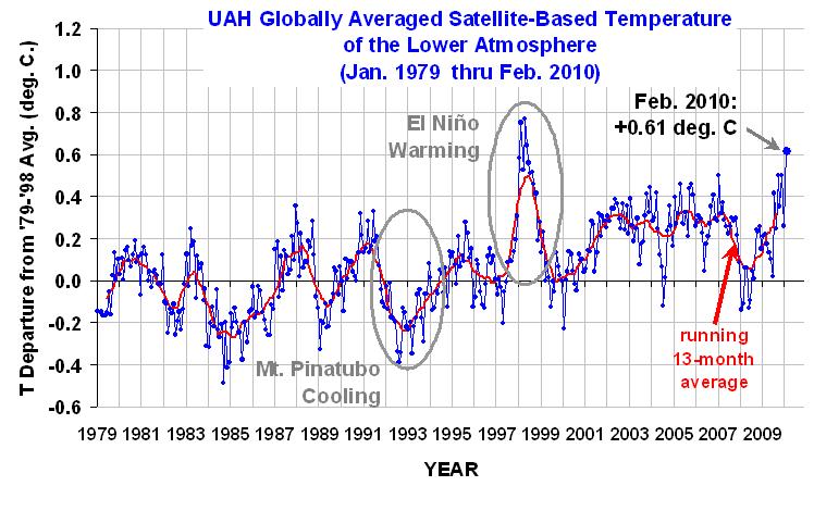 I believe I recall that one of the British offices (MET Office, WMO?) concluded that we had to start over and re-establish data sets in which we could have confidence. I either did not capture it or did not tag it correctly. In any event, I can't cite it just now. I believe I recall that one of the British offices (MET Office, WMO?) concluded that we had to start over and re-establish data sets in which we could have confidence. I either did not capture it or did not tag it correctly. In any event, I can't cite it just now. |
|
|
|
Post by aj1983 on Mar 10, 2010 11:34:26 GMT
I've noticed that Dr. Spencer accuses the surface data of not removing enough UHI effects. However, it is quite inconvenient for him that the average anomalies of surface and satellite data over the last 30 years are extremely close. So if there is any underestimation of UHI, it is currently not showing up, or it is tiny. Remember, I'm not saying there does not exist an UHI. (At the moment, skeptics should use HADCRUT3 data, because that data set shows most stagnation of the temperature rise in recent years.) BTW: a bit preliminary, but seems like March is also well on its way of becoming a record warm month: discover.itsc.uah.edu/amsutemps/execute.csh?amsutempsbut spikes like that are just weather/el nino of course, though a little inconvenient for the global coolers, because it messes up with their precious cooling trend.  I'm still waiting though for the global warming to return here this year, because we are about 4 C below average here this month. But that is also just weather. |
|
|
|
Post by nautonnier on Mar 10, 2010 12:34:29 GMT
I've noticed that Dr. Spencer accuses the surface data of not removing enough UHI effects. However, it is quite inconvenient for him that the average anomalies of surface and satellite data over the last 30 years are extremely close. So if there is any underestimation of UHI, it is currently not showing up, or it is tiny. Remember, I'm not saying there does not exist an UHI. (At the moment, skeptics should use HADCRUT3 data, because that data set shows most stagnation of the temperature rise in recent years.) BTW: a bit preliminary, but seems like March is also well on its way of becoming a record warm month: discover.itsc.uah.edu/amsutemps/execute.csh?amsutempsbut spikes like that are just weather/el nino of course, though a little inconvenient for the global coolers, because it messes up with their precious cooling trend. I'm still waiting though for the global warming to return here this year, because we are about 4 C below average here this month. But that is also just weather.
but spikes like that are just weather/el nino of course, though a little inconvenient for the global coolers, because it messes up with their precious cooling trend.
I'm still waiting though for the global warming to return here this year, because we are about 4 C below average here this month. But that is also just weather."Has anyone else noticed this paradoxical effect? Someone posts about how cold it is - and is immediately replied to with a graphic of temperature measurements showing that its actually warmer than its been since 'records began'. This winter has seen records for snowfall in many places - with all the US covered in snow at times including snow in Louisiana and Florida. Barcelona and Beaches in Southern France covered in snow in March, China covered in snow.... and its WARMER than ever... It is hardly surprising that there is a growing lack of trust from the general population in weather forecasters and climatologists. If they have been snowed in for weeks their crops have failed and they are told by 'scientists' that it was the warmest month ever. |
|
|
|
Post by hunter on Mar 10, 2010 13:26:50 GMT
I think the records are basically junk.
And there is no raw data that claims things are going to warm.
There are data sets that show minuscule warming in the past 100 years or so, there are data sets that show this warming is not unusual.
There are models that claim to predict warming in the future, anywhere from a bit to a crazy amount.
If we had the list of questions you asked, maybe it would be easier to help you.
Sanitize it to keep the names private, etc.
|
|
|
|
Post by aj1983 on Mar 11, 2010 14:50:02 GMT
I've noticed that Dr. Spencer accuses the surface data of not removing enough UHI effects. However, it is quite inconvenient for him that the average anomalies of surface and satellite data over the last 30 years are extremely close. So if there is any underestimation of UHI, it is currently not showing up, or it is tiny. Remember, I'm not saying there does not exist an UHI. (At the moment, skeptics should use HADCRUT3 data, because that data set shows most stagnation of the temperature rise in recent years.) BTW: a bit preliminary, but seems like March is also well on its way of becoming a record warm month: discover.itsc.uah.edu/amsutemps/execute.csh?amsutempsbut spikes like that are just weather/el nino of course, though a little inconvenient for the global coolers, because it messes up with their precious cooling trend. I'm still waiting though for the global warming to return here this year, because we are about 4 C below average here this month. But that is also just weather.
but spikes like that are just weather/el nino of course, though a little inconvenient for the global coolers, because it messes up with their precious cooling trend.
I'm still waiting though for the global warming to return here this year, because we are about 4 C below average here this month. But that is also just weather."Has anyone else noticed this paradoxical effect? Someone posts about how cold it is - and is immediately replied to with a graphic of temperature measurements showing that its actually warmer than its been since 'records began'. This winter has seen records for snowfall in many places - with all the US covered in snow at times including snow in Louisiana and Florida. Barcelona and Beaches in Southern France covered in snow in March, China covered in snow.... and its WARMER than ever... It is hardly surprising that there is a growing lack of trust from the general population in weather forecasters and climatologists. If they have been snowed in for weeks their crops have failed and they are told by 'scientists' that it was the warmest month ever. Using this logic I have to say that we've had extreme AGW in the winters until 2008-2009, and global cooling here after that. Oh, BTW, we also had global cooling in 1996 here. If I'd use the springs, I would come up with quite a different story. It is hardly surprising that people think it is cooling when it is cold, and warming when it is warm. Even for scientists it can be tempting to do the same. Even with this cool winter, it has been warming very rapidly during the last few decades here. No paradoxical effects here. BTW, using the RAW data you would see much stronger warming. (I'm somewhat expecting you to come up with some series which show cooling now.). |
|
|
|
Post by nautonnier on Mar 11, 2010 17:45:54 GMT
"BTW: a bit preliminary, but seems like March is also well on its way of becoming a record warm month: discover.itsc.uah.edu/amsutemps/execute.csh?amsutemps
but spikes like that are just weather/el nino of course, though a little inconvenient for the global coolers, because it messes up with their precious cooling trend.
I'm still waiting though for the global warming to return here this year, because we are about 4 C below average here this month. But that is also just weather."Has anyone else noticed this paradoxical effect? Someone posts about how cold it is - and is immediately replied to with a graphic of temperature measurements showing that its actually warmer than its been since 'records began'. This winter has seen records for snowfall in many places - with all the US covered in snow at times including snow in Louisiana and Florida. Barcelona and Beaches in Southern France covered in snow in March, China covered in snow.... and its WARMER than ever... It is hardly surprising that there is a growing lack of trust from the general population in weather forecasters and climatologists. If they have been snowed in for weeks their crops have failed and they are told by 'scientists' that it was the warmest month ever. Using this logic I have to say that we've had extreme AGW in the winters until 2008-2009, and global cooling here after that. Oh, BTW, we also had global cooling in 1996 here. If I'd use the springs, I would come up with quite a different story. It is hardly surprising that people think it is cooling when it is cold, and warming when it is warm. Even for scientists it can be tempting to do the same. Even with this cool winter, it has been warming very rapidly during the last few decades here. No paradoxical effects here. BTW, using the RAW data you would see much stronger warming. (I'm somewhat expecting you to come up with some series which show cooling now.). This is the kind of statement that gives climatology a bad name. Its been warming so its hotter in fact record breaking heat hottest 6 months in the data record etc etc - and yet its now cold apparently everywhere. Where did all the heat go - did it cluster around the thermometers for warmth? As far as most people know you cannot have something record hot and record freezing at the same time as indicated by their own eyes - there are still snow banks in NE US from the 'snowmageddon' - how often does it snow in the Ballearics? So if we look at this from a system heat content point of view - where is the extra heat that has led to the higher temperatures? All the glib - its just weather - is ducking the question - the heat has to be somewhere to make it a record hot 6 months. And remember if its in the atmosphere that is heat leaving to space. As I said in another post - there may be some error(s) or misassumption in the averaging being done |
|
tsh
Level 2 Rank

Posts: 69
|
Post by tsh on Mar 11, 2010 18:41:35 GMT
Just addressing the data series:
Recent records may not fully adjust for UHI, this could easily contribute a significant (20-50%) of the past 30 year's trend.
Climatic variation caused the LIA, and post 1950 cooling (see glacier extent, there was a recent period of growth).
Reconstructions from proxies past 1850 are at risk of averaging noise. Few series are reliable for long term temperature reconstruction (as opposed to ~10 year variation)
|
|
|
|
Post by glc on Mar 11, 2010 22:01:17 GMT
Just addressing the data series:
Recent records may not fully adjust for UHI, this could easily contribute a significant (20-50%) of the past 30 year's trend.
But satellites also show a warming trend. Plus, of course, UHI will not actually affect the trend unless there's a trend in the UHI.
|
|
|
|
Post by nautonnier on Mar 11, 2010 22:17:22 GMT
Just addressing the data series:
Recent records may not fully adjust for UHI, this could easily contribute a significant (20-50%) of the past 30 year's trend.But satellites also show a warming trend. Plus, of course, UHI will not actually affect the trend unless there's a trend in the UHI. The trend in the UHI is caused by the increase in population. Last time I checked this increase was still happening. Everywhere is becoming an urban sprawl connecting what were once individual towns and the towns are becoming denser with fancy air conditioning and 24 hour lighting. |
|
|
|
Post by Ratty on Mar 11, 2010 23:59:52 GMT
Is there an explanation somewhere of how satellites measure temperature, something a retired English teacher could follow?
|
|
|
|
Post by Graeme on Mar 12, 2010 2:50:21 GMT
Is there an explanation somewhere of how satellites measure temperature, something a retired English teacher could follow? Try this one: wattsupwiththat.com/2010/01/12/how-the-uah-global-temperatures-are-produced/On the 'warmest month' issue, the UAH (satellite) temperatures had January as a very warm month, but the following article indicates that it was largely due to the seas: wattsupwiththat.com/2010/02/05/spencer-record-january-warmth-is-mostly-sea/I'd be curious as to whether the other temperature data sets showed the same. ie. Where did they show the warming? Was it land or sea? If it was land (I think it was, from graphics I recall seeing), then we have a fundamental difference between the UAH and other records. Yes, the total may come out the same, but the detail may be very different, if my memory is correct. If that's true, then the different data sets aren't really agreeing at all. |
|
|
|
Post by stranger on Mar 13, 2010 3:18:22 GMT
Weeel - let's start with the most important factor. Data. Accurate Data. Uncorrupted Data. There are four official standard sets of temperature databases. As of 03:12Z 13/03/10, three of the four have been PROVEN corrupt - the fourth is merely "highly suspect."
And Hadley, NOAA, et al, et ux, have known for years that the data "global warming" is based on have been tampered with.
Unless and until an uncorrupted temperature database can be found, or one of the long running private databases is accepted as "official" there is no sound basis to postulate any sort of global warming. On the other hand, it is only necessary to go outside to have at least a tentative basis for postulating general global cooling.
Stranger
|
|


