|
|
Post by astroposer777 on Aug 21, 2010 16:16:16 GMT
|
|
|
|
Post by hairball on Aug 21, 2010 17:54:45 GMT
 Sorry, the y-axis of the original image I put here was too high by an order of magnitude (I think).  This is based on NSIDC saying there's 1.7 million km^3 of ice there and a litre of ice weighing about 900g. I'm having a blond day today though, so I could still be wrong  . |
|
|
|
Post by icefisher on Aug 21, 2010 18:01:23 GMT
Yeah if you pick a short enough period of time. 2003 to 2007 was a long stretch of El Nino years. ENSO is irrelevant to these momentum like changes in an area well outside the tropics. The below graph of antarctic ice mass covers a La Nina period. Where's the rebound that your "El Nino" comment would imply should exist? That is not a claim you have supported Socold. Here look at these actual arctic measurements. 2009- Here you can see temps increasing in late spring with the onset of the 2009 El Nino. 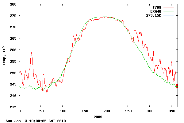 2010-Here you can see the temps decreasing at the turn of spring to summer this year. 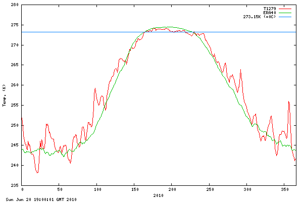 Now it might not be caused by the El Nino but it could be caused by the same thing that causes the El Nino despite your religious claims otherwise. You are posting some charts the methods of which are hidden from the public behind a paywall. In my view paywall science should never be part of public debate either by reference or by direct use from an abstract or an open study that relies upon paywall science. Any thing that does not stand alone on publicly available evidence should be excluded, including any open study that depends upon references to paywall science. Ultimately to be an open and transparent public debate item it has to be available to the public. No if ands or buts. There is just too few standards and too much politics in science to allow charts that have not been publicly vetted to be used as evidence in public debate. Some of these studies would cost each member of the public thousands of dollars or more to just to weave through the multiple layers of referencing to paywall science. It just simply does not belong in a public debate. Ultimately it comes around to folks not wanting folks to have the details lest they find something wrong with them. Anybody that feels that way probably believes there is something wrong with it. |
|
|
|
Post by icefisher on Aug 21, 2010 18:31:55 GMT
Looks like Hansen has a hand in the adjustments. PGR is an acronym for post glacial rebound. " However, the detection of the PGR signal from satellite gravity data includes the challenges of separating this signal from the other geophysical processes sensed by the mission. Gravity feild variations due to, e.g., oceanographic, land hydrological and atmospheric processes may partly mask the PGR signal." Indeed! When you look at the thermal changes of the crust itself, cooling in the antarctic should cause contraction without ice loss. Thus attributing mass change to ice loss seems rather shaky. Despite so called arctic amplification of temperatures still by far the big fluctuations in mass balance are at the equator where there is no significant ice. The ice melt at Greenland is much different and may be an honest reflection of ice sheet melt. But since 2008 there may not be warming occurring there.ed under current weather patterns but you are not seeing anything like that in antarctica which appears to be even orders of magnitude more stable than the African savannah. I think what we are dealing with is that deal where the scientists simply find what they are looking so hard for with exceedingly little evidence it is real. Paywalls help protect the illusion and climate science computer pinheads whose universities pony up the subscriptions with tax dollars can sit around in their ivory towers going yup yup yup yup yup . . . .this information is really good for climate science!!!!! |
|
|
|
Post by socold on Aug 22, 2010 2:42:48 GMT
ENSO is irrelevant to these momentum like changes in an area well outside the tropics. The below graph of antarctic ice mass covers a La Nina period. Where's the rebound that your "El Nino" comment would imply should exist? That is not a claim you have supported Socold. Here look at these actual arctic measurements. It's your claim that's the problem. You are the one claiming that ENSO is a big influence of ice trends. It isn't though - as I showed, the La Nina period didn't cause a reversal of ice loss. That's just a coincidence. If arctic temperature was so easily dominated by ENSO then the 1998 el nino should show a significant warming effect in the arctic, but it doesn't. Same for other large ENSO events like the 2008 la nina. The arctic is sometimes warmer than normal and colder than normal but it does so independent of ENSO. Another point is that the arctic is warming up faster during winter than summer, which could be why those graphs exhibit the warm anomaly in the winter and then a cooler summer, which only by coincidence coincides with the onset of the la nina. |
|
|
|
Post by icefisher on Aug 22, 2010 3:48:10 GMT
It's your claim that's the problem. You are the one claiming that ENSO is a big influence of ice trends. It isn't though - as I showed, the La Nina period didn't cause a reversal of ice loss. You didn't show anything Socold. You played the role of a carny barker and said come look at the two-headed lady just pay your $16 and I will show you a lady with a doll's head strapped on her shoulder. That's just a coincidence. If arctic temperature was so easily dominated by ENSO then the 1998 el nino should show a significant warming effect in the arctic, but it doesn't. Same for other large ENSO events like the 2008 la nina. The arctic is sometimes warmer than normal and colder than normal but it does so independent of ENSO. You say! You can see the difference between the 1998 El Nino and the 1999 La Nina here. Keep in mind ENSO only has about a 1/4 degree effect worldwide while it has 10 times in Nina 3.4.
No Problem spotting Super El Ninos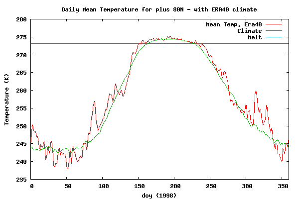 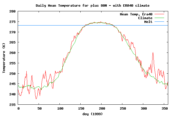 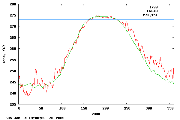
Another point is that the arctic is warming up faster during winter than summer, which could be why those graphs exhibit the warm anomaly in the winter and then a cooler summer, which only by coincidence coincides with the onset of the la nina.
What happens does the CO2 leave the arctic in the summer? |
|
|
|
Post by socold on Aug 22, 2010 12:54:01 GMT
"No Problem spotting Super El Ninos" The 1998 El Nino was at the start of the year, yet as the graph shows temperatures were about average. By the start of 1999 we were in a La Nina, yet if anything the start of 1999 is warmer than the start of 1998. And look at the start of 2009, La Nina conditions - warmer than the lot. Conclusion: there is no signal at all from the super el nino in those arctic temperature records. If you go through all the graphs and all the ENSO years you will find this is a recurring pattern. ENSO has little, if any detectable signal in arctic temperatures. "What happens does the CO2 leave the arctic in the summer?" In summer heat is expended at the surface melting ice. This cools the surface. Here are the temperature trends for the arctic that are expected if sea ice declines. The warming trend for the surface of the arctic during the summer is the lowest of the lot. It gets warmer higher in the atmosphere, but at the surface the heat expended melting sea ice is holding back the temperature trend. The most warming occurs in winter.  Figure 1: Temperature trends linked to changes in sea ice. Temperature trends over the 1989–2008 period averaged around circles of latitude for winter (a), spring (b), summer (c) and autumn (d). The trends are derived from projections of the temperature field on the sea ice time series.www.skepticalscience.com/What-causes-Arctic-amplification.html Figure 1: Temperature trends linked to changes in sea ice. Temperature trends over the 1989–2008 period averaged around circles of latitude for winter (a), spring (b), summer (c) and autumn (d). The trends are derived from projections of the temperature field on the sea ice time series.www.skepticalscience.com/What-causes-Arctic-amplification.htmlSo the graphs you list, which overall throughout the various years show relatively heightened anomalies in winter, and near-normal temps in summer are actually a case of observations matching what is expected from models. |
|
|
|
Post by icefisher on Aug 22, 2010 16:05:50 GMT
"No Problem spotting Super El Ninos" The 1998 El Nino was at the start of the year, yet as the graph shows temperatures were about average. By the start of 1999 we were in a La Nina, yet if anything the start of 1999 is warmer than the start of 1998. And look at the start of 2009, La Nina conditions - warmer than the lot. Conclusion: there is no signal at all from the super el nino in those arctic temperature records. You are looking at winter conditions where the temperature signal is so varied the small deviation to global temperatures caused by ENSO is buried by much larger fluctuations. The signal being only a 1/4 degree is only discernable in the summer. The week by week up to 40degC winter fluctuations just bury it. It does appear though that there has been a summer cooling trend in the arctic dating back to as far as 1993/5 with some minor ENSO trending fluctuations. If you go through all the graphs and all the ENSO years you will find this is a recurring pattern. ENSO has little, if any detectable signal in arctic temperatures. LOL! I only ever suggested that is was small so I guess we are not so much in disagreement. "What happens does the CO2 leave the arctic in the summer?"
In summer heat is expended at the surface melting ice. This cools the surface.
Here are the temperature trends for the arctic that are expected if sea ice declines. The warming trend for the surface of the arctic during the summer is the lowest of the lot. It gets warmer higher in the atmosphere, but at the surface the heat expended melting sea ice is holding back the temperature trend. The most warming occurs in winter.
Figure 1: Temperature trends linked to changes in sea ice. Temperature trends over the 1989–2008 period averaged around circles of latitude for winter (a), spring (b), summer (c) and autumn (d). The trends are derived from projections of the temperature field on the sea ice time series.
www.skepticalscience.com/What-causes-Arctic-amplification.html
So the graphs you list, which overall throughout the various years show relatively heightened anomalies in winter, and near-normal temps in summer are actually a case of observations matching what is expected from models.
You are describing negative feedback Socold. But the trend is to cooler not as a reduction in warming suggesting something else at work. Your graphs do not provide for "cooler" surface temperatures just less warming in the arctic summer. Seems the models are missing an elemental piece. |
|
|
|
Post by socold on Aug 22, 2010 19:31:38 GMT
not really  |
|
|
|
Post by icefisher on Aug 22, 2010 19:45:58 GMT
Not really? Are you imagining seeing any blue in the Arctic surface region? The reddog is supposed to be above the surface according to AGW theory and your model runs show it. But the real temperature record does not show it. And blue at the surface is contrary to the layered assumptions of back radiation where virtually everything gets warmer except for that little blue epicycle at mid latitudes in the window that was added to explain why it was getting cooler in the winter in mid latitudes. Seems more epicycles are needed. Seems to me 2010 Winter was also very comparable to 1999 cooling from 2009. |
|
|
|
Post by socold on Aug 22, 2010 19:55:20 GMT
The two images I have posted are different - just mentioning it as your response seems to suggest you think I just reposted the same one.
The observations presented in the second graph show faster warming in the troposphere than the surface during summer in the arctic. Other months look like more warming at the surface. The expected pattern from a reduction in sea ice is given in the first image. The main thing I notice is that both show faster warming in the troposphere than the surface during summer.
|
|
|
|
Post by icefisher on Aug 22, 2010 20:37:17 GMT
The two images I have posted are different - just mentioning it as your response seems to suggest you think I just reposted the same one. The observations presented in the second graph show faster warming in the troposphere than the surface during summer in the arctic. Other months look like more warming at the surface. The expected pattern from a reduction in sea ice is given in the first image. The main thing I notice is that both show faster warming in the troposphere than the surface during summer. Which of course is the only place on earth we aren't taking any real readings. The last refuge of AGW? As Joe Louis once said he can run but he can't hide. Big Mother Joe looks poised to go into the corner and pummel you. |
|
|
|
Post by magellan on Aug 22, 2010 20:42:13 GMT
The two images I have posted are different - just mentioning it as your response seems to suggest you think I just reposted the same one. The observations presented in the second graph show faster warming in the troposphere than the surface during summer in the arctic. Other months look like more warming at the surface. The expected pattern from a reduction in sea ice is given in the first image. The main thing I notice is that both show faster warming in the troposphere than the surface during summer. Which of course is the only place on earth we aren't taking any real readings. The last refuge of AGW? As Joe Louis once said he can run but he can't hide. Big Mother Joe looks poised to go into the corner and pummel you. The tropics don't matter anymore ;D |
|
|
|
Post by socold on Aug 22, 2010 21:17:58 GMT
"Which of course is the only place on earth we aren't taking any real readings"
vs
"Here look at these actual arctic measurements."
Both comments by icefisher on this thread and this page.
|
|
|
|
Post by astroposer777 on Aug 22, 2010 21:50:49 GMT
What is really obvious from the DMI charts (if you trust them) is that the variability of the Arctic temperature has been much greater during the Nov-Apr period since 1958. The mean is quite smooth during the other half of the year suggesting that it has not varied much during the last 50 years. Is it a surprise that models show greater impact from any warming during this part of the year?
|
|


 .
.
