|
|
Post by hunterson on Oct 1, 2010 16:08:47 GMT
So he can't be sincere, he must be cynical and wicked. I suggest you use that red button. He may sincerely believe that CO2 is not a threat and have justified to himself that it is OK to misrepresent IPCC projections for the greater good. He may believe in a philosophical model of the world where winning the argument is more important than being "right". I don't know how cynical or wicked that makes him. Projection is a wonderful thing. The AGW movement relies on it utterly. But enough of Monckton. I do not even like him. |
|
|
|
Post by steve on Oct 1, 2010 16:21:12 GMT
My argument consisted of saying that this: 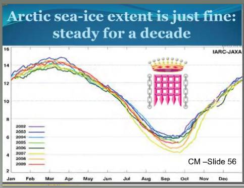 was inconsistent with this:  and that the arrow was added to this:  to imply that this was not going to happen:  I don't recall commenting on his appearance or hobbies. The Royal Society does not disagree with me. It says This is the sort of comment that would normally make you spit blood as it basically says that even if it cools, the CO2 is still causing warming, and the thing that is causing the cooling could cease to happen at any time, or go in reverse and add to the CO2 warming. |
|
|
|
Post by icefisher on Oct 2, 2010 11:50:11 GMT
Steve, Monckton's graphs are honest graphs he didn't modify any data points unlike others.
These are not cases of graphs like the Hockey Stick or Hide the Decline or the stepladder prop Al Gore used on a hugely blown up faked graph.
Perhaps its the conclusion he reaches you do not like. But Monckton is communicating to people who only heard the "Arctic Death Spiral" and "Florida disappearing off the map" soundbites and he does it by showing widely accepted data that clearly does not demonstrate any such thing.
Nothing dishonest in any of those and I don't think he claimed there wouldn't be any more warming, ice melt, or sea level rise Steve. He is just pointing out that stuff goes up and it goes down and sometimes it goes flat.
And by the way a persons title is part of his appearance and his dabbling in patents is clearly a hobby.
|
|
|
|
Post by icefisher on Oct 2, 2010 12:07:50 GMT
The Royal Society does not disagree with me. It says This is the sort of comment that would normally make you spit blood as it basically says that even if it cools, the CO2 is still causing warming, and the thing that is causing the cooling could cease to happen at any time, or go in reverse and add to the CO2 warming. The model prediction is .2 to .4 per decade Steve. But the RS is not endorsing this as fact or even wide agreement. It is in the contentious section of their paper. The .2 to .4 per decade prediction will be dead before the end of the prediction period. The RS seems oblivious to the fact that for a decade already this prediction got the holy stuffing knocked out of it and probably before IPCC publishes another one, as you predict, there is going to be some adjustments. Hansen yet again is predicting a new record year for 2012 but its not likely going to happen and when it doesn't happen its going to bring into focus the ludicrousness of spending gobs of money on making predictions that consistently fail to materialize. He has been wrong so much that even if it turns out he is right this time it will be chalked up to the blind squirrel theory. Astrologers have a better track record and they got relegated to a novelty category. |
|
|
|
Post by socold on Oct 2, 2010 14:18:29 GMT
Steve, Monckton's graphs are honest graphs he didn't modify any data points unlike others. These are not cases of graphs like the Hockey Stick or Hide the Decline or the stepladder prop Al Gore used on a hugely blown up faked graph. Actually isn't this exactly like Al Gore's graph? Correct me if I am wrong but Al Gore's graph wasn't fake was it? It showed CO2 and temperature from standard ice core data. Just as Monckton's graphs depict real data (well some of them do). But people can be misled by real data if it's given out of context. If they are misled intentionally then that's dishonest. Either way they are misled. With Gore's graph, despite it being factual data, people nevertheless can be misled into thinking it proves the co2 change caused the temperature change, unless they are given more information. With Monckton's sea ice graph, despite it being factual data, people nevertheless will be misled into thinking it proves arctic sea ice isn't in decline (monctkon even explicitly titles it with "it's fine" and "steady for a decade"). But in context we know arctic sea ice is in decline and hasn't been steady for a decade. If monckton had shown a timeline of arctic sea ice instead (eg arctic.atmos.uiuc.edu/cryosphere/IMAGES/seaice.anomaly.arctic.png) this would be clear. When audience go away with ideas which are wrong then they've been misled. Deliberately or not. If they went in thinking that arctic sea ice is in a death spiral and came out thinking "it's fine - steady for a decade", they've come out knowing less than when they went in. They've been "de-educated", "delearned", misled. |
|
|
|
Post by boxman on Oct 2, 2010 15:33:59 GMT
socoldI guess you forgot the fact that they even tinkered with the ice core ones? They actually changed it so that it looked like CO2 increased before temperature, when the opposite was actually true.
|
|
|
|
Post by icefisher on Oct 2, 2010 17:12:44 GMT
With Monckton's sea ice graph, despite it being factual data, people nevertheless will be misled into thinking it proves arctic sea ice isn't in decline (monctkon even explicitly titles it with "it's fine" and "steady for a decade"). Monckton's graph shows all the data Socold. How can you say it doesn't show any decline? What it doesn't show is an "arctic ice death spiral" which would in my mind be a situation where the entire range of annual ice fluctuation threatens to be below typical annual minimums.
But in context we know arctic sea ice is in decline and hasn't been steady for a decade. If monckton had shown a timeline of arctic sea ice instead (eg arctic.atmos.uiuc.edu/cryosphere/IMAGES/seaice.anomaly.arctic.png) this would be clear.
When audience go away with ideas which are wrong then they've been misled. Deliberately or not.
Just isn't so Socold. 2008 recovery was almost the highest on record. 2009's minimum was 3rd from the bottom. You can only show declines by not showing all the data or all the datapoints throughout the year. Monckton did not stoop to that deceptive approach he produced a graph that showed what is considered to be a complete dataset of sea ice that does not rely upon proxy. Liars lie with numbers by not showing all the numbers. Summer ice minimum is not a good indicator of ice health for any known scientific reason. It is featured exclusively because it selectively suggests a general ice decline but it is only one day in the year and a summer ice free arctic has already occurred during the Holocene, perhaps for a majority of the Holocene. Figures don't lie but liars lie with figures. The tricks in the book are almost endless. Tricks like not showing zero origins, by selectively choosing data, by appending data sets of different resolutions by selectively excluding data. You know Socold Textbook climategate stuff! The stuff you personally have defended unrelentingly. Its a complete howling joke that you come in and suggest that presenting all the data is somehow deceptive and that selective presentations of data are more telling. |
|
|
|
Post by socold on Oct 3, 2010 0:00:44 GMT
socoldI guess you forgot the fact that they even tinkered with the ice core ones? They actually changed it so that it looked like CO2 increased before temperature, when the opposite was actually true. I don't think they changed the data, or you are right I would have remembered it. |
|
|
|
Post by socold on Oct 3, 2010 0:25:09 GMT
Liars lie with numbers by not showing all the numbers. Summer ice minimum is not a good indicator of ice health for any known scientific reason. Summer extent is the issue. That's what the "death spiral" is all about and is why people focus on the minimum each year and the prospect of zero ice in summer. If people go away thinking that monckton addressed that issue with his "arctic sea ice is just fine: steady for a decade" then he has misled them. Pure and simple. It rather sounds like he has misled you too. Monckton's graph shows all the data Socold. How can you say it doesn't show any decline? So Monckton's own graph disagrees with his title of the graph? Sure the graph shows a decline (falsifying Moncktons conclusion and title) but it's not half as clear as if he had shown a timeline. Like this one:  A clear decline even over entire years. In no way shape or form is that "steady for a decade" Arctic death spiral is more of a prediction that the arctic is heading inevitably for summer wipeout. Monckton misled people by describing the data as steady for a decade. There's a decline even if you use all the data so either way he let people go away programmed to believe lies. Actually the most misleading side in this debate, with graphs, omissions, sleights of hand, is yours. By far. |
|
|
|
Post by poitsplace on Oct 3, 2010 3:02:15 GMT
If people go away thinking that monckton addressed that issue with his "arctic sea ice is just fine: steady for a decade" then he has misled them. Pure and simple. It rather sounds like he has misled you too. About the most misleading thing anyone could tell you about arctic ice...is that its presence in any way indicates a MORE healthy planet. |
|
|
|
Post by icefisher on Oct 3, 2010 4:13:33 GMT
Summer extent is the issue. That's what the "death spiral" is all about and is why people focus on the minimum each year and the prospect of zero ice in summer. 1. The ice freezes back to the same amount of ice each winter Socold, that was your statement. Thus if the ice is here every year at the same level it is here every year at the same level. 2. Ice melts every summer. In fact, recent studies show that for most of the Holocene there was less summer ice than today. 3. Despite perhaps more than a thousand years without summer ice north of Greenland to the pole and beyond polar bears did just fine. So there is no death spiral and you have finally admitted it at least in terms of the usually stated effects. Perhaps you have some other impending disaster in mind. |
|
|
|
Post by icefisher on Oct 3, 2010 4:18:50 GMT
So Monckton's own graph disagrees with his title of the graph? Sure the graph shows a decline (falsifying Moncktons conclusion and title) but it's not half as clear as if he had shown a timeline. Like this one:
A clear decline even over entire years. In no way shape or form is that "steady for a decade"That graph is more deceptive than the one he used because all it shows are anomalies and does not put the anomalies in context of how much ice is being talked about. But Socold doesn't this graph put the lie to your statement that the ice comes back to the same level every year? Or is it just an immaterial difference? |
|
|
|
Post by socold on Oct 3, 2010 11:01:26 GMT
The ice grows back over 80N each year. The cryosphere today graph doesn't show just 80N. The cryosphere today graph is not deceptive People who see the CT graph will go away thinking that arctic sea ice has been in decline for the past decade, which it has so they go away educated. People looking at Monckton's graph on the otherhand wouldn't be able to tell the trend from the graph, but would go away thinking it had been "steady for a decade" because of what Monckton wrote on the slide. Therefore they go away with false ideas and are misled. Summer extent is the issue anyway, not ice extent over the whole year. Summer extent is in decline over the past decade too. As some think the decline is now irreversible they refer to it as a death spiral. One of those studies the McKay ( bprc.osu.edu/geo/publications/mckay_etal_CJES_08.pdf) has been misinterpreted by skeptics. Another case where they use an actual study in their posts and somehow readers of those posts go away with incorrect ideas about the study. Ie they've been misled. The McKay study was touted on WUWT for example as " Peer reviewed study says current Arctic sea ice is more extensive than most of the past 9000 years" (wait peer review is now a badge of credibility?). But that's not what the paper says: "Nevertheless, the dinocyst reconstructions for site HLY0501-05 clearly show that sea-surface conditions, notably sea-ice cover, have fluctuated significantly during the Holocene. Since the early Holocene, sea-ice cover exhibits a general decreasing trend. This is in direct contrast to the eastern Arctic where sea-ice cover was substantially reduced during the early to mid-Holocene and has increased over the last 3000 years" So it doesn't claim arctic sea ice has been lower during the holocene. In general it doesn't matter whether arctic summer sea ice was lower in the past (whether the holocene or the eemian) than the present. Just as it doesn't matter if the MWP was warmer than today. The relevant comparison is between the past and where we are heading. What very warm conditions in the arctic in the distant past show is that rapid warming of the arctic is possible, there are no self-defense mechanisms in climate to prevent it. Therefore there really is nothing standing between our emissions and such conditions. |
|
|
|
Post by boxman on Oct 3, 2010 14:43:35 GMT
Liars lie with numbers by not showing all the numbers. Summer ice minimum is not a good indicator of ice health for any known scientific reason. Summer extent is the issue. That's what the "death spiral" is all about and is why people focus on the minimum each year and the prospect of zero ice in summer. If people go away thinking that monckton addressed that issue with his "arctic sea ice is just fine: steady for a decade" then he has misled them. Pure and simple. It rather sounds like he has misled you too. So Monckton's own graph disagrees with his title of the graph? Sure the graph shows a decline (falsifying Moncktons conclusion and title) but it's not half as clear as if he had shown a timeline. Like this one: A clear decline even over entire years. In no way shape or form is that "steady for a decade" Arctic death spiral is more of a prediction that the arctic is heading inevitably for summer wipeout. Monckton misled people by describing the data as steady for a decade. There's a decline even if you use all the data so either way he let people go away programmed to believe lies. Actually the most misleading side in this debate, with graphs, omissions, sleights of hand, is yours. By far. What about this one: arctic.atmos.uiuc.edu/cryosphere/IMAGES/seaice.anomaly.antarctic.pngNearly exact mirrored version of the arctic one  |
|
|
|
Post by icefisher on Oct 3, 2010 15:28:35 GMT
But that's not what the paper says:
"Nevertheless, the dinocyst reconstructions for site HLY0501-05 clearly show that sea-surface conditions, notably sea-ice cover, have fluctuated significantly during the Holocene. Since the early Holocene, sea-ice cover exhibits a general decreasing trend. This is in direct contrast to the
eastern Arctic where sea-ice cover was substantially reduced during the early to mid-Holocene and has increased over the last 3000 years" 3000 years only covers the last 25% of the Holocene. Before that "sea-ice was substantially reduced" in the eastern Arctic. The difference it appears is ice started increasing in the eastern Arctic before the western Arctic to 2010's value. LOL!! Not only is CO2 taking seasonal vacations in the Arctic but its been on reduced staff for the past few hundred years!! This study covered almost 9,500 years of the Holocene and as you can see from the graph:  Trigger core data are shown by the solid symbols and piston core data by the open symbols. The thick line Trigger core data are shown by the solid symbols and piston core data by the open symbols. The thick line
is the data smoothed using a 5-point average. Modern sea surface conditions are shown by the thick bar on the x axis (modern range).It appears to me that sea ice should continue to decrease in the Arctic to around >50% concentration for only about 4 to 5 months a year (as opposed to the current 9.5 months a year) to get inline with the trend throughout the Holocene. But trends do change so we might not get that low. The problem with the graph you suggest Monckton use selectively looks at a very narrow time period exhibiting a very modest downward trend in sea ice over the past decade. That is in fact what is deceptive suggesting the teensy downturn in Arctic ice is somehow going to translate into a death spiral. But in the grander arctic oscillation the recent small downturn is peanuts in relationship to the fluctuations seen on the above graph. In other words the word "steady" is perfectly appropriate in the context of an alleged "death spiral" as normal decadal, centennial, and millenial fluctuations in the Arctic have a rich history of making the last 30 years look flat in comparison. So it is in fact Monckton who is the one NOT being deceptive. Further it seems probable that when >50% sea ice drops into the range of 6 months a year a truly ice free summer becomes a real probability and we can see from the graph we have been there many times. |
|


