|
|
Post by acidohm on Jun 27, 2015 12:53:43 GMT
Graywolf: That blob was there in the 1940's as well. Joe Bastardi talks about this. During the 1940's, other items of interest. 1. The St Roch sailed the Northern North West Passage. 2. The German warships sailed the North Eastern Passage to get to the Pacific in WW2. The timing of the temperature increase is similar in both events. Early 20th Century warming, then a decline. Late 20th Century warming, another decline? Are we witnessing a repeating event? Striking similarity don't you think? Does history repeat itself? I could have sworn the consensus was this is unprecedented.....your falling off message Sig!! |
|
|
|
Post by icefisher on Jun 27, 2015 12:56:08 GMT
Bad week across the basin as the Blob eats away Beaufort Thickness. With the Alaskan current giving the basin a direct line back into the blob it's not looking good for the pacific side right now? The C.A. is also feeling the heat so it looks clear we will have a few routes through the NW Passage this year? In the past the year after Nino is bad for volume in the basin ( all that warm water makes its way up the US coast and into the basin via Bering) but last years near Nino and the persistence of the blob make this year into a 'low volume' candidate? Hardly! There was a mass of warm water moving north past southern California last year and this spring that was far beyond anybody's recollection. It may have been a bust at the equator but here it brought warm water species not seen at all or not seen in quantity for a long long period of time. The process seems to be currently faltering but there is a lot of hot water up in the Gulf of Alaska. Outside water, off socal, has a small positive anomaly but it has only gone up a degree or two since the mid winter low. Usually by now that water would have warmed several degrees. |
|
|
|
Post by duwayne on Jun 27, 2015 13:12:06 GMT
From Paul Homewood's website.... "As the albedo effect is greatest at the summer solstice, how does Arctic sea ice extent compare with the historical average at that time of year? At 21st June this year, the extent was 10.611 million sq km, against the 1981-2010 average of 11.491, a deficit of 0.880 million sq km. How then does this compare to Antarctic sea ice extent at the summer solstice there last year, on 21st December? The actual extent was 11.025 million sq km, a surprisingly similar number. However, this compared to the 1981-2010 average of 9.233, giving an excess of 1.792 million sq km. Taking the two poles together, at the summer solstice there is actually an net excess of 0.912 million sq km. If, as they say, summer sea ice reflects sunlight, thus moderating global climate, the increase in Antarctic ice is actually having a larger cooling effect than the opposite effect in the Arctic. We also need to factor in the facts that most of the Antarctic ice lies at lower latitudes than in the Arctic. This year, most of the deficit in the latter is in the Barents and Kara Seas, around Svalbard. This mainly lies between 75 and 80N. In comparison, the excess ice down south is around 65S, where the albedo effect will be greater. In terms of albedo therefore, the increasing trend of sea ice in the Antarctic is much more significant than the decline in the Arctic." notalotofpeopleknowthat.wordpress.com/2015/06/26/albedo-effect-at-the-poles/#more-15373 |
|
|
|
Post by Ratty on Jun 28, 2015 2:14:49 GMT
DMI today: 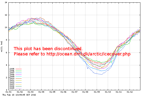 |
|
|
|
Post by douglavers on Jun 28, 2015 6:34:17 GMT
It looks like all the petawatt hours of power which have not reached the Arctic via North Atlantic drift are just starting to have an effect on ice melting.
Methinks Europe might have more to worry about than Greece/Ukraine/politics next winter.
|
|
|
|
Post by nonentropic on Jun 28, 2015 9:58:48 GMT
heatwave booked for next week it could boil the water yet
|
|
|
|
Post by duwayne on Jul 3, 2015 14:15:54 GMT
A few years ago one of the posters here reported a new finding that the rapid ice melt in the arctic was causing massive amounts of methane to be released from the ocean bottom. In a few years, he said as I recall, this would lead to a massive increase in atmospheric methane beyond anything envisioned by most climate experts like those at the IPCC. Since methane is a potent greenhouse gas, the poster predicted that global temperatures would skyrocket and by now and in the near future would be far beyond the levels projected by the IPCC. Since I've had trouble sleeping ever since Graywolf made us aware of this terrible problem, I asked him if he would keep us updated on the rapid rise of methane so we could be prepared. Graywolf hasn't provided the updates as I had hoped, but for those who are worrying about this problem I did run across this IPCC chart in a recent post on WUWT by Christopher Monckton.  Interestingly, the IPCC didn't see this worthy of inclusion in their final report. In addition to the methane chart, the WUWT post notes that the current El Nino likely will cause an upward blip in global temperatures sufficient to curtail the global temperature pause, at least temporarily. wattsupwiththat.com/2015/07/02/el-nio-begins-to-curtail-the-pause/ |
|
|
|
Post by Ratty on Jul 4, 2015 0:38:54 GMT
Code, The graph you have brought to my attention (thank you) is extent. As far as I can tell, the one I posted is area ("cover"). I like the extent one better though .... shows more ice.  Is the "cover" version obsolete? It seems to roughly accord with Cryosphere Today NH Sea Ice Area. |
|
|
|
Post by Ratty on Jul 4, 2015 5:34:38 GMT
Ratty, Heck I'm no expert I only went to the link and found the explanation given that the graph you found was extent as was the one I posted (both are extent) but that the link you found was not graphing coastal areas. "The plot above (my post) replaces an earlier sea ice extent plot(your post), that was based on data with the coastal zones masked out. This coastal mask implied that the previous sea ice extent estimates were underestimated. The new plot (my post) displays absolute sea ice extent estimates. The old plot (your post) can still be viewed here for a while. ocean.dmi.dk/arctic/icecover.uk.phpFrom what I read they seem to think that yes it is obsolete. Code, thanks for going to all that bother ..... My original post was from ocean.dmi.dk/arctic/plots/icecover/icecover_current.png - not ocean.dmi.dk/arctic/icecover.uk.php. So, I must have picked it up from their website by chance and I guess it will eventually disappear. I can't seem to find anywhere that DMI does an area graph ?? Wouldn't a phone call be much simpler than all this typing?  |
|
|
|
Post by nonentropic on Jul 4, 2015 5:44:23 GMT
Are extent and area actually different?
A major problem with micro observation of sea ice extent is that the metrics are not based on actual ice extent but thresholds of ice cover so a 15% ice covered region can with a wind shift compress to a fifth of the area but with no change in actual ice present.
cherry picking and alarmist shrill result. (both sides)
|
|
|
|
Post by Ratty on Jul 4, 2015 6:57:17 GMT
Are extent and area actually different? By definition? The "15% Rule". A major problem with micro observation of sea ice extent is that the metrics are not based on actual ice extent but thresholds of ice cover so a 15% ice covered region can with a wind shift compress to a fifth of the area but with no change in actual ice present. You're right, of course. cherry picking and alarmist shrill result. (both sides) But, but .... how can I stick it to my alarmist friends if I don't watch the wriggles? |
|
|
|
Post by fredzl4dh on Jul 4, 2015 13:39:54 GMT
|
|
|
|
Post by acidohm on Jul 4, 2015 20:34:20 GMT
That's a great site...thx fredzl4dh! |
|
|
|
Post by douglavers on Jul 10, 2015 7:58:35 GMT
|
|
|
|
Post by Ratty on Jul 16, 2015 7:12:51 GMT
|
|