|
|
Post by glennkoks on Mar 24, 2012 1:13:04 GMT
sig, you bring up a good point. I was under the impression that NSIDC.org was the 1979-2011 average. It clearly says 1979-2000 mean. If you added the missing 11 years of data to that average it is certainly possible that we are "above" average currently. As with anything "climate" nowadays you have to read the fine print with your filter on.
|
|
|
|
Post by sigurdur on Mar 24, 2012 16:34:59 GMT
|
|
|
|
Post by sigurdur on Mar 24, 2012 16:36:41 GMT
|
|
|
|
Post by astroposer777 on Mar 24, 2012 18:43:55 GMT
  Presentation is very important to perception. Both maps show essentially the same data, but most would infer that the NOAA map shows a higher global sst. |
|
|
|
Post by sigurdur on Mar 24, 2012 18:53:53 GMT
Astroposer777:
I agree. The reason I like Unisys is that the resolution is higher.
I have two areas of interest when looking at SST maps.
One area is off Alaska. There was a hot spot parked there last year. This affects rainfall patterns in the Lower Great Plains. The moisture in the Upper Great Plains comes from the area west of Mexico. The wind patters, etc are affected by the area off Alaska. When the moisture plume goes over a dry area, it looses, as to be expected.
Right now, it is cold off Alaska. This indicates that the upper great plains is going to be wetter than average, which the 10 and 14 day models are showing. While we have been above average in temps, in my area we are now wet. STill have water standing from last weeks rains. To the west of me, in the more semi arid plains, they are still dryer, but not extreme dryness.
My area is 2 inches of precip from having another misserable spring planting season. Worrisome.
The Ohio River valley has now had ample precip. Illinois is a bit behind yet, but catching up rapidly.
The ocean heat pattern is telling me that this could be another wet spring.
|
|
|
|
Post by astroposer777 on Mar 24, 2012 19:16:01 GMT
Astroposer777: I agree. The reason I like Unisys is that the resolution is higher. I have two areas of interest when looking at SST maps. One area is off Alaska. There was a hot spot parked there last year. This affects rainfall patterns in the Lower Great Plains. The moisture in the Upper Great Plains comes from the area west of Mexico. The wind patters, etc are affected by the area off Alaska. When the moisture plume goes over a dry area, it looses, as to be expected. Right now, it is cold off Alaska. This indicates that the upper great plains is going to be wetter than average, which the 10 and 14 day models are showing. While we have been above average in temps, in my area we are now wet. STill have water standing from last weeks rains. To the west of me, in the more semi arid plains, they are still dryer, but not extreme dryness. My area is 2 inches of precip from having another misserable spring planting season. Worrisome. The Ohio River valley has now had ample precip. Illinois is a bit behind yet, but catching up rapidly. The ocean heat pattern is telling me that this could be another wet spring. I find it worrisome that a government agency creates a graphic which misleads the public into believing that we are warming at an accelerated rate. |
|
|
|
Post by socold on Mar 24, 2012 20:30:54 GMT
If anything the unisys map is the misleading one. They use light blue for warmer than average temperatures. Yet the color blue is associated with cold.
|
|
|
|
Post by icefisher on Mar 25, 2012 0:24:07 GMT
Presentation is very important to perception. Both maps show essentially the same data, but most would infer that the NOAA map shows a higher global sst. Its probably appropriate to show a cooling anomaly.  |
|
|
|
Post by astroposer777 on Mar 25, 2012 16:19:12 GMT
If anything the unisys map is the misleading one. They use light blue for warmer than average temperatures. Yet the color blue is associated with cold. That is a valid observation, however in my opinion the Unisys map provides a better picture of sst anomaly by providing clear contour lines and numerical values. Thank you for the link you provided on another thread, that was the one I was looking for. |
|
|
|
Post by trbixler on Apr 2, 2012 14:31:29 GMT
|
|
|
|
Post by throttleup on Apr 27, 2012 16:43:18 GMT
All,
I came across this link and thought some may find it of interest. If it was posted before, then I missed it.
It contains many interesting drawings, maps and related information. HMS Hecla and Griper in winter quarters at Melville Island, from William Edward Parry, Journal of a Voyage, 1821. Ice: A Victorian Romance, is an exhibition of fifty-five rare books and journals, which were originally displayed at the Linda Hall Library, May 1-September 13, 2008. The online exhibition duplicates the physical exhibit, with the inclusion of additional images. Navigation is straightforward. The NEXT button or link will take you though the exhibition item by item. link: www.lindahall.org/events_exhib/exhibit/exhibits/ice/index.shtml
|
|
|
|
Post by tobyglyn on Apr 28, 2012 5:04:30 GMT
What a great link - thanks!
|
|
|
|
Post by throttleup on May 14, 2012 12:58:35 GMT
All,
FYI...
The Global Change observation Mission 1st-Water "SHIZUKU" mission is scheduled to launch 18 May.
The Advanced Microwave Scanning Radiometer-EOS (AMSR-E) that was onboard the Aqua satellite died last October. Its successor, AMSR-2, is onboard Shizuku.
The old AMSR-E antenna was about 1.6 meters diameter; the new AMSR-2 is about 2 meters. Hopefully they'll throw on some extra lube to keep that baby working a good, long time.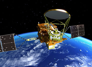 www.jaxa.jp/countdown/f21/index_e.htmlHere's to a good launch. Maybe next year Numerouno can host another Arctic Sea Ice contest. www.jaxa.jp/countdown/f21/index_e.htmlHere's to a good launch. Maybe next year Numerouno can host another Arctic Sea Ice contest.
That is, of course, assuming there is any Arctic ice at all... 
|
|
|
|
Post by hrizzo on May 14, 2012 18:06:47 GMT
|
|
|
|
Post by trbixler on May 14, 2012 18:32:47 GMT
I am surprised that they have not figured out how to sabotage the satellite imagery so that it can be said without refutation that it is indeed gone. |
|


