|
|
Post by missouriboy on May 28, 2020 14:12:34 GMT
The Long Paddock is rapidly cooling. The last great cooling occurred at the start of SC24, beginning May, 2010 with an initial value of -0.2 (on the MEI scale) and dropping to -2.4 by July, then slowly increasing to neutral over the next 23 months. The ONI Index was not as quick or deep ... dropping to -1 by July and -1.7 by October. If this be real, and continues, expect Dr Roy's global lower troposphere anomaly index to rapidly follow ENSO downward, with the usual lag. I assume there is a real relationship, and that it will continue. In 2010, the Global index dropped from +0.51 (3/10) to -0.19 (3/11) ... a drop of 0.7 C. We are at +0.38 for April, 2020. A drop similar to 3/10-3/11 would take the index to -0.32 ... a value not seen since 1993. Such a change would provoke the Great Denier Press to engage in supposedly impossible contortions to explain away this inconvenience. But they have become masters of the big lie. Importantly, such a change (or even lower) might show the limits of how long accumulated ocean heat can support higher global temperatures. This has been a much argued metric, and is important to what happens to global temperatures if we are moving into a solar cycle no larger than SC24. Given that SCs 21-23 were well above normal and assuming that heat accumulation in the Earth system is largely related to that "Grand Maximum", a drop to temperatures of 27 years ago after a low cycle of 11 years might bode ill for future years. This metric may give us a rough estimate of how fast our oceans shed heat. 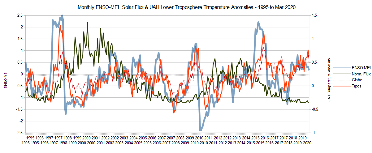 |
|
|
|
Post by nautonnier on May 28, 2020 15:53:49 GMT
I think it is more likely that the 'Great Denier Press' will just say look how cold it has got because of the COVID-19 industry reductions, bypassing any CO2 level arguments. They will insist stopped industry, flying and driving and now it's got cold QED!
And the Greta Gullibles will all agree
|
|
|
|
Post by missouriboy on May 28, 2020 19:12:53 GMT
I think it is more likely that the 'Great Denier Press' will just say look how cold it has got because of the COVID-19 industry reductions, bypassing any CO2 level arguments. They will insist stopped industry, flying and driving and now it's got cold QED! And the Greta Gullibles will all agree Of course the gullible Gretas will agree. But as emissions go back up and the heat fails to arrive, the marginal gullibles will continue to fall away. And if by chance they don't, then they can relearn the fine art of cave living combined with hunting and gathering. I don't believe that their soft-living environment has equipped them for that. They will drop like flies. |
|
|
|
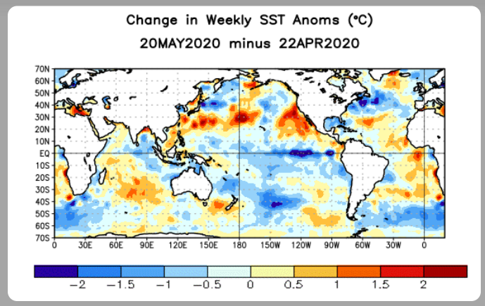
Post by missouriboy on May 29, 2020 16:48:26 GMT
The Northern Hemisphere symmetry of this SSTA rendering is pretty interesting. I have a shadow memory of something similar from years ago, but can't find it. Ask Joe.  From the same time in 2010. The N Atlantic is definitely colder N America to Europe. 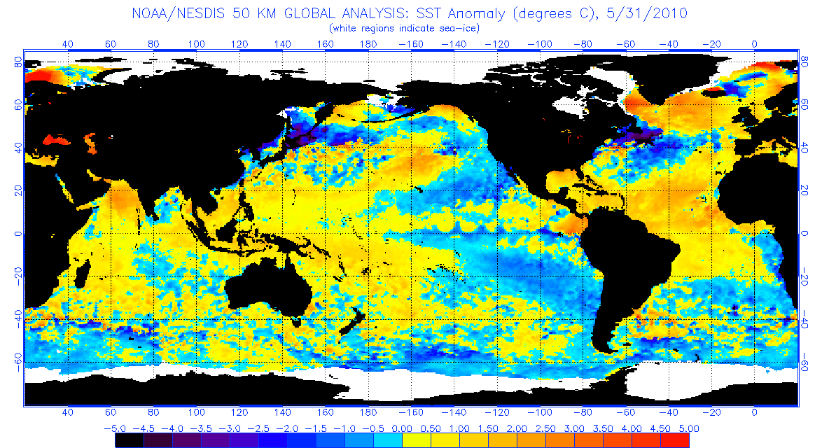 |
|
|
|
Post by acidohm on May 30, 2020 6:33:30 GMT
The Northern Hemisphere symmetry of this SSTA rendering is pretty interesting. I have a shadow memory of something similar from years ago, but can't find it. Ask Joe. From the same time in 2010. The N Atlantic is definitely colder N America to Europe. 2010 shows a strong tripole feature (3 alternating temperature bands). When this shows in May it's a good cold signature for winter.....i have no idea why this works as a means of forecast...but it does) There is a tripole right now but perhaps not as distinct as 2010. |
|
|
|
Post by nautonnier on May 30, 2020 9:55:02 GMT
The Northern Hemisphere symmetry of this SSTA rendering is pretty interesting. I have a shadow memory of something similar from years ago, but can't find it. Ask Joe. From the same time in 2010. The N Atlantic is definitely colder N America to Europe. 2010 shows a strong tripole feature (3 alternating temperature bands). When this shows in May it's a good cold signature for winter.....i have no idea why this works as a means of forecast...but it does) There is a tripole right now but perhaps not as distinct as 2010. You need to be cautious comparing those images at some point NOAA decided to alter the color scales. So in the older map any SST below zero showed as blue. In the newer maps there is white either side of the zero and the color saturations used are lighter, the visual impact is to provide less contrast for temperature differences. |
|
|
|
Post by missouriboy on May 30, 2020 16:08:56 GMT
|
|
|
|
Post by acidohm on May 30, 2020 22:31:14 GMT
There's at least one cycle 25 spot showing itself farside, current 0 spot run likely about to end soon. |
|
|
|
Post by blustnmtn on May 30, 2020 23:13:02 GMT
I believe the flora of planet earth are still quite happy with the way CO2 works. 🤓 |
|
|
|
Post by missouriboy on May 31, 2020 0:04:57 GMT
I believe the flora of planet earth are still quite happy with the way CO2 works. 🤓 The Greenies need a chlorophyll check. Supplements could be prescribed.. |
|
|
|
Post by duwayne on Jun 6, 2020 22:53:50 GMT
I've put a barely readable graph into my avatar. This is the weekly ONI starting at the beginning of the year for 1998 (blue) at the top, 2010 in the middle and 2020 at the bottom in purple. The 2020 line is currently at -0.5 which is the 3rd number up from the bottom on the left side. The graph covers approximately 2 years with vertical lines 8 weeks apart.
|
|
|
|
Post by missouriboy on Jun 7, 2020 3:31:14 GMT
I've put a barely readable graph into my avatar. This is the weekly ONI starting at the beginning of the year for 1998 (blue) at the top, 2010 in the middle and 2020 at the bottom in purple. The 2020 line is currently at -0.5 which is the 3rd number up from the bottom on the left side. The graph covers approximately 2 years with vertical lines 8 weeks apart. Where did you get your weekly(?) ONI Index? |
|
|
|
Post by duwayne on Jun 7, 2020 13:48:33 GMT
I've put a barely readable graph into my avatar. This is the weekly ONI starting at the beginning of the year for 1998 (blue) at the top, 2010 in the middle and 2020 at the bottom in purple. The 2020 line is currently at -0.5 which is the 3rd number up from the bottom on the left side. The graph covers approximately 2 years with vertical lines 8 weeks apart. Where did you get your weekly(?) ONI Index? The weekly ONI (Oceanic Nino Index) is shown on the fourth screen down on this link as Nino 3.4. This report is updated once a week. www.cpc.ncep.noaa.gov/products/analysis_monitoring/lanina/enso_evolution-status-fcsts-web.pdf |
|
|
|
Post by Ratty on Jun 7, 2020 23:56:22 GMT
I've put a barely readable graph into my avatar. This is the weekly ONI starting at the beginning of the year for 1998 (blue) at the top, 2010 in the middle and 2020 at the bottom in purple. The 2020 line is currently at -0.5 which is the 3rd number up from the bottom on the left side. The graph covers approximately 2 years with vertical lines 8 weeks apart. What is an ONI? Oni (鬼) is a kind of yōkai, ogre, or troll in Japanese folklore. en.wikipedia.org/wiki/OniC'mon Code. We're trying to be serious here.  |
|
|
|
Post by missouriboy on Jun 8, 2020 3:20:16 GMT
DuWayne's graph gave me an idea. After noticing that Every (All 6) Pre-cycle La Nina since 1950 begins its plunge from Nino territory in early summer (usually June) of the year in which the new solar cycle kicks off, I took my monthly ENSO-ONI index for the NINO 3.4 area and charted it starting in January of that year for 50 months. You will note the sets of progressively positive synchronous waves moving toward solar maximum. Every cycle shows the peaks and troughs ... generally 12 months apart. Usually the first wave is deepest ... but sometimes the second is. If this is the year, our drop should happen very soon. The legend box year is the graph start year for that cycle. The Nino Mid-Pacific Heartbeat. The first 36 months of each temporal transect are highlighted in yellow on Chart 2. 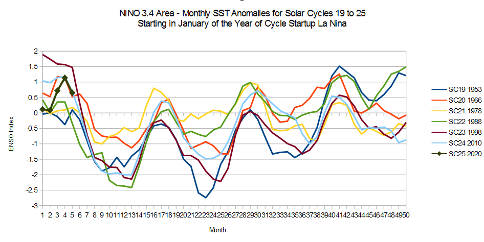 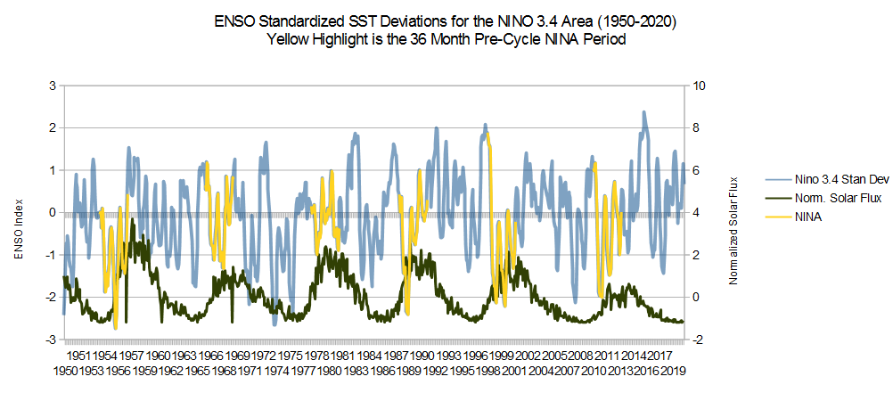 |
|


 Still no sunspots since the first of May.