|
|
Post by steve on Apr 14, 2013 19:26:37 GMT
There is a lot of other mythology about the IPCC and the MWP. The figure above is misleading in its representation of the IPCC graph from 1990. The IPCC graph did not have any numbers on the temperature axis, and the caption points out that the diagram is a schematic. The diagram also has a line stating it is temperatures around the beginning of the 20th Century. If you believed the scale that has since been added, you will find that adding the warming since the beginning of the 20th Century to the dashed line would take you above the MWP temperatures. That is misleading Steve. The accompany text indicates the tickmarks on the left side of the graph labeled as "Temperature Change (deg C) are single units. The accompaning text says "The period since the end of the last glaciation has been characterized by small changes in global average temperature with a range of probably less than 2°C (Figure 7.1)" Each graph holds the Holocene within a range of one tickmark above and below the average tickmark line. Got the blinders on as usual huh? Ha ha, you cut off the text you quoted before it says: ... though it is still not clear whether all the fluctuations indicated were truly global. Good thing I took my blinders off in time. What is misleading about saying there were no numbers when there were no numbers. There were no numbers. Guessing the numbers will not do. Less than 2C means between 0C and 1.999...C It doesn't mean about 2C or nearer to 2C than to 1C. Presumably you didn't notice that the MWP-LIA difference in the second plot is larger than the difference in the third, then? When they say it is a schematic, they mean it is a schematic. |
|
|
|
Post by steve on Apr 14, 2013 19:43:42 GMT
Funny how steve always manages to find references from SkS, RC etc., known for shall we say, less than complete honest information. Odd, I found a reference to CA for the very same graph using Google. 'IPCC 1990 mwp' put CA #1. Where did IPCC 1990 Figure 7c Come From?Paranoid Magellan, If you do a search for "ipcc mwp plot" which I said I used the first link is the SkS link. It's also first for "ipcc medieval warm period" and the first well known site for "ipcc mwp". If I had done "ipcc 1990 mwp" then I'd have linked to climateaudit. If I'd done "ipcc mwp far" realclimate is up first. How many attempts did you make before you found climateaudit first? It doesn't matter though as it's the same plot. I did take care to identify where the link was and link to the original PDF *and* take the caption from the PDF rather than copy the scepticalscience caption just so sensibly sceptical people could see that I wasn't pulling a fast one. |
|
|
|
Post by nautonnier on Apr 14, 2013 21:41:05 GMT
Correlating the Ancient Maya and Modern European Calendars with High-Precision AMS 14C Dating
The reasons for the development and collapse of Maya civilization remain controversial and historical events carved on stone monuments throughout this region provide a remarkable source of data about the rise and fall of these complex polities. Use of these records depends on correlating the Maya and European calendars so that they can be compared with climate and environmental datasets. Correlation constants can vary up to 1000?years and remain controversial. We report a series of high-resolution AMS 14C dates on a wooden lintel collected from the Classic Period city of Tikal bearing Maya calendar dates. The radiocarbon dates were calibrated using a Bayesian statistical model and indicate that the dates were carved on the lintel between AD 658-696. This strongly supports the Goodman-Martínez-Thompson (GMT) correlation and the hypothesis that climate change played an important role in the development and demise of this complex civilization.Interesting that the weather led to droughts in South America when it did. linkCorrelating Ancient Maya and Modern Calendars
Eastern Settlement (Greenland)
Norse Colony of Greenland, the Eastern Settlement
About a century after the Norse settlement of Iceland and after the point when land became scarce there, Erik the Red (also spelled Eirik the Red) was kicked out of Iceland for killing a handful of his neighbors after a land dispute. In 983, he became the first recorded European to set foot on Greenland. By 986, he had set up the Eastern Settlement, and taken the best land for himself, an estate called Brattahild.
Eventually, the Eastern Settlement grew to ~200-500 (estimates vary) farmsteads, an Augustinian monastery, a Benedictine convent and 12 parish churches, accounting for perhaps as many as 4000-5000 individuals. Norsemen in Greenland were primarily farmers, raising cattle, sheep and goats, but supplementing that regimen with local marine and terrestrial fauna, trading polar bear fur, narwhal ivory and falcons for grain and metals from Iceland and eventually Norway. Although there were recorded attempts to grow barley, they were never successful.
Eastern Settlement and Climate Change
Some paleoenvironmental evidence suggests that the settlers damaged Greenland's arability by cutting down much of the existing trees—mostly isolated copses of birch—to build structures and burning scrubland to extend areas of pasture, resulting in increased soil erosion.
Climate change, in the form of a slow cooling of the average sea temperature by 7 degrees centigrade by 1400, spelled the end of the Norse colony. The winters became very harsh and fewer and fewer ships made the trip from Norway. By the end of the 14th century, the Western Settlement was abandoned. Eastern Viking Settlement on GreenlandThese historic _facts_ of course are not real in some people's minds. They would prefer to take a the width of a set of tree rings from a single tree in on a peninsula in Siberia and claim they know the world temperatures from that - to the nearest hundredth of a degree Centigrade. That is climate 'science' - history is for arts graduates and therefore not real.
|
|
|
|
Post by icefisher on Apr 14, 2013 23:19:03 GMT
That is misleading Steve. The accompany text indicates the tickmarks on the left side of the graph labeled as "Temperature Change (deg C) are single units. The accompaning text says "The period since the end of the last glaciation has been characterized by small changes in global average temperature with a range of probably less than 2°C (Figure 7.1)" Each graph holds the Holocene within a range of one tickmark above and below the average tickmark line. Got the blinders on as usual huh? Ha ha, you cut off the text you quoted before it says: ... though it is still not clear whether all the fluctuations indicated were truly global. Good thing I took my blinders off in time. What is misleading about saying there were no numbers when there were no numbers. There were no numbers. Guessing the numbers will not do. Less than 2C means between 0C and 1.999...C It doesn't mean about 2C or nearer to 2C than to 1C. Presumably you didn't notice that the MWP-LIA difference in the second plot is larger than the difference in the third, then? When they say it is a schematic, they mean it is a schematic. Steve, just about every argument you have made rests on scientific community dictum. Anecdotal knowledge as compiled by various scientific sources such as Akasofu is discounted by groups of scientists with politically-granted labels and agendas and who make a living on the largess of a public made concerned about the climate. Actually the only way to have a neutral debate on this topic is via running the public contribution to climate science funding down to zero. Even then it would probably take a few years for the whining to stop. And schematic means only they did not provide the individual details of the various methods of developing temperature timelines of various lengths. . . .nothing more nothing less. If the underlying data had supported mean temperature estimates different than the lines on the graph the lines on the graph would reflect that instead of what they to reflect. The imprecision of proxies themselves precludes a comparison of the charts between themselves and different proxies are used for differing period of times. That was true then and still is true today. You then wonder why skeptics have a problem with the Science presentation of Marcott's work. The problem is precisely that schematics of unlike proxies of different time lengths were presented. The lack of punishment for "hiding the decline" will continue to manifest it self as fraudulent science for as long as it does remain unpunished. Marcott himself came clean on the issue not wanting to sully his reputation with that sort of presentation. But thats not going to stop less than honorable people from misrepresenting his work under the guise of the Science presentation. |
|
|
|
Post by cuttydyer on Apr 15, 2013 7:44:34 GMT
Tibetan Temperature Reconstruction Shows Medieval Warm Period Was Warmer Than Today.
A team of scientists led by HE YuXin of the Department of Earth Sciences at the University of Hong Kong examined two lake cores extracted from the Tibetan Plateau in order to reconstruct the past temperature development.
Extract:
4 Conclusion
In this study, we have evaluated the validity of alkenone
index U3k'7 as a temperature proxy and then used this proxy
to reconstruct late Holocene temperature changes on the
northern Tibetan Plateau. Based on the decadally-resolved,
biomarker alkenone-based, temperature reconstructions,
marked warm periods and cold periods can be clearly identified
over the last ~2500 years. Our records show that the
regional temperatures during the MWP exceeded those in
the recent warm period. The estimated warmth during the
MWP optimum relative to the recent level could be bracketed
by the ~1.9°C estimated from Lake Gahai and ~0.5°C
from Lake Qinghai. Therefore, the MWP warmth was probably in a climate state beyond the climate variability
captured by the recent warm period, joining a growing body
of such evidence elsewhere. Further, the temperature variability
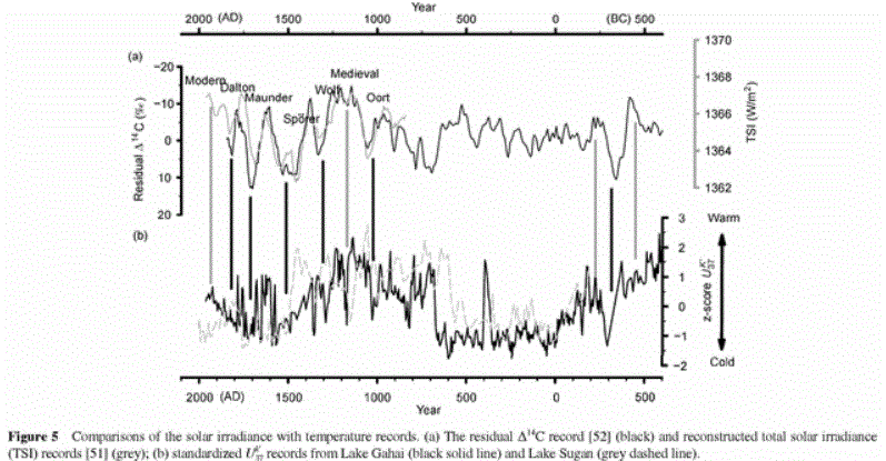
appears to correspond to solar irradiance changes,
suggesting a possible link between the two, at least on the
northern Tibetan Plateau, during the late Holocene.

Link to pdf paper: link.springer.com/content/pdf/10.1007%2Fs11434-012-5619-8
Link to notrickszone article: notrickszone.com/2013/04/13/tibetan-temperature-reconstruction-shows-medieval-warm-period-was-warmer-than-today/
|
|
|
|
Post by steve on Apr 15, 2013 12:48:41 GMT
cuttydyer,
The point I keep trying to make is that when people spot an MWP signal, it can be
from as early as 850AD and as late as 1400AD.
Your paper describes quite a late MWP - it's getting warm just as the Greenland
dwellers are starting to struggle.
Also, as with most proxies, there are lots of qualifiers in the paper - one of the lakes
gives a much much stronger signal than another, suggesting that other issues affected the
signal significantly.
The paper below has an even later Tibetan MWP period (1200-1400AD), but also a Medieval
cold period between 1000-1200AD.
|
|
|
|
Post by steve on Apr 15, 2013 18:28:37 GMT
Ha ha, you cut off the text you quoted before it says: ... though it is still not clear whether all the fluctuations indicated were truly global. Good thing I took my blinders off in time. What is misleading about saying there were no numbers when there were no numbers. There were no numbers. Guessing the numbers will not do. Less than 2C means between 0C and 1.999...C It doesn't mean about 2C or nearer to 2C than to 1C. Presumably you didn't notice that the MWP-LIA difference in the second plot is larger than the difference in the third, then? When they say it is a schematic, they mean it is a schematic. Steve, just about every argument you have made rests on scientific community dictum. Anecdotal knowledge as compiled by various scientific sources such as Akasofu is discounted by groups of scientists with politically-granted labels and agendas and who make a living on the largess of a public made concerned about the climate. Actually the only way to have a neutral debate on this topic is via running the public contribution to climate science funding down to zero. Even then it would probably take a few years for the whining to stop. If you want to argue for anecdotal evidence against scientific evidence, then we can have that argument. But at the moment people are putting up scientific papers in support of an MWP, so I'm responding with arguments relating to scientific papers. No. "Schematic" means that it can be ignored because none of the people who reviewed it had enough information to comment or rebut it. The "hide the decline" plot was not a scientific plot, so it cannot be fraudulent science. It was a pretty picture used on the cover of a weather brochure that probably wasn't read by anybody. If you apply such a standard to the "hide the decline" plot you should equally reject the IPCC 1990 MWP plot for being fraudulent science. As a lab demonstrator when at university I would reject any and all plots that failed to label both axes with title, units and numbers - they're not fraudulent, they are there to be ignored at will (or to be scornfully given low marks when submitted to the power-hungry lab demonstrator) |
|
|
|
Post by cuttydyer on Apr 17, 2013 8:56:24 GMT
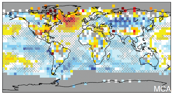
Dr Seb Lunings take on the paper:  The problem was the Atlantic region, which had an excellent amount of data to support the Medieval warmth. Here the temperatures stood at least at today’s levels. Therefore Michael Mann searched around for other regions where far less data was available and found the Central Eurasian region would do just fine. The scarcity of available data left lots of room for interpretation. This is how the authors plotted a huge region of cold over a large swath of Central Eurasia during the Medieval Warm Period, which supposedly offset the inconvenient Atlantic warmth.  Figure 1: Temperature anomalies during the Medieval Warm Period 1000 years ago as to Mann et al. (2009). In Central Eurasia the authors interpreted a pronounced cold zone. A Chinese team of scientists led by He YuXin of the University of Hong Kong, however, took a very close look at Mann’s liberally interpreted data and his postulated Central Eurasian cold zone. Using sediment cores extracted from two different lakes and using the so-called alkenone method, the Chinese scientists reconstructed the temperature development over the past 2000 years for the northern Tibetan Plateau, which according to Mann was significantly colder 1000 years ago. The surprise was big when the new, hard data showed the opposite was in fact true. It turns out that the region of the theoretical cold in the northern Tibetan Plateau during the Medieval Warm Period was indeed not colder but was warmer than today, see Science Bulletin. In their paper, YuXin and his colleagues made yet another interesting discovery. In the abstract they write: ‘Further, our temperature reconstructions, within age uncertainty, can be well correlated with solar irradiance changes, suggesting a possible link between solar forcing and natural climate variability, at least on the northern Tibetan Plateau.’ The surprisingly good synchronicity between sun and climate in the region of study is clearly visible from the study’s chart:  Figure 2: Good agreement between the temperature development at the northern Tibetan Plateau (lower curve) and solar activity over the past 2500 years. From YuXin et al, 2013. |
|
|
|
Post by glennkoks on Apr 24, 2013 13:18:43 GMT
A harbinger of things to come?
March 2013
This was one of the coldest Marches in the historical series, dominated by easterly winds, with high pressure often to the north blocking the milder Atlantic air. It was especially cold during the second half of the month. There were some spells of rain, and substantial late-season snowfalls in certain areas between the 6th and the 27th, but also a lot of cold, dry weather. Many overcast days led to sunshine totals being well below average in eastern and south-eastern areas.
Temperatures for March were well below average everywhere. The provisional UK mean temperature was 2.2 °C, which is 3.3 °C below the 1981-2010 average. It was the coldest March since 1962, and the equal second-coldest in the series from 1910. March was the coldest month of the 'extended winter', the first time this has happened since 1975, and the coldest calendar month since December 2010. The month was drier than average in the north and west, but rainfall totals were mostly near or above average elsewhere. The UK overall had 65% of average rainfall. There was 81% of the long-term average sunshine for the UK overall, but with a strong contrast between brighter western and duller eastern areas.
|
|
|
|
Post by steve on Apr 24, 2013 16:31:31 GMT
cuttydyer,
This is a bit of a hand-waving statement from Dr Whoishe?
What data does the good Dr think Mann relied upon to give the cold blob? If the cold blob were slightly warmer what impact would it have on the Hockey stick shape (very little I'd guess)? Given the wide differences between the lakes studied in this paper, are they very good temperature proxies?
And any comments on the paper I found that appears to support a cold period in Tibet 1000 years ago?
|
|
|
|
Post by cuttydyer on Apr 25, 2013 7:39:16 GMT
Steve,
It doesn’t surprise me that not all regional proxy temperature measurements support a global MWP. If one were to collect every current independent thermometer based temperature record, would every collected dataset support the current value of the HADCRUT4 global mean? - many NH datasets wouldn’t (or Antarctic), including the MET Offices CET data – does this then invalidate the current claims of a global warming – nope.
|
|
|
|
Post by cuttydyer on Apr 25, 2013 9:36:20 GMT
|
|
|
|
Post by icefisher on Apr 25, 2013 14:28:10 GMT
cuttydyer, This is a bit of a hand-waving statement from Dr Whoishe? What data does the good Dr think Mann relied upon to give the cold blob? If the cold blob were slightly warmer what impact would it have on the Hockey stick shape (very little I'd guess)? Given the wide differences between the lakes studied in this paper, are they very good temperature proxies? And any comments on the paper I found that appears to support a cold period in Tibet 1000 years ago? As Steve McIntyre proved, Mann's methods produced a hockey stick even when random data was fed into them. So you are right adding information to Mann's methods would likely not change the result much. |
|
|
|
Post by steve on Apr 25, 2013 16:45:05 GMT
Steve, It doesn’t surprise me that not all regional proxy temperature measurements support a global MWP. If one were to collect every current independent thermometer based temperature record, would every collected dataset support the current value of the HADCRUT4 global mean? - many NH datasets wouldn’t (or Antarctic), including the MET Offices CET data – does this then invalidate the current claims of a global warming – nope. Indeed not! Which is why Steve McIntyre would quite often be able to find a questionable looking surface station dataset to place before his minions - until the surfacestations project hit the Muller buffers that is. That is why you have to look at lots of pieces of evidence, not just a few. And if you are, for example, trying to compare with the recent 30-50 years, you should look at each 30-50 year period of the past in isolation (as far as can be managed given the resolution of some proxies). There is a tendency to compare the recent 30-50 (or even 100 year) average with the *peak* of any Medieval reference. In short, this is the point I am making. |
|
|
|
Post by icefisher on Apr 26, 2013 2:02:49 GMT
Indeed not! Which is why Steve McIntyre would quite often be able to find a questionable looking surface station dataset to place before his minions - until the surfacestations project hit the Muller buffers that is. That is why you have to look at lots of pieces of evidence, not just a few. And if you are, for example, trying to compare with the recent 30-50 years, you should look at each 30-50 year period of the past in isolation (as far as can be managed given the resolution of some proxies). There is a tendency to compare the recent 30-50 (or even 100 year) average with the *peak* of any Medieval reference. In short, this is the point I am making.[/quote] Its not clear the extent of what you are saying Steve. Should we never compare current temperatures to past proxies that entail a great deal of averaging over a significant period of time? If so I disagree. The proxies for the MWP clearly sets a minimum standard. Perhaps even if it stays at the current temperature in a couple of hundred years, our worldit will look much closer to the world of the MWP. I would suggest that since we just rose from the LIA the warmth is not currently significant because it has not been around long enough to be something of great enough endurance to have confidence it will show up in a proxy a thousand years from now as does the MWP. What I see is in just the ocean oscillation record a rather clear pattern of about .7degC from natural variation (and I don't care if you use the recent one or the one at the beginning of the 20th century!). I don't see that pattern in the proxies and the reason might be that they are not sensitive enough to capture less than 100 year averages. Thats pretty significant because after that what left? About a half degree of modern warming? |
|


