|
|
Post by missouriboy on May 18, 2015 3:28:28 GMT
Thrown in a May deviation. There is one heck of a spike low happening right now. YaSiree! I can't wait for the 'final' May data. I'm working up March and April now. January and February are amazing at how 'tight' the deviations are over time...and how perfect those curves are ... slow but steady. The rest of the months have much greater deviations. |
|
|
|
Post by missouriboy on Aug 10, 2016 1:33:43 GMT
|
|
|
|
Post by juancarnuba on Aug 15, 2016 0:42:37 GMT
I think that most of the people on these boards are mostly concerned with the approaching cooling the approaching Gleissberg Minimum will bring. Some of the things I've been reading lately suggest that this Gleissberg Cycle corresponds to the DeVries Cycle Minimum. I'm pretty sure the last time this happened was the Maunder Minimum.
My question is: What happens after 3 years of crop failures in the Northern Hemisphere?
|
|
|
|
Post by walnut on Aug 15, 2016 2:09:09 GMT
We got a small dose of it during the solar minimum between 23 and 24. Long, cool winters, late springs, wet late winters, and ruined acres of wheat in Oklahoma and Kansas. Wheat prices spiked.
|
|
|
|
Post by Ratty on Aug 15, 2016 3:56:31 GMT
We got a small dose of it during the solar minimum between 23 and 24. Long, cool winters, late springs, wet late winters, and ruined acres of wheat in Oklahoma and Kansas. Grain prices spiked. Well done Walnut. I'm collecting acronyms and you've provided me another. GPS = Grain Price Spike SMS = Strawberry Milk Shake (aka [Micro$oft] System Management Server) TCP/IP = This Creates Problems, Immense Problems Etc, etc ..... PS: Don't worry; I will be donating my brain to science.  |
|
|
|
Post by sigurdur on Aug 15, 2016 4:50:11 GMT
Not too soon we hope Ratty
|
|
|
|
Post by Ratty on Aug 15, 2016 4:58:06 GMT
Not too soon we hope Ratty No. Still working fine Sig. This came to me during an epiphany: IPCC = ImPerceptible Change Confirmed Sadly, there is an occasional glitch when I think I may be wrong. Cue the Fonz. |
|
|
|
Post by missouriboy on Aug 15, 2016 7:18:47 GMT
I think that most of the people on these boards are mostly concerned with the approaching cooling the approaching Gleissberg Minimum will bring. Some of the things I've been reading lately suggest that this Gleissberg Cycle corresponds to the DeVries Cycle Minimum. I'm pretty sure the last time this happened was the Maunder Minimum. My question is: What happens after 3 years of crop failures in the Northern Hemisphere? If this happens, first the current surpluses disappear and grain prices rise. Then those areas of the world where populations have grown beyond their carrying capacity (think poor middle east) start to starve. This was a common occurrence in the past. Improvements in transport allowed us to move the surpluses around to areas of deficit. But we have not yet overcome climate on a mass scale. Remember the 2007-08 food riots in the middle east? |
|
|
|
Post by Ratty on Aug 15, 2016 7:48:26 GMT
|
|
|
|
Post by nautonnier on Aug 17, 2016 11:10:49 GMT
|
|
|
|
Post by missouriboy on Aug 21, 2016 5:29:18 GMT
North American Grain Belt Temperatures Since 2000 Support Astro
It had been about 15 months since I updated by temperature data base for NWS recording stations in the Grain Belt. So I updated them. The charts below show the trends in temperatures and estimated Growing Degree Days for 11 weather stations along an 850-mile swath along longitude 96.5 West from Emporia, KS to Winnipeg, Canada from 1896 to 2015. Nowhere do I see CAGW in the weather service records. I do see a decline of about 20 to 30 percent in growing degree days between 2000 and 2014 and a decline of 2 to 3 degrees C in the northern grain belt ... north of Sioux City, IA spanning about 5 to 6 degrees of latitude from there to the Canadian border. The
spaghetti shows cooling. Areas south of Sioux City, IA seem relatively flat for now with perhaps a slight downward drift. I am also posting this on the North American Grain Belt thread. Note that, from the 1890s to the 1940s, the northern grain belt warmed faster than those areas further south ... gaining about 2 C in annual average temperature. The cycles in the Grand Maximum are clearly visible in the data. AND the 1930s were the warmest at these stations. That 2 C gain has clearly been lost in the 16 years since 1998. This cooling amounts to ~0.14 C per year ... or 1.4 C per decade, which, if we have a 2 decade contraction, which is about half of Astro's forecast 36-year cold period, would amount to 2-3 C of further loss into the 2030s. To get an idea of how this translates into growing degree days, I constructed a quickee technique using avg. monthly maximum and minimum temperatures. These plugged into what should be a summation of daily highs (capped at 80F) + daily lows (set at 50F if below) divided by two, minus 50 C (the baseline growing temp.) gives you daily GDD, which are then inflated back to monthly totals by multiplying the requisite number of days. These values (chart 3) show the same thing ... perhaps worse. Looks like GDDs declined by 25% or so from 1998 to 2015. The one test I did with daily data showed that this technique wasn't far off. The data bases are just too large for my poor little laptop. 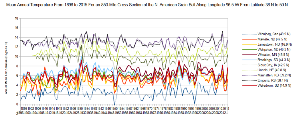 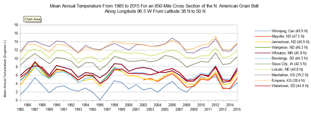 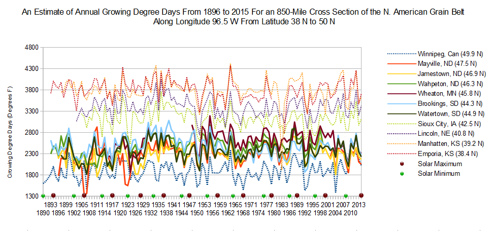 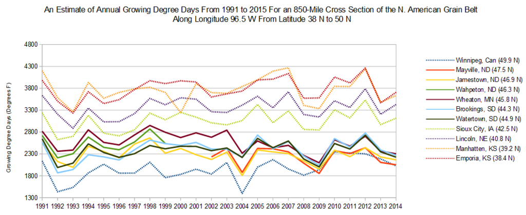 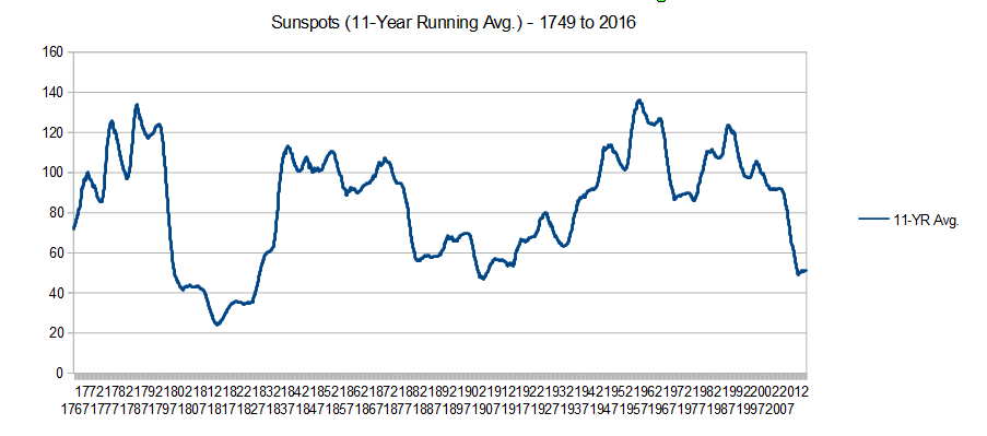
|
|
|
|
Post by duwayne on Aug 21, 2016 15:36:56 GMT
North American Grain Belt Temperatures Since 2000 Support Astro
It had been about 15 months since I updated by temperature data base for NWS recording stations in the Grain Belt. So I updated them. [ snip] Missouriboy, would it be fair to conclude from this sunspot chart that the global warming over the last half of the previous century (1950-1999) was not due to increased solar activity? |
|
|
|
Post by glennkoks on Aug 21, 2016 15:56:21 GMT
missouriboy,
Thanks for the post. It's very informative. The graphs illustrate the downward trend since 1997 quite well.
|
|
|
|
Post by missouriboy on Aug 22, 2016 3:13:08 GMT
North American Grain Belt Temperatures Since 2000 Support Astro
It had been about 15 months since I updated by temperature data base for NWS recording stations in the Grain Belt. So I updated them. [ snip] Missouriboy, would it be fair to conclude from this sunspot chart that the global warming over the last half of the previous century (1950-1999) was not due to increased solar activity? Take a look at the chart below ... HADSST3 SST deviations (10-year avg) for the northern and southern hemisphere oceans, the Geomagnetic AP Index deviations (11-year avg coincident with average solar cycle length) and low-level cloud cover percentages for 15 degrees north and south of the equator. Note the SST deviation change correspondence to the geomagnetic activity index deviations. There is even a lag of about one solar cycle in the ocean trend responses. Extension of ocean warming beyond the latest AP downturn, which appears to have begun about 1993 was, at first, puzzling ... but when you note the decrease in cloud cover (about 20%), which has occurred since the AP turnover, this may not be surprising. Note that the southern hemisphere ocean deviation change flattened within one solar cycle of the AP downturn. The current AP index decline is already below solar cycle 14 (1902-1913), which WAS the deepest downturn for which we have reconstructed AP data. While there is stored, resident oceanic heat acquired (my assumption) as a result of the 75 year Grand Maximum (1920-1995), a continued decline in geomagnetic activity could return ocean SSTs to the zero level by 2020 to 2030. Perhaps lower? That resident heat may be slow to shed ... but note how quickly it happened during solar cycles 14 and 20. By climatic standards that is. Also note that geomagnetic deviation peaks are coincident with temperature peaks in the N American Grain Belt. So, while we do not know exactly how land-based climates respond to solar activity, it seems that the mid-latitudes of the grain belt, which are the current transition zone between tropics and pole, have been shedding(?) heat since the AP index turned over. So yes, I think that solar energy, with many feed backs, drives climate. Even CO2 probably serves a function, even if only as insulation.
However, no matter how much insulation I place in my walls and roof, if I turn off the furnace in winter, I'm still an ice cube. 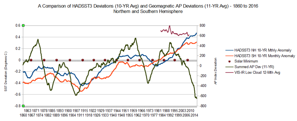 |
|
|
|
Post by missouriboy on Aug 24, 2016 3:23:54 GMT
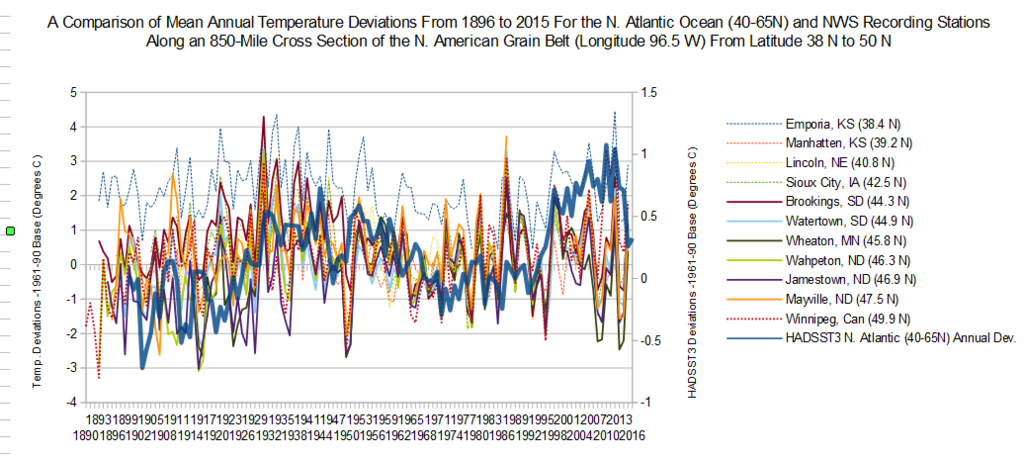
North Atlantic SST Anomaly Curves Look Amazing Similar to Grain Belt LST Anomaly CurvesTo date I had been looking at temperature changes at NWS recording stations along longitude 96.5 West as raw, mean monthly temperatures. These show obvious declines since 1998 across this cross section north of about 38 North latitude (Sioux City, IA). I decided to compare them to trends in sea surface temperatures (SSTs) for the North Atlantic and NE Pacific Oceans. Since I now have the historical HADSST3 data, I can discretely carve out deviations for custom areas that are not readily available elsewhere. To do this, I had to convert the station temperatures to anomalies ... so I used the HADSST3 base period (1961-1990). So have a peek at Charts 1 and 2. Sig mentioned many moons ago a role for the N. Atlantic in the Midwest climate. Chart 1 shows an uncanny fit between annual deviations of the grain belt stations and the HADSST3 anomalies for the N. Atlantic Ocean north of
40 North latitude (40-65N). Of course, we try to remember that, 'correlation does not equal causation' ... but these two sets of curves
could be 2nd or 3rd cousins?
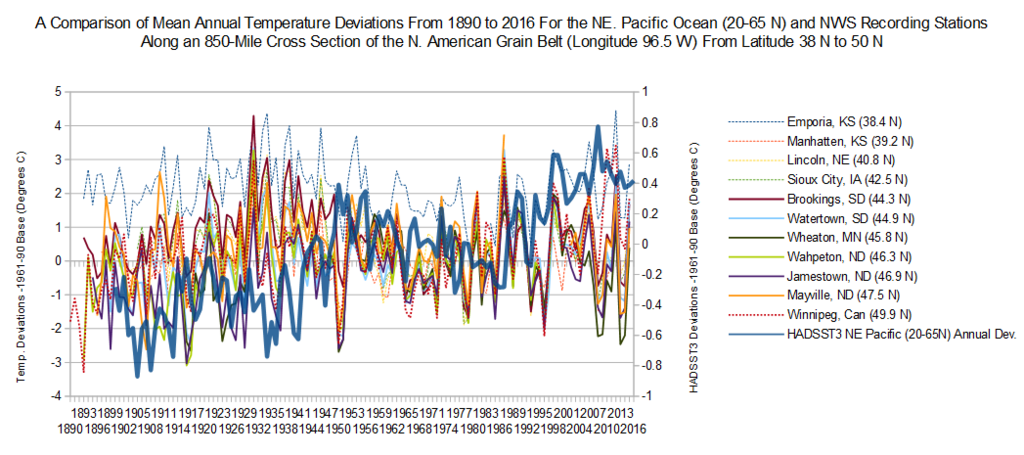
Comparisons to the Northeast, extra-tropical Pacififc Ocean (20-65 N east of 180 W longitude) shows large differences in the 1930s and 1940s,
when eastern Pacific waters were still in a cool period. This I remember being pointed to as a 'setup' that influenced the extensive
droughts that ocurred during that period. Since about 1950, the NE Pacific and N. Atlantic SST curves have generally mirrored
each other.
I hesitate to point out (but only briefly  ) that huge, ominous SST temperature crash that has occurred in the N Atlantic over the last 2-3 ) that huge, ominous SST temperature crash that has occurred in the N Atlantic over the last 2-3
years. While some modification appears to be occurring this summer, the long-term outlook does not look good. These trends appear to
take the shape of stair steps across two to three year intervals. That, in combination with a resumption of cooling in the NE Pacific, could
put us in poorly quantified waters (pun intended).
|
|


 ) that huge, ominous SST temperature crash that has occurred in the N Atlantic over the last 2-3