|
|
Post by kenfeldman on Mar 25, 2009 20:25:46 GMT
Since the oceans cover 70% of the planet, most of the extra heat accumulating in the climate system due to the rapid growth of emissions of greenhouse gases in the past four decades is stored in the oceans. One of the best measures of the increase of heat due to greenhouse gases is ocean heat content. Here is a graph of ocean heat content over the past few decades:  While the graph does show some variability from year to year, just as weather does, the overall trend is an increase in heat content. It's interesting to note that the shape of the curve is similar to global sea level rise, which to date has been dominated by the thermal expansion of water, another indicator that the ocean is storing a lot of heat:  |
|
|
|
Post by woodstove on Mar 25, 2009 22:02:19 GMT
Since the oceans cover 70% of the planet, most of the extra heat accumulating in the climate system due to the rapid growth of emissions of greenhouse gases in the past four decades is stored in the oceans. One of the best measures of the increase of heat due to greenhouse gases is ocean heat content. Here is a graph of ocean heat content over the past few decades: While the graph does show some variability from year to year, just as weather does, the overall trend is an increase in heat content. It's interesting to note that the shape of the curve is similar to global sea level rise, which to date has been dominated by the thermal expansion of water, another indicator that the ocean is storing a lot of heat: A quote from the paper the heat content graph is from that I find interesting: "There is one difference in data processing between our earlier works and our present work. Previously we computed climatological monthly means by averaging all data in each 1°-square for each climatological month regardless of year of observation. Now we compute decadal monthly means by averaging all data within each month for decadal periods beginning with 1955-1964 and then averaging these decadal climatological monthly means to compute the long-term climatological monthly mean (1955-2006). This is necessary because of the large amount of Argo profiling float data introduced to the observing system in recent years which can bias climatologies to the Argo sampling period. The last “decade” for compositing was actually 1995-2006." [Emphasis mine.] In other words, our funding depends upon the upward trend, and we figured out a way to diminish the significance of the most recent data showing lower OHC. We would have been crazy to do otherwise. Sorry! Rest of article here: ftp.nodc.noaa.gov/pub/data.nodc/woa/PUBLICATIONS/grlheat08.pdf |
|
|
|
Post by kenfeldman on Mar 25, 2009 22:43:15 GMT
This is a perfect example of the deniers in action. They can't refute the science, so they accuse the scientists of fraud!
I encourage everyone to re-read the part of the study that woodstove posted here:
They changed how they compute the baseline for the anamolies from their previous study, because there is much more data for the past few years, when the ARGO floats were deployed. That's all that happened, no fraud involved!
And note the last five years of the data show a huge increase in ocean heat content, not the decrease that woodstove claims.
|
|
|
|
Post by woodstove on Mar 25, 2009 23:48:34 GMT
Hi Ken.
It's true, diminishing the statistical significance of the most accurate and copious data does strike me as unscientific. Changing methodologies mid-stream also strikes me as unscientific.
I did not say that OHC had decreased significantly.
The "last five years" are not present in the data you have provided.
Argo showed cooling once, and was recalibrated at the direction of NOAA higher-ups.
AGW adherents can't win; nature wins this game.
|
|
|
|
Post by socold on Mar 26, 2009 0:08:13 GMT
|
|
|
|
Post by kenfeldman on Mar 26, 2009 4:57:00 GMT
It goes to 2008. It's in the paper that you supposedly read.
|
|
|
|
Post by kenfeldman on Mar 26, 2009 5:00:58 GMT
The 1970s bump appears to be an artifact of the different fall rates in the XBT measurements. It's not in the Domingues 2008 paper that also uses the corrected data: 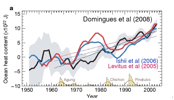 |
|
|
|
Post by neilhamp on Mar 26, 2009 8:32:25 GMT
|
|
|
|
Post by steve on Mar 26, 2009 9:52:08 GMT
Woodstove,
There is plenty to discuss about this paper, such as the fact that its results differ from other papers by appearing to be "warmer".
But to state that a quote about one plot is actually a quote about another seems deliberately dishonest, particularly when it is obvious that the plot shown by Ken is clearly *not* a decadal mean that stops at 2006.
Further, the plot Ken is consistent with your faith in the "cooling ocean" paper because it *does* show the 4 year slight cooling/minimal change between 2003 and 2007 that has previously been reported by Willis. So it is further dishonest to suggest that they have figured a way of diminishing it.
|
|
|
|
Post by glc on Mar 26, 2009 10:50:02 GMT
While the graph does show some variability from year to year, just as weather does, the overall trend is an increase in heat content. It's interesting to note that the shape of the curve is similar to global sea level rise, which to date has been dominated by the thermal expansion of water, another indicator that the ocean is storing a lot of heat Indeed it is interesting and it does invite the question as to whether one is driving the other. Perhaps the changes in OHC released heat into the atmosphere which has resulted in higher surface and satellite temperatures. Of course, the 'mainstream' explanation is that the accumulation of CO2 in the upper atmosphere has changed the net radiative flux at the ocean surface which has reduced the rate of cooling from below. There are few areas where I agree with Magellan, but he does have a point whenever he argues on this issue. There is huge variation in downwelling LW radiation (100s w/m2) whereas any change in the CO2 contribution since 1955 cannot be more than 1 w/m2 (or 0.2 w/m2). I not a great fan of solar theories but it seems to me that the intense cycles (particularly 21 and 22) in the latter part of the 20th century could just as easily explain the ocean warming - not necessarily by TSI alone but in combination with other factors such as a small reduction in cloudiness. |
|
|
|
Post by woodstove on Mar 26, 2009 14:20:36 GMT
Woodstove, There is plenty to discuss about this paper, such as the fact that its results differ from other papers by appearing to be "warmer". But to state that a quote about one plot is actually a quote about another seems deliberately dishonest, particularly when it is obvious that the plot shown by Ken is clearly *not* a decadal mean that stops at 2006. Further, the plot Ken is consistent with your faith in the "cooling ocean" paper because it *does* show the 4 year slight cooling/minimal change between 2003 and 2007 that has previously been reported by Willis. So it is further dishonest to suggest that they have figured a way of diminishing it. Hi Steve. Well, I think this is the first time anyone has accused me of being dishonest on this site. A few things: 1. I have quoted the paper from which the graph was taken. Are you suggesting that I misquoted the paper? 2. I also provided a link to the paper, inviting people to draw their own conclusions and have an informed debate. 3. Instead of labeling me as "dishonest" perhaps you could stick to the matter at hand: The authors' decision to change methodologies. 4. Yes, I do feel they have a "warmist" mindset. I am prepared, however, to step away from the suggestion that they are not good people. I was attempting a little humor when it came to funding. You are familiar with the advantage that AGWers have over realists when it comes to funding? |
|
|
|
Post by ron on Mar 26, 2009 14:27:36 GMT
You are familiar with the advantage that AGWers have over realists when it comes to funding? Not to mention ginormous super computers to play on |
|
|
|
Post by solartrack on Mar 26, 2009 16:01:11 GMT
Too busy at work to do now but a simple gas solubility on temp for CO2 calc against this probably explains why the CO2 that comes and goes is not the same source as my 3 cylinder DAF...
|
|
|
|
Post by Maui on Mar 26, 2009 16:05:39 GMT
Within the past year, a major error in ocean temperature sampling was discovered. I may have the facts twisted, and I'll find corrections and a reference if desired...
World War II caused a shift from the British sampling sea temperatures via a bucket of water collected from the side of the ship to USA's being responsible for most measurements, and these readings were from engine room intakes. Thus, sea temperatures appeared to increase as the British data became less prevalent.
And how does anyone know if ocean temperature changes are not from undersea volcanoes?
|
|
|
|
Post by steve on Mar 26, 2009 17:34:41 GMT
Woodstove, There is plenty to discuss about this paper, such as the fact that its results differ from other papers by appearing to be "warmer". But to state that a quote about one plot is actually a quote about another seems deliberately dishonest, particularly when it is obvious that the plot shown by Ken is clearly *not* a decadal mean that stops at 2006. Further, the plot Ken is consistent with your faith in the "cooling ocean" paper because it *does* show the 4 year slight cooling/minimal change between 2003 and 2007 that has previously been reported by Willis. So it is further dishonest to suggest that they have figured a way of diminishing it. Hi Steve. Well, I think this is the first time anyone has accused me of being dishonest on this site. A few things: 1. I have quoted the paper from which the graph was taken. Are you suggesting that I misquoted the paper? 2. I also provided a link to the paper, inviting people to draw their own conclusions and have an informed debate. 3. Instead of labeling me as "dishonest" perhaps you could stick to the matter at hand: The authors' decision to change methodologies. 4. Yes, I do feel they have a "warmist" mindset. I am prepared, however, to step away from the suggestion that they are not good people. I was attempting a little humor when it came to funding. You are familiar with the advantage that AGWers have over realists when it comes to funding? Woodstove, I should not lower myself to the level of those who make more direct accusations of fraud, or otherwise impugn the honesty of scientists, so I will apologise. I will however restate the point: In addition to the analysis of long term trends the paper does discuss the creation of a semi-operational dataset - ie. where the data is updated on a seasonal or annual basis with the figures for that period alone. It's pretty clear that the first plot in the original post is *not* a decadal trend and also, unlike what you suggest, it does include the 2003-2007 flattish spot similar to the flattish-downish period previously reported by Willis. |
|


