|
|
Post by missouriboy on Jun 10, 2021 22:43:51 GMT
I am not in a position to run 'the experiment' - I also do not believe that you can heat water with LWIR. Problem is that the climate 'scientists' are all believers and they do not want to run the experiment - why would they? I meant to say I'm not buying the cool the water with LWIR claim. How about this experiment. If your oven has a top heating coil then place 2 containers of water near the bottom. Put something on a rack above the cups, which blocks the radiant heat from the coil to one of the cups. Turn on the coil and see how the temperature of the water in the 2 cups compares as time passes. Without looking anything up. I see two possible problems. The radient heat spectrum of the stove is likely much greater than CO2 emissions, and you might need to insulate the cups, so that only the water surface is exposed. |
|
|
|
Post by nautonnier on Jun 11, 2021 13:28:57 GMT
This is not THE experiment obviously. But I had not systematically plotted the UAH lower tropsphere temperature anomaly vlues computed for area overlying the World's oceanic and land masses against ENSO values. So, I did. Previous plots were only for the UAH global and tropical values. Chart 1 shows monthly UAH Northern hemisphere, Southern hemisphere and Tropical Oceans plotted against ENSO-ONI monthly values since 1979. All aggregate UAH oceanic anomalies show the same trend, tracking and lagging Central and Eastern Pacific surface temperatures. A remarkedly tight distribution. Chart 2 shows monthly UAH Northern and Southern hemisphere land and ocean anomalies plotted against ENSO-ONI monthly values since 1979. Land areas have greater variance but show the same general trends as the ocean values. Chart 3 shows the same variables as chart 1, extended across the entire UAH time series from 1979. UAH lower troposphere temperature anomalies follow ENSO anomalies with a lag of about 2 to 4 months. There is only one exception in the time series. In 1991, UAH temperature anomalies for all oceans decline as ENSO rises for a period of about 4 months. I have no explanation for this deviation from what is otherwise a perfect pattern. 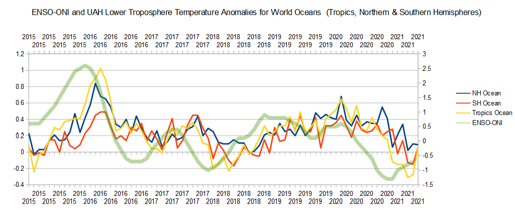 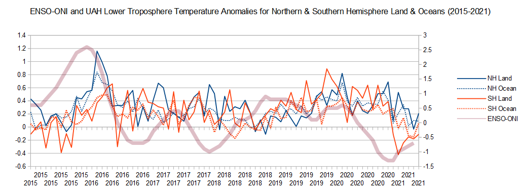 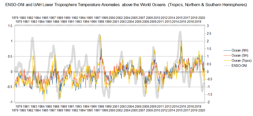 The generated links are not picking up the dropbox links (as you can see I have edited the links to add DL instead of the HTTPS:// |
|
|
|
Post by missouriboy on Jun 11, 2021 17:10:39 GMT
Has something changed. All my image links (in BBCode) show up as src="http://dl.dropbox.com ... and they've always been viewable before, and even now as I brouse them.
|
|
|
|
Post by nautonnier on Jun 11, 2021 19:58:32 GMT
This is not THE experiment obviously. But I had not systematically plotted the UAH lower tropsphere temperature anomaly vlues computed for area overlying the World's oceanic and land masses against ENSO values. So, I did. Previous plots were only for the UAH global and tropical values. Chart 1 shows monthly UAH Northern hemisphere, Southern hemisphere and Tropical Oceans plotted against ENSO-ONI monthly values since 1979. All aggregate UAH oceanic anomalies show the same trend, tracking and lagging Central and Eastern Pacific surface temperatures. A remarkedly tight distribution. Chart 2 shows monthly UAH Northern and Southern hemisphere land and ocean anomalies plotted against ENSO-ONI monthly values since 1979. Land areas have greater variance but show the same general trends as the ocean values. Chart 3 shows the same variables as chart 1, extended across the entire UAH time series from 1979. UAH lower troposphere temperature anomalies follow ENSO anomalies with a lag of about 2 to 4 months. There is only one exception in the time series. In 1991, UAH temperature anomalies for all oceans decline as ENSO rises for a period of about 4 months. I have no explanation for this deviation from what is otherwise a perfect pattern. The generated links are not picking up the dropbox links (as you can see I have edited the links to add DL instead of the HTTPS://It may be the browsers or the way that they use HTTPS that has changed |
|
|
|
Post by Ratty on Jun 11, 2021 21:03:18 GMT
|
|
|
|
Post by missouriboy on Jun 12, 2021 14:08:19 GMT
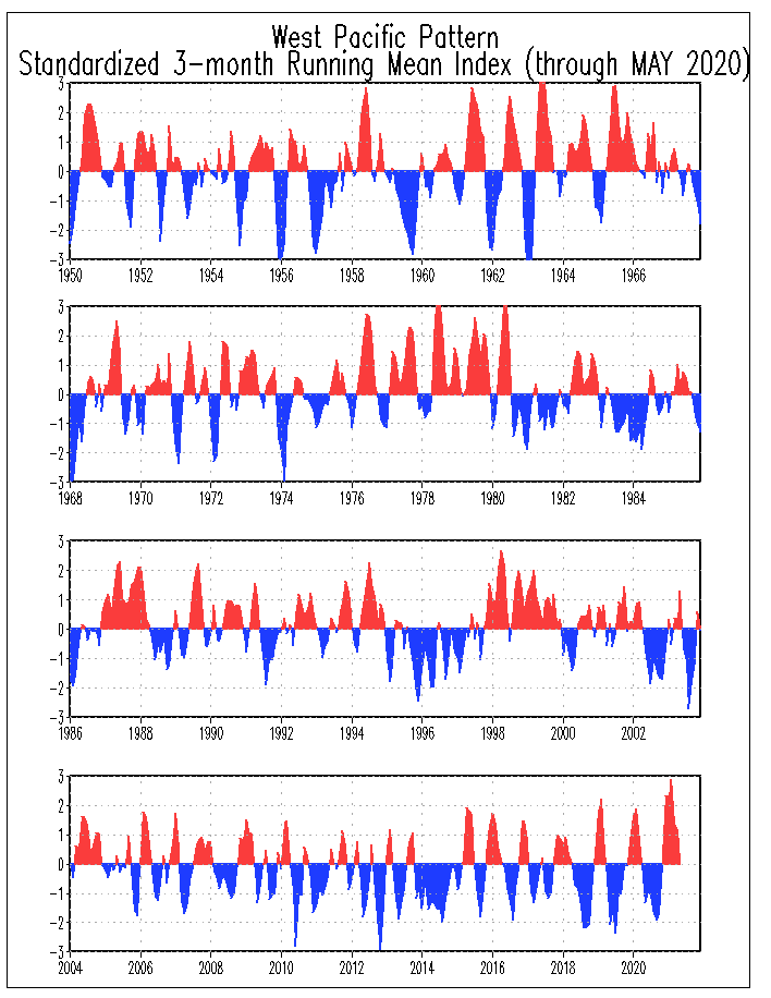
Stare at this for a while. Values are standardized deviations from the the current 30-year mean for the Western Warm Pool. My mistake. I was looking for the Western Pacific WARM Pool. This is the Western Pacific Pattern ... defined as ... The WP pattern is a primary mode of low-frequency variability over the North Pacific in all months, and has been previously described by both Barnston and Livezey (1987) and Wallace and Gutzler (1981). During winter and spring, the pattern consists of a north-south dipole of anomalies, with one center located over the Kamchatka Peninsula and another broad center of opposite sign covering portions of southeastern Asia and the western subtropical North Pacific. Therefore, strong positive or negative phases of this pattern reflect pronounced zonal and meridional variations in the location and intensity of the entrance region of the Pacific (or East Asian) jet steam. These anomalies exhibit a strong northward shift from winter to summer, which is consistent with the observed northward shift of the Eat Asian jet stream. A third anomaly center is located over the eastern North Pacific and southwestern United States in all seasons.
The positive phase of the WP pattern is associated with above-average temperatures over the lower latitudes of the western North Pacific in both winter and spring, and with below-average temperatures over eastern Siberia in all seasons. It is also associated with above-average precipitation in all seasons over the high latitudes of the North Pacific, and below-average precipitation across the central North Pacific especially during the winter and spring.
 |
|
|
|
Post by nautonnier on Jun 12, 2021 15:59:08 GMT
Stare at this for a while. Values are standardized deviations from the the current 30-year mean for the Western Warm Pool. My mistake. I was looking for the Western Pacific WARM Pool. This is the Western Pacific Pattern ... defined as ... The WP pattern is a primary mode of low-frequency variability over the North Pacific in all months, and has been previously described by both Barnston and Livezey (1987) and Wallace and Gutzler (1981). During winter and spring, the pattern consists of a north-south dipole of anomalies, with one center located over the Kamchatka Peninsula and another broad center of opposite sign covering portions of southeastern Asia and the western subtropical North Pacific. Therefore, strong positive or negative phases of this pattern reflect pronounced zonal and meridional variations in the location and intensity of the entrance region of the Pacific (or East Asian) jet steam. These anomalies exhibit a strong northward shift from winter to summer, which is consistent with the observed northward shift of the Eat Asian jet stream. A third anomaly center is located over the eastern North Pacific and southwestern United States in all seasons.
The positive phase of the WP pattern is associated with above-average temperatures over the lower latitudes of the western North Pacific in both winter and spring, and with below-average temperatures over eastern Siberia in all seasons. It is also associated with above-average precipitation in all seasons over the high latitudes of the North Pacific, and below-average precipitation across the central North Pacific especially during the winter and spring.
Sorry MoBoy I am not getting any of your dropbox diagrams/pics |
|
|
|
Post by duwayne on Jun 12, 2021 16:11:04 GMT
I meant to say I'm not buying the cool the water with LWIR claim. How about this experiment. If your oven has a top heating coil then place 2 containers of water near the bottom. Put something on a rack above the cups, which blocks the radiant heat from the coil to one of the cups. Turn on the coil and see how the temperature of the water in the 2 cups compares as time passes. Without looking anything up. I see two possible problems. The radient heat spectrum of the stove is likely much greater than CO2 emissions, and you might need to insulate the cups, so that only the water surface is exposed. OK. Insulated cups it is. Nautonnier's claim was for LWIR and wasn't limited to CO2. |
|
|
|
Post by sigurdur on Jun 12, 2021 16:30:02 GMT
Without looking anything up. I see two possible problems. The radient heat spectrum of the stove is likely much greater than CO2 emissions, and you might need to insulate the cups, so that only the water surface is exposed. OK. Insulated cups it is. Nautonnier's claim was for LWIR and wasn't limited to CO2. Things to add 1. Wind 2. Surface area 3. Daylight verses night The sun emits across the electromagnetic spectrum. When it comes to CO2, the change in reflection works both ways. Up and down. Adding more CO2 results in more photon absorption of incoming radiation. It emits in all directions. When it comes to water, the variables are not static. A wind creates more surface area to absorb, which creates a faster evaporative effect. Swamp coolers rely on this. Just some food for thought. |
|
|
|
Post by nautonnier on Jun 12, 2021 16:51:04 GMT
OK. Insulated cups it is. Nautonnier's claim was for LWIR and wasn't limited to CO2. Things to add 1. Wind 2. Surface area 3. Daylight verses night And also plants and their cooling by transpiration that cover perhaps 20% of the land area of the planet. So if LWIR does not increase the temperature of the surface, then the entire industry of Climate 'Science' and reduction of CO 2 has a fatal flaw. I cannot understand why this is not being treated as a flaw in the Climate Change Hypothesis to the extent that it is falsifiedIt is common for these hypotheses to have a base assumption that can be very unsafe. ALWAYS search for that base assumption. The mathematicians will want you to jump past that with a ' given that LWIR' increases the temperature of the surface'.... when you say you do not believe that is true - they will get very defensive and normally try to move you onto math and algorithms. They really do NOT believe in ' AGW' let alone ' Climate Change'. So to go from that to Biden saying that it is the fundamental threat to the human species is a bit of a jump - that makes sense only if he [ or more correctly - his handlers] thinks there is money or power and control to be had in ' Climate Change'. For Joe 'the big guy' it will be money that persuades him, for his handlers and the WEF/Klaus Schwab it will be power and control |
|
|
|
Post by missouriboy on Jun 12, 2021 16:57:40 GMT
I think they came up with this one to explain how the atmospheric heating that wasn't happening according expectation (models) was "hiding in the oceans". They needed a mechanism. PPM can also mean "Piss Poor Mechanism".  |
|
|
|
Post by missouriboy on Jun 12, 2021 16:59:21 GMT
IS ANYBODY ELSE HAVE PROBLEMS SEEING MY CHARTS?
|
|
|
|
Post by sigurdur on Jun 12, 2021 17:59:12 GMT
Nope
|
|
|
|
Post by nautonnier on Jun 12, 2021 18:54:33 GMT
OK - I changed from Firefox to Edge and no change I then went back to Internet Explorer and I got one of these for each diagram  So it would appear that it is a browser standards issue. |
|
|
|
Post by missouriboy on Jun 12, 2021 19:27:24 GMT
So how do I fix for multi-browser? Seems this just happened as I have not changed my posting technique.
|
|