|
|
Post by tallbloke on Jun 19, 2009 7:49:13 GMT
I've been asked to move this here from the ss24/spaceweather section. after reading Bob Tisdales stuff the way heat energy builds up in the pacific warm pool in ways which don't get recorded by surface temp measurement, it occurred to me that it might be an interesting exercise to look at some solar data in a cumulative way to see if it helped us understand the solar activity - terrestrial climate link. I posted the graph and Leif told me it was rubbish. ;D The mods then locked the thread and told me to hop it. So I thought I'd get a second third and hopefully lots of opinions from others here. anyway, here is the graph. 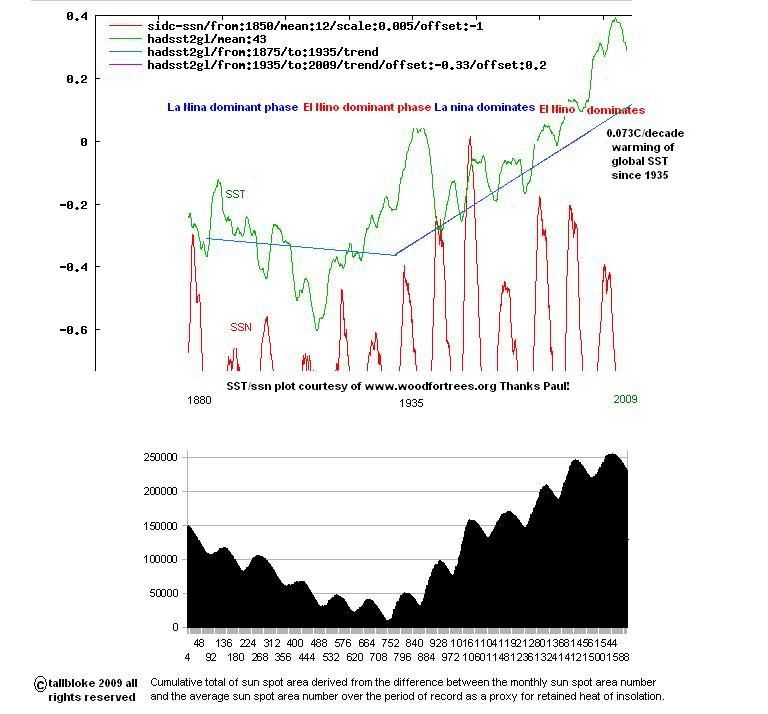 i630.photobucket.com/albums/uu21/stroller-2009/ssa-sst-ssn.jpg?t=1245340259 i630.photobucket.com/albums/uu21/stroller-2009/ssa-sst-ssn.jpg?t=1245340259So, whaddaya think? |
|
|
|
Post by jimcripwell on Jun 19, 2009 11:28:19 GMT
Sorry tallbloke, I dont understand your graph. I am convinced that the sun somehow controls the earth's climate by the variation of it's magnetic effects. I am also sure that this process is extremely complex. The most likely way this happens, is variations in what happens to clouds.
|
|
|
|
Post by curiousgeorge on Jun 19, 2009 11:58:39 GMT
It appears your graph is attempting to establish a correlation between the two. I'd suggest that a proper correlation analysis, rather than simple graphs, would be more appropriate, and would yield better information. You should consult a professional statistician to help with this if needed.  |
|
|
|
Post by tallbloke on Jun 19, 2009 16:32:05 GMT
It appears your graph is attempting to establish a correlation between the two. I'd suggest that a proper correlation analysis, rather than simple graphs, would be more appropriate, and would yield better information. You should consult a professional statistician to help with this if needed. Thanks George, are you volunteering?  It's very preliminary at the moment, but I've had some encouragement form Stephen Wilde, who wants to include it in a piece on his website at www.climaterealists.comI'm working on extending the series with more data. I'll update when that is complete. |
|
|
|
Post by curiousgeorge on Jun 19, 2009 17:06:47 GMT
It appears your graph is attempting to establish a correlation between the two. I'd suggest that a proper correlation analysis, rather than simple graphs, would be more appropriate, and would yield better information. You should consult a professional statistician to help with this if needed. Thanks George, are you volunteering? It's very preliminary at the moment, but I've had some encouragement form Stephen Wilde, who wants to include it in a piece on his website at www.climaterealists.comI'm working on extending the series with more data. I'll update when that is complete. Thanks, but I retired about 10 years ago. These days I spend my time indulging my hobbies. I'd be very cautious about inferring anything from this without a substantial formal analysis. You may find E.T. Jaynes (d. 1998 ) work of interest regarding Probability as Logic - omega.albany.edu:8008/JaynesBook.html (incomplete free postscript files ) , since the entire climate debate is supported by differing interpretations of probabilities derived from incomplete information. Published book, etc. is discussed here: bayes.wustl.edu/ . |
|
|
|
Post by tallbloke on Jun 19, 2009 17:26:29 GMT
Thanks George, are you volunteering? It's very preliminary at the moment, but I've had some encouragement form Stephen Wilde, who wants to include it in a piece on his website at www.climaterealists.comI'm working on extending the series with more data. I'll update when that is complete. Thanks, but I retired about 10 years ago. These days I spend my time indulging my hobbies. I'd be very cautious about inferring anything from this without a substantial formal analysis. You may find E.T. Jaynes (d. 1998 ) work of interest regarding Probability as Logic - omega.albany.edu:8008/JaynesBook.html (incomplete free postscript files ) , since the entire climate debate is supported by differing interpretations of probabilities derived from incomplete information. Published book, etc. is discussed here: bayes.wustl.edu/ . Thanks again George. I think Stephen is a pretty good bet anyway. He's been a fellow of the royal meteorological society since 1968, and should know a thing or two about stats. |
|
|
|
Post by jurinko on Jun 19, 2009 17:54:32 GMT
This chart is better:  SST corrected for wrong accounting for change in sampling method plays well with SSN. |
|
|
|
Post by tallbloke on Jun 19, 2009 18:20:02 GMT
Thanks, that's useful. I was discussing with Bob Tisdale on WUWT how we might adjust for outgoing LWR following major el Nino events. The resulting curve on the solar accumulation graph would match your SST reconstruction betterthan the HadleySST record. Have you got a source for that graph I can go to, or is it your own? |
|
|
|
Post by jurinko on Jun 19, 2009 19:31:12 GMT
It is my own, made according to this article: www.climateaudit.org/?p=1276I used HadSST2 data and since 1945 applied a correction based on sampling method chart, which is in the link above. |
|
|
|
Post by tallbloke on Jun 19, 2009 20:39:30 GMT
Jurinko, nice work. I read all the climate audit articles on bucket adjustments etc last year. It's very difficult to know where to put the line. I think some postwar cooling is likely, due to the negative ENSO phase. Perhaps the true line lies somewhere between hadley's and your reconstruction.
I'm getting away from trying to fit the solar cycle sunspot number amplitudes to the SST data and looking instead at accumulated heat.
The bottom panel in my graph is a cumulative count based on sunspot area rather than number.
|
|


