I have a prediction icefisher. But it depends on what solar and ENSO do, which I obviously cannot predict. But I can put the formula up so that it can be computed in future based on what ENSO and sunspot count does.
For each month do the following:
1) Take the sunspot count from
solarscience.msfc.nasa.gov/greenwch/spot_num.txtMultiply the value by 0.0015
Take away 0.1
The result is solar contribution in degrees C
2) Take MEI value from 3 months previous from
www.cdc.noaa.gov/people/klaus.wolter/MEI/table.htmlMultiply it by 0.12
Take away 0.1
The result is ENSO contribution in degrees C
3) Take volcanic forcing from
data.giss.nasa.gov/modelforce/RadF.txt (StratAerosol column)
Multiply it by 0.05
The result is Volcanic contribution in degrees C
4) Work out the warming from the background warming trend.
Take the number of months since Jan 1970, divide by 12. Take the number and work out T:
T = 0.0035x^1.4 (ie 0.0035 multiplied by T to the power of 1.4)
The result (T) is the accumulated warming trend by that month in degrees C
5) Add the result of steps 1,2,3 & 4 together. The result is the predicted HadCRUT3vgl (
www.cru.uea.ac.uk/cru/data/temperature/hadcrut3vgl.txt) anomaly for that month.
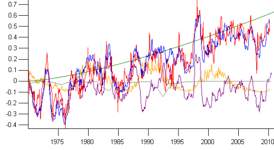
To date this is how it's looking. Step 1 (solar) is in orange. Step 2 (ENSO) is in purple. Step 3 (volcanic) is in grey). Step 4 (background warming trend) is in green. The blue line is step 5, the result of adding all steps. Red is HadCRUT3.

It doesn't line up perfectly, I wouldn't expect it to because there's more than the above 4 factors at play. But I think those 4 factors are enough to predict most of the pattern. It agrees best over decades or more, rather than in individual years or months.
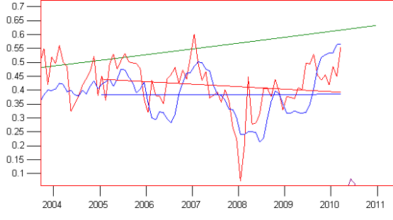
Since 2005 hadcrut3 shows about 0.04C warming while the blue prediction is about flat:

That's despite the green background trend line showing 0.12C warming in that period. Why is that? How can there be a background warming trend of about 0.2C/decade if temperature is flat since 2005?
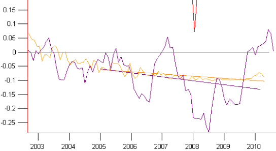
The reason the blue line goes flat, despite continued background warming is that both the solar trend (orange) and ENSO (purple) have had negative trends since 2005. In the graph ENSO is contributing 0.08C cooling since 2005 and the solar cycle is contributing 0.04C cooling. In total that's 0.12C cooling which masks the 0.12C warming background trend since 2005.

So the flat temperature since 2005 doesn't mean the background warming trend has stopped. I think this is a reflection that could be true of real life too. In short I think it is a graphic demonstration of why the temperature records are compatible with ongoing background warming. The negative ENSO slope and solar cycle minimum have potentially masked it. With just 5 years since 2005 it's not possible to say with any confidence that the background warming trend has stopped.