|
|
Post by poptech on Jan 4, 2010 4:44:19 GMT
Global Cooling in 2009"2009 was another year of global cooling, which saw numerous low temperature and high snowfall records smashed. The Dutch canals froze over for the first time in 12 years, record cold came to Al Gore's home town and ironically a blizzard dumped snow on the Copenhagen convention where world leaders met to try and stop global warming. It was so cold that even the BBC was forced to ask, what happened to global warming? As Climategate would reveal, IPCC scientists had been hard at work hiding evidence of global cooling. Yet the observational evidence cannot be ignored." 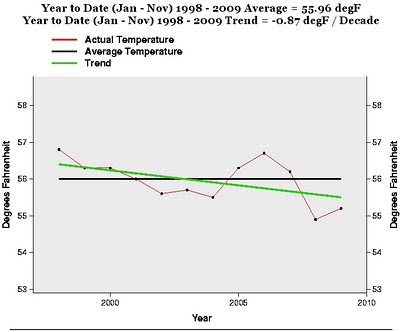
|
|
|
|
Post by Ratty on Jan 4, 2010 6:22:05 GMT
What is the data source used for the graph? |
|
|
|
Post by steve on Jan 4, 2010 10:08:54 GMT
If you Google the text you get to a blog where the source claims to be NCDC, but the NCDC plot looks like this:  and the outlook is for 2009 to be the 5th warmest year in the record, whereas this plot has 11 warmer years. Variability of more than one degree Celsius within the 10 years sounds a bit large too for global data. Perhaps this is a selective subset of the data. |
|
|
|
Post by aj1983 on Jan 4, 2010 13:33:35 GMT
The fact that ice skating in the Netherlands becomes world news is itself already a sign of global warming, as this used to be something that happened rather often.
People think that it is really cold now, and the media are talking about the Elfstedentocht (the biggest ice skating event on natural ice in the northern part of the Netherlands, 200 km, of which there have been 15 between 1900 and 2000, the last one in 1997), but people reporting from locations are saying most of the tour is still liquid water... (it is 3 C currently due to onshore winds from the seasonably warm North Sea)
People don't seem to notice that it has to become really a lot colder than this to have one. Of course the snow does not help, but there was quite some snow in other Elfstedentocht years.
|
|
|
|
Post by nautonnier on Jan 4, 2010 13:59:11 GMT
Amazing those graphs what you can do by using different baselines. The smaller one is showing that there is a downward trend from 1998 - 2009 in terms of degrees F with a vertical scale of 5 deg F Steve's response is a graph using a baseline of 1900 - 2000 which shows the same thing only with a vertical scale of 2 deg C. But the horizontal scale hides the detail of the first graphic. As I said in another post - perhaps the entire Holocene should be used as the baseline. This would show that the 'global average temperatures' are actually below the Holocene average and look like they are going to fail to reach the average Holocene temperatures until sometime NEXT century if at all. And for this the entire world is meant to panic and spend non-existent funding on 'climate change' rather than on saving lives from disease and hunger? (Depending on which of the many unvalidated proxies are used to measure postulate Holocene Temperatures  ) |
|
|
|
Post by steve on Jan 4, 2010 15:26:40 GMT
Nautonnier, amazing how a change in scale can confuse some people.
The poptech plot shows a difference of about 1.8F between 1998 and 2009 period. That's equivalent to about 1 Celsius.
To use the same baseline on my graph, 1998 would be +0.5C about the same as it is, and 2009 would be minus 0.5C! If you drew that on "my" graph you'd have an upside-down hockey-stick.
|
|
|
|
Post by nautonnier on Jan 4, 2010 16:00:04 GMT
Nautonnier, amazing how a change in scale can confuse some people. The poptech plot shows a difference of about 1.8F between 1998 and 2009 period. That's equivalent to about 1 Celsius. To use the same baseline on my graph, 1998 would be +0.5C about the same as it is, and 2009 would be minus 0.5C! If you drew that on "my" graph you'd have an upside-down hockey-stick. Well this remains my reason for using the Holocene average temperature as the comparator. Under that as I said we are still below average and unlikely to make the Holocene average by next century. This longer, climatic, timescale view also allows people to compare the ups and downs of temperature unforced by the wicked SUVs and concrete factories. |
|
|
|
Post by steve on Jan 4, 2010 17:00:47 GMT
Well indeed!
The only data we have about the Holocene is imperfect proxy data which doesn't say what you would like it to say. The fact that the temperature may be variable without CO2 change doesn't help your claim that there must be an inbuilt mechanism preventing variability, or prove that CO2 cannot have any effect. The fact that some of our ancestors survived climate change in the past does not mean that some of them didn't - though ancient humans were probably more adaptable. Since a lot of our current infrastructure (cities, buildings, transport and power infrastructure) will need to be protected and upgraded to deal with any CO2-induced changing climate, comparisons are not that meaningful.
|
|
|
|
Post by magellan on Jan 4, 2010 17:13:16 GMT
Well indeed! The only data we have about the Holocene is imperfect proxy data which doesn't say what you would like it to say. The fact that the temperature may be variable without CO2 change doesn't help your claim that there must be an inbuilt mechanism preventing variability, or prove that CO2 cannot have any effect. The fact that some of our ancestors survived climate change in the past does not mean that some of them didn't - though ancient humans were probably more adaptable. Since a lot of our current infrastructure (cities, buildings, transport and power infrastructure) will need to be protected and upgraded to deal with any CO2-induced changing climate, comparisons are not that meaningful. Do you still support the hockey stick now that it's all laid out to bare it's horrible nakedness? Or is time to "move on"? Arguing it isn't a necessary requirement for AGW isn't going to wash. Eliminating the MWP was the crown jewel for IPCC in 2001, and throughout the years afterward, all of it a bastardization of science. |
|
|
|
Post by boxman on Jan 4, 2010 17:46:51 GMT
The fact that ice skating in the Netherlands becomes world news is itself already a sign of global warming, as this used to be something that happened rather often. People think that it is really cold now, and the media are talking about the Elfstedentocht (the biggest ice skating event on natural ice in the northern part of the Netherlands, 200 km, of which there have been 15 between 1900 and 2000, the last one in 1997), but people reporting from locations are saying most of the tour is still liquid water... (it is 3 C currently due to onshore winds from the seasonably warm North Sea) People don't seem to notice that it has to become really a lot colder than this to have one. Of course the snow does not help, but there was quite some snow in other Elfstedentocht years. It has not been common occurrence for decades now. Last time it froze over was not 1997, but last year.. And it makes sense that it was more common back when earth was experiencing a colder climate cycle. I have a feeling these events will become far more common in the near future. |
|
|
|
Post by boxman on Jan 4, 2010 17:52:54 GMT
Well indeed! The only data we have about the Holocene is imperfect proxy data which doesn't say what you would like it to say. The fact that the temperature may be variable without CO2 change doesn't help your claim that there must be an inbuilt mechanism preventing variability, or prove that CO2 cannot have any effect. The fact that some of our ancestors survived climate change in the past does not mean that some of them didn't - though ancient humans were probably more adaptable. Since a lot of our current infrastructure (cities, buildings, transport and power infrastructure) will need to be protected and upgraded to deal with any CO2-induced changing climate, comparisons are not that meaningful. There are plenty of fossil records as well as history to back up some of these warmer holocene periods. One example is the MWP which has been confirmed in many parts of the world and was most likely nowhere near the warmest holocene warm period. |
|
|
|
Post by icefisher on Jan 4, 2010 18:04:33 GMT
The fact that some of our ancestors survived climate change in the past does not mean that some of them didn't - though ancient humans were probably more adaptable. Maybe, Vlad, some of your ancestors survived. . . .but none of mine did. One thing is for sure there is always room for more "worry wart" concerns at the bottom of the concern list. |
|
|
|
Post by steve on Jan 4, 2010 18:17:58 GMT
If you could point me to a post where I claimed that the Hockey Stick was an accurate representation of the last millennium temperatures, then I'll give you an answer. My argument has always been that there has never been any good evidence that says that there was a period during the MWP era (900-1350) that was globally warmer than now. I am utterly unqualified to judge whether the Hockey Stick analysis was done correctly or appropriately (given what was known in 1998). I've checked this by digging out some posts I made on climateaudit in 2007. IIRC, Mann and Briffa seem to have argued strongly about the issue in the stolen emails, but Briffa's view (a long time ago) was only that it may have been that Northern Hemisphere summers may have been warmer (which may not be a surprise given that the northern latitudes received more summer sunlight then). Steve McIntyre said 2 and a half years ago "At this point, I’m not arguing that a MWP is established world wide, but that the arguments against it are flawed." Which seems to concur with what I said, though it does put the cart before the horse by half-implying that an MWP is an accepted fact that is there to be disproved. climateaudit.org/2007/05/15/swindle-and-the-ipcc-tar-spaghetti-graph/#comment-88194 |
|
|
|
Post by icefisher on Jan 4, 2010 18:24:24 GMT
If you Google the text you get to a blog where the source claims to be NCDC, but the NCDC plot looks like this: and the outlook is for 2009 to be the 5th warmest year in the record, whereas this plot has 11 warmer years. Variability of more than one degree Celsius within the 10 years sounds a bit large too for global data. Perhaps this is a selective subset of the data. Its probably manufactured with a lot of worrying. The problem with data like this is you can pretty much get it to say what you want to say with all the lack of quality standards and stations moving around getting appended to together by somebody looking for a result they believe ardently in. Sobering for that thought is the knowledge that the 1940's hump was higher than the current one for probably the best monitored large territorial area on the globe right here in the USA. Even if you write that off to a regional issue. . . .the fact is its the biggest well monitored area around and GLCs UK data while a longer time set is far more prone to something like an arctic or single ocean shift. Throw in some Siberian wishful thinking and viola you have this graph. |
|
|
|
Post by Graeme on Jan 4, 2010 21:28:10 GMT
What is the data source used for the graph? As Steve indicated, the graph and quote comes from a blog: www.populartechnology.net/2010/01/global-cooling-in-2009.htmlThe '338' sources listed in the title of this thread refers to the number of links in the above blog to references on cooling in 2009 (up to 375 sources at the time of this post, though as some of those links are themselves blog entries reporting what some of the other links state, the number is artificially inflated). Issues with this graph and the one that Steve presented: 1. They aren't comparing the same things. The graph above is clearly labelled as Jan-Nov data only for each year, while Steve's graph is almost certainly full year data (since it's a standard graph and not one that's actually generated for an apples-to-apples comparison). 2. The graph above cherrypicks it's start point as the hottest year in the last 50 years (1998), so naturally there will be a cooling trend from that point. The blog article above has a link to it's 2008 post about cooling. The graph on that one is more interesting:  Note the reference (UAH) (As an aside, isn't it great we have multiple sources for global temperatures -- it means we get to pick the source that fits our theories). However, even this graph looks dodgy to me, because that global trend line doesn't seem to make sense. The trend over the last four years appears to be the trend over a short period of time, but the trend line that precedes it appears to be smoothed over a longer period of time. eg. The period from 2006-2008 shows a marked decline, but a similar period from 1990-1992 shows a completely different trend line shape. While I accept the basic idea that there has been cooling since 1998 (be definition, since no year since then has reached the temperatures of that year), this blog doesn't appear to trying to present 'truth' but is spinning the data to present it's desired conclusions (just like some blogs on the other side of the fence do). This is what's frustrating me so much the whole AGW issue -- there is so much spin going on in both directions that I find it difficult to take any statements at face value. |
|


 )
) 
