|
|
Post by sigurdur on Dec 5, 2009 2:19:48 GMT
HI all.
Thought we should start a thread showing the difference between the Popular Mechanics temp graph of old.....verses the temp graph of new.
I don't know how to move the graphs over to this thread for comprison and a robust discussion.
Upon examination, does anyone else see a bit of question here?
|
|
|
|
Post by Graeme on Dec 6, 2009 20:59:32 GMT
Well, in my short quick-and-dirty comparison with the NCDC data the Popular Mechanics temp graph shows clear discrepancies. Given that the PM graph was produced at the time (1950s/1960s), I'm more inclined to believe that they had their figures without any adjustments made. Does anyone know where to access national annual temperatures for the period from 1890 (or thereabouts) to 1950 from other sources for comparison? From the Sea Ice thread, the links are: Popular Mechanics article with national temperature graph: tinyurl.com/yawg4dmTemperature graph from John Daly's web site: www.john-daly.com/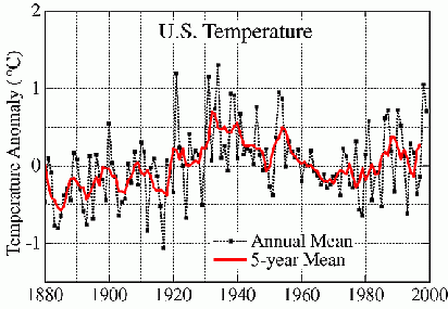 The data I downloaded from the NCDC site (selecting National, annual mean data) is as follows. The first column is the year. The second is the data from the NCDC site, and the third column is the ten year moving average (starting from 1905, ten years from the start of the NCDC dataset) which I calculated myself so I can do a like-to-like comparison with the PM graph: 1895 51.21 1896 52.8 1897 52.27 1898 52.12 1899 51.73 1900 53.52 1901 52.65 1902 52.42 1903 51.49 1904 51.96 52.217 1905 51.8 52.276 1906 52.53 52.249 1907 52.26 52.248 1908 52.82 52.318 1909 52.17 52.362 1910 53.19 52.329 1911 52.78 52.342 1912 51.03 52.203 1913 52.32 52.286 1914 52.6 52.35 1915 52.2 52.39 1916 51.57 52.294 1917 50.82 52.15 1918 52.62 52.13 1919 52.26 52.139 1920 51.78 51.998 1921 54.53 52.173 1922 52.77 52.347 1923 52.41 52.356 1924 51.31 52.227 1925 53.22 52.329 1926 52.68 52.44 1927 52.83 52.641 1928 52.64 52.643 1929 51.58 52.575 1930 52.71 52.668 1931 54.28 52.643 1932 52.48 52.614 1933 53.74 52.747 1934 54.83 53.099 1935 52.61 53.038 1936 52.86 53.056 1937 52.28 53.001 1938 53.94 53.131 1939 54.01 53.374 1940 52.62 53.365 1941 53.47 53.284 1942 52.61 53.297 1943 52.84 53.207 1944 52.65 52.989 1945 52.5 52.978 1946 53.72 53.064 1947 52.7 53.106 1948 52.42 52.954 1949 52.88 52.841 1950 52.22 52.801 1951 51.91 52.645 1952 53.1 52.694 1953 54.16 52.826 1954 54.11 52.972 1955 52.49 52.971 1956 53.11 52.91 1957 52.86 52.926 1958 52.75 52.959 1959 52.9 52.961 1960 52.22 52.961 |
|
|
|
Post by stranger on Dec 7, 2009 2:50:51 GMT
I remember the winter of '48/49 very well. One of my friends toes were frozen walking to school. But when you look at the Popular Mechanics graph remember that most of the reporting stations were still in their original siting, unsullied by parking lots, air conditioners, and other continuity destroying events. As far as I remember the graph agrees with the period from 1940 or so to 1950.
Prefacing my comment with the fact that I am in a temperature sensitive business, I assume the end of the red line on the John Daly graph represents 1995. If so, the chart seems somewhat off. We had a couple of really spectacular winters in the 1990's and several summers were somewhat colder than "normal."
I made a July and August trip from south Mississippi to Lincoln, Ne, to Boise, through Yellowstone, to the Black Hills, to Sioux Falls, back to Lincoln, to Minneapolis, through Chicago and across Indiana to Pennsylvania, and south to Atlanta. Talking to people all the way - and the invariable comment was how cool the summer had been. Most places had not seen 100 degrees in a year, some had not seen 90. Particularly areas east of South Bend.
Yet, in early September I was amazed to see a NOAA rep on C-Span flipping his charts, citing the places I had just been as having "much higher than normal temperatures." That sort'a thing shakes your faith in NOAA.
Stranger
|
|
|
|
Post by glc on Dec 8, 2009 0:16:50 GMT
HI all.
Thought we should start a thread showing the difference between the Popular Mechanics temp graph of old.....verses the temp graph of new.
I don't know how to move the graphs over to this thread for comprison and a robust discussion.
Upon examination, does anyone else see a bit of question here?
I haven't looked at the PM graph too closely but I'm not sure where the "difference" is supposed to be. Could you indicate more precisely what we're supposed to be looking for.
|
|
|
|
Post by sigurdur on Dec 8, 2009 0:37:44 GMT
HI all.
Thought we should start a thread showing the difference between the Popular Mechanics temp graph of old.....verses the temp graph of new.
I don't know how to move the graphs over to this thread for comprison and a robust discussion.
Upon examination, does anyone else see a bit of question here? I haven't looked at the PM graph too closely but I'm not sure where the "difference" is supposed to be. Could you indicate more precisely what we're supposed to be looking for. GLC: You are a very observant fellow. I don't want to lead someone into confirming what I see. I am curious if anyone else sees the diff between the highs and lows shown in the 50's and the high and lows shown in the chart made of a similiar period in 2009. |
|

