|
|
Post by steve on Jun 10, 2013 12:52:50 GMT
I think you have to be a little wary of these model-data comparisons from Spencer and Christy. True the most of the model projections are diverging from the observations. Whether this is due to natural variability, unknown changes in forcings or due to model error is not clear to modelers - though clearly sceptics will assume it is the latter. So diversion in other metrics is not surprising. That said, the Christy graphs are pretty skewed and don't mention the fact that there is an awful lot of difference and uncertainty within the satellite and radiosonde data. You appear to incorrectly assume that the models missing natural variability, or being ignorant of forces that can change climate are mutually exclusive from the models being wrong. The reason why does not matter the models are in error! There has never been a kicker in professional football who has missed 72 consecutive field goals. Thats probably due to the fact kickers get fired long before approaching such a level of futility. . . .not because there are no bad kickers. I should correct the appearance and say that all three aspects are probably at work. So adding to those aspects if one also ignores or hides errors in the observations, and is selective about start-points, then one can make quite a compelling image. Imagine if a climate scientist had averaged two different datasets and hidden the fact that they differed by claiming that the average was the ground-truth that proved the sceptics' belief was wrong? Sceptics (and other climate scientists) would be up in arms. |
|
|
|
Post by steve on Jun 9, 2013 20:23:30 GMT
I think you have to be a little wary of these model-data comparisons from Spencer and Christy.
True the most of the model projections are diverging from the observations. Whether this is due to natural variability, unknown changes in forcings or due to model error is not clear to modelers - though clearly sceptics will assume it is the latter.
So diversion in other metrics is not surprising. That said, the Christy graphs are pretty skewed and don't mention the fact that there is an awful lot of difference and uncertainty within the satellite and radiosonde data.
|
|
|
|
Post by steve on Jun 9, 2013 9:19:10 GMT
I quite agree Steve, If you plot the trend line from 1967 to 2000 it is very close to that from 1967 to 2013 However all trend lines from 2001 onwards show a downward trend 10 to 12 years is too short a period to measure a trend, but history suggests a cooling period may have started. We can only wait to see if these trend lines continue. If a 30years cooling period did start at the turn of the century we can only wait for the data. I am 72. I hope to live long enough to see if I am right If not, I my epitaph will read "I told them it was getting colder" Yes, 10-12 years is too short. For example, the trend from 2001-2011 shows warming. So did the cooling start in 2000, or did it start in 2011? The reason for not picking short periods is that they are very sensitive to the choice of the end-points of the range. That is the reason why they are stated as "not being statistically significant" - because you can't tell whether the apparent trend is due to expected variation in the signal that is independent of the trend. |
|
|
|
Post by steve on Jun 9, 2013 9:10:36 GMT
I think that when the trend line from the upto 1990+ period when extended would go through the middle of the "cooling" trend line rather than meeting it (or approximately meeting it) at the end-points, it suggests that your graph is misconstructed. This link compares trend lines since 1967-1998 and trend lines since 1967 to latest data. The cooling hasn't started yet.  Steve, what's your scientific reason for picking 1967 as the starting point for the chart? Duwayne, The reason was to give both trend lines more than 30 years of data. But you get the same result with 1962, 1972, 1977 and pretty much anything else I've tried before 1980. At 1982 the trends are pretty similar as the relative importance of the 1998 end-point increases. |
|
|
|
Post by steve on Jun 8, 2013 7:13:56 GMT
For those who think natural processes may determine the temperature rise over the next 100years We should recognize that the current cooling cycle, if real, should last at least 30 years. 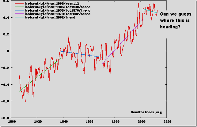 If the 30 year cycles continue to repeat themselves we will see two cooling periods up to 2100 and only one warming period. I think that when the trend line from the upto 1990+ period when extended would go through the middle of the "cooling" trend line rather than meeting it (or approximately meeting it) at the end-points, it suggests that your graph is misconstructed. This link compares trend lines since 1967-1998 and trend lines since 1967 to latest data. The cooling hasn't started yet. |
|
|
|
Post by steve on Jun 7, 2013 5:43:07 GMT
icefisher,
The biomass figures were just being used to demonstrate the likely energy flows through plants in general.
Nautonnier claimed that uptake of energy by plants was a missing component in the energy flow diagrams.
In fact, you can probably consider such energy flows by estimating what energy would be released while generating 4-6 parts per million of CO2 per year (rough levels of emission from all sources) whether it be fossil fuel burning or land use change (net CO2 release from plant and tree loss).
The amount of heat released by fossil fuels is trivial. The amount of heat released through land use changes is more trivial.
|
|
|
|
Post by steve on Jun 6, 2013 13:04:11 GMT
cuttydyer,
Looking for correlations can be constructive. But until you know the causation there is very little you can do to model it.
Given the much larger effects of the Sun on the atmosphere (heating rather than tides - though there are tides as well), it would be hard to imagine a role for the tiny effects of the Moon. Does this forecast differ from astromet, who (IIRC) thinks global temperatures peak in 2017 implying El Nino in 2018 is unlikely...?
|
|
|
|
Post by steve on Jun 6, 2013 12:56:30 GMT
Steve; Your link didn't work. Would you post a working one please? I do agree with your comment that the energy retention is a very small amount. Eben a 10% biomass increase looked at via an annual basis would result in a very small heat capture. I added a Link. The url works if you paste the text into a browser. This forum used to allow you to wrap links in a url tag, but it didn't work on this link. |
|
|
|
Post by steve on Jun 6, 2013 12:50:29 GMT
The amount of energy is trivial. This site suggests that annual yields from biofuel harvesting are up to around 100 GJ per hectare. This equates to 31 Watts per hectare (when you divide by seconds in a year) which equates to 0.031W/m^2. www.biomassenergycentre.org.uk/portal/page?_pageid=75,163231&_dad=portal&_schema=PORTAL This figure is obviously related to the potential energy uptake of ideal land. But energy lost by the energy diagrams would be related to *increases* in plant amount which are going to be far far less than the ideal on average. Steve, Aren't those values net yield, as apposed to gross consumption by the crop? Sig, LinkAssuming you start with scrub, grow plants, cut the plants to return the land to the same amount of scrub then burn all the plants as biofuels, anything that is consumed by the crop but that does not end up in the net yield must go back into the biosphere. |
|
|
|
Post by steve on Jun 6, 2013 6:05:59 GMT
So when the DLL function was run it returns a structure and in that structure there are arrays as well as individual items. You are left to figure out the reality and or significance of the values in the returned structure. Of course the structure should represent the the results of the original request. I think I get it now that I have a working model. But did you understand the structure? I understand that it demonstrates a fundamental misunderstanding. |
|
|
|
Post by steve on Jun 6, 2013 6:00:01 GMT
Icefisher,
So if your plot is demonstrating anything, it is demonstrating that the (mostly upwards) trend was 0.2C/decade larger during the last solar max than the one before (Cycle 22).
So given the current low solar max, and given the variability in the trends, the trend being 0.2C lower than Cycle 22 is not indicative of anything much.
I'm a patient person. It would be nice to better tie down the actual causes of variability to their specific components (heat uptake, aerosols, solar or the effects of two or more of these combined), but in the meantime the variability is not indicative of the trend changing much and is reasonable as compared with what models can potentially demonstrate.
|
|
|
|
Post by steve on Jun 6, 2013 5:49:14 GMT
An interesting post on WUWT an Engineers take on historical carbon dioxide levels but it raises a point that perhaps should have been obvious. The simplistic energy budget diagrams much loved by SoCold etc. all show radiation in being matched by temperature rise and radiation out. When plant's photosynthesize and create oxygen and sugars and then those are used as chemical energy to build long chain molecules and in various metabolic pathways. That chemical energy came from the Sun and is now 'locked up' as plant material such as cellulose molecules. I don't see any of that energy in those 'energy budget diagrams'. How much energy is needed to 'build' a tree? a forest? An ocean full of plankton? Seems there is a term left out of the equation - could that be the 'missing heat'? Plant productivity is included in earth system models (which are more complex versions of climate models that are used in some areas of research). The amount of energy is trivial. This site suggests that annual yields from biofuel harvesting are up to around 100 GJ per hectare. This equates to 31 Watts per hectare (when you divide by seconds in a year) which equates to 0.031W/m^2. www.biomassenergycentre.org.uk/portal/page?_pageid=75,163231&_dad=portal&_schema=PORTAL LinkThis figure is obviously related to the potential energy uptake of ideal land. But energy lost by the energy diagrams would be related to *increases* in plant amount which are going to be far far less than the ideal on average. |
|
|
|
Post by steve on Jun 1, 2013 9:04:23 GMT
I would say that Lucia agrees with me (roughly).
and:
|
|
|
|
Post by steve on Jun 1, 2013 8:44:53 GMT
The 0.1-0.2 bit is on the first page or so of the Global temperature prediction thread.
The emissions don't need to "gather momentum". The 0.1-0.2C acknowledged the possibility of "natural variability" and the forecasts for less warming at the time (i.e. the Smith paper). There is enough energy going into the ocean to accelerate this warming if it stops going into the ocean so much. So the rate of warming depends on whether the ocean heat uptake remains consistent.
|
|
|
|
Post by steve on May 29, 2013 6:51:13 GMT
Icefisher, Different people have different views. That is all there is to it. I'm inclined to believe the 95% possibility. Loehle clearly *thinks* he has found a warmer 30 year period, but his abstract says "The warmest tridecade of the MWP was warmer than the most recent tridecade, but not significantly so[." Translation: the evidence is weak despite my best efforts to find a warm period. And note that the most recent tridecade to now is 0.1C warmer than the most recent tridecade to 2007 (when Loehle's paper was first published). I suspect that has dented his statistic even more. I don't see where you addressed anything about Loehle's evidence or his motivations Steve. Just more mud slinging huh? Loehle's self characterization seems absolutely neutral, much more than can be said of you. "I am not a “denialist” and my recent paper (Loehle, C. and N. Scafetta. 2011. Climate Change Attribution Using Empirical Decomposition of Historical Time Series. Open Atmospheric Science Journal 5:74-86) attributes about 40% of recent warming to human activity – estimating that this equates to a no-feedback atmosphere." I haven't called Loehle a denialist. He is someone looking hard for evidence of the opposite to the consensus. There is nothing wrong in doing that and there is nothing wrong in pointing out the fact that despite looking hard his evidence supports what I'm saying more than it supports sceptic ideas of a very warm MWP. In my old field of astrophysics there were many such contrarians. They were mostly wrong but they stimulated debate. I checked early pages of the global temperature prediction thread to be sure, but I've been quoting 0.1-0.2C in a decade for quite a few years. |
|


