|
|
Post by lsvalgaard on Jun 18, 2010 4:18:06 GMT
Geoff Sharp writes: "Ken Tapping has performed some analysis on this topic and shows that there is some divergence between flux and sunspots during SC23. helios.swpc.noaa.gov/sww/2010/friday/SWW_2010_KFT.pdf He uses the standard Canadian flux data and shows plots describing this variance. The difference in this analysis is he is not showing a trend change as per Dr. Svalgaard but an overall difference covering the entire cycle. If I smooth the standard data further a large anomaly is apparent around 20001/2002 and then the two measures come back together. The reason for this divergence could be high flare activity at cycle max or one of the other factors that drive F10.7 Flux, it is more of a one off event rather than a gradual diminishing of sunspots." Well, Geoff clearly does not have his stuff together as per my previous post. Time to ignore him. |
|
|
|
Post by lsvalgaard on Jun 17, 2010 14:10:33 GMT
He has not done a valid analysis. Even his own plot shows the changing relationship. If he [and you] thinks this is valid, you are missing out on an important finding. And he has an agenda: getting the SSN as low as possible AND having that SSN be a valid measure of solar activity. In addition he misrepresents the facts about the number of data sets, missing that the more the better. If you are not sure 'what we are doing'. How about reading our paper about it? that spells out in detail what we did: www.leif.org/research/Solar%20Radio%20Flux.pdfA valid and constructive criticism would take the form of specific comments on each point, rather than the 'head in the sand' approach of 'not being sure'. Read and be sure. "Changing relationship" ? Your emotional comments are suggesting you are not a fan of the Layman's Count? Since the Layman's count does not extend to pre-Sc23 data, it is hardly relevant. Ken Tapping describes the situation thus: "Changes in Solar Behaviour Before and During Cycle 23, and into the Extended Minimum". So 'change' seems to be the operative word. Here is his take on the different cycle 23:  Using the original Canadian F10.7 only, shows the same result:  For a given F10.7 flux value, the cycle 23 SSN [red plusses] are smaller than during previous cycles. This is with the original Canadian flux values. As said before, the adjustment is in any case only a 1.5% effect and much smaller than discrepancy shown in the above figure. The [almost] correct way of doing it, is to find a regression formula for 1947-1990 for SSN vs. F10.7 flux. This allows us to calculate the SSN from the flux at all times and check if the SSN during SC23 is lower than that predicted by the formula. I say ‘almost’ because that comparison assumes that the calibration of F10.7 has been constant, which we know from the Japanese data that it was not, but since the error is small, we’ll let that slide. First the regression formula based on 16,000 individual days:  and then the comparison [solar cycle per solar cycle] between SSN observed [reddish] and calculated from F10.7 [bluish] for every single day since measurements began until today: 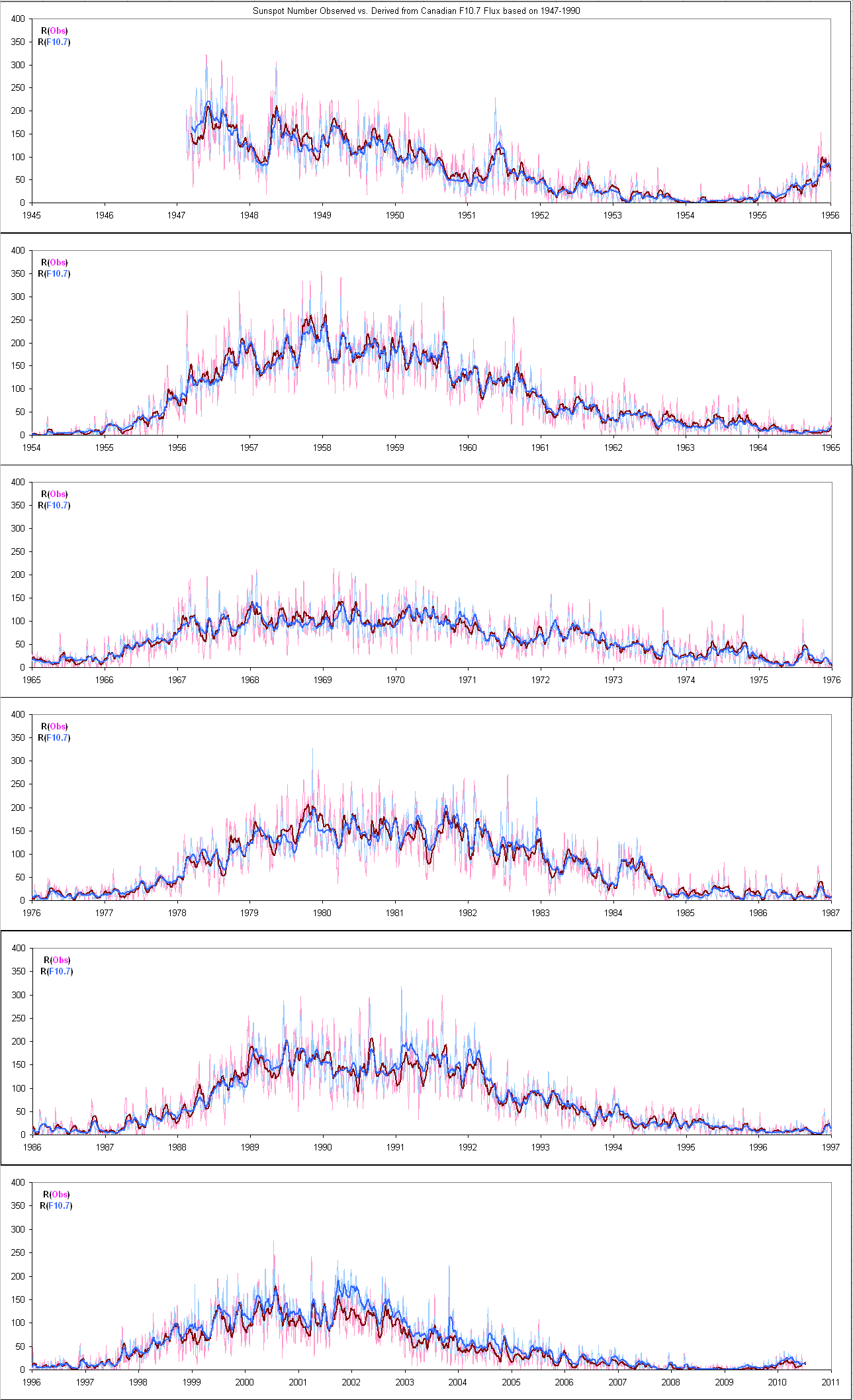 The heavier curves are 27-day running averages. It should now be clear that during SC23 the reddish curves are consistently below the blue, showing a deficiency of spots as Tapping said there should be. |
|
|
|
Post by lsvalgaard on Jun 17, 2010 7:27:06 GMT
I am not sure what you guys are doing but Geoff looks to have done the analysis. The standard flux data matches with sunspot record. I don't think he is biased, just interested in getting the facts straight without an agenda. He has not done a valid analysis. Even his own plot shows the changing relationship. If he [and you] thinks this is valid, you are missing out on an important finding. And he has an agenda: getting the SSN as low as possible AND having that SSN be a valid measure of solar activity. In addition he misrepresents the facts about the number of data sets, missing that the more the better. If you are not sure 'what we are doing'. How about reading our paper about it? that spells out in detail what we did: www.leif.org/research/Solar%20Radio%20Flux.pdfA valid and constructive criticism would take the form of specific comments on each point, rather than the 'head in the sand' approach of 'not being sure'. Read and be sure. |
|
|
|
Post by lsvalgaard on Jun 17, 2010 5:53:43 GMT
In answer to previous questions about why does the F10.7 Flux record vary from the sunspot record during Sc23. Geoff Sharp writes" I decided to spend a day looking at the data. I picked 2 spots in the record where there is high flux count, the first 28/08/1999 where the flux and Sunspot record are close on Leif's comparison graph and the other on 28/09/2001 where a large divergence is shown. I meticulously went over the SOHO continuum and magnetogram images looking for a change in relationship between the plage area's and sunspot areas. Each image had every relevant pixel counted and there looked to be no change in the relationship. I next checked the sunspot counting methods and they too looked good with the usual difference between NOAA & SIDC. Then I researched how Leif arrived at his F10.7 Flux values to find that he has merged 3 datasets to form a composite series. The longest continuous dataset for F10.7 is from 1947 produced in Canada, the two other Japanese records that split the time frame are higher and lower than the Canadian record. If I plot the Canadian record (adjusted for Earth's elliptical orbit)against the SIDC daily record I get this." First, picking two days only out of 20,000 is not enough to carry any weight. Geoff is wrong about the composite: it is made not out of three records, but out of four [or more precisely, 8] data sets. This is the strength of the composite. His assertion that the Canadian dataset is a single continuous series is typical of the misrepresentations that he excels in. I have described several times how the composite was made. Either he does not [or cannot] read what I write [in which case his statements are unfounded] or he deliberately misrepresents them [in which case he is less than honest]. Take your pick. An independent analysis by Ken Tapping [the director of the Canadian F10.7 observatory] using only the Canadian data yields essentially the same result as my analysis: lasp.colorado.edu/sorce/news/2010ScienceMeeting/doc/Session6/6d_Tapping_i.pdfhelios.swpc.noaa.gov/sww/2010/friday/SWW_2010_KFT.pdfThis is because the difference [and adjustments] between the various parts of the composite are much smaller than the changes seen in SC23. Including the Japanese data only strengthens the Canadian finding. This is also the opinion of both the director [Tapping] of the Canadian observatory and of the director [Shibasaki] of the Japanese Observatory. These two people are the World's foremost experts on the Sun's microwave flux, and are co-authors on our paper: www.leif.org/research/Solar-Microwaves-at-23-24-Minimum.pdfI don't think Geoff's biased opinion carries much weight. I have asked him to do the analysis correctly, but so far without result. |
|
|
|
Post by lsvalgaard on Jun 10, 2010 5:54:09 GMT
Dr. Svalgaard, 1078 looks kind of like a cycle 23 region... It has a fairly low latitude and has the correct polarity. (for cycle 23) I understand that a certain percentage of these areas (3% I think) are simply twisted so far around that they appear "backwards", but, if memory serves, most of the "backward" areas are fairly short lived and pretty small as these things are measured. 1078 seems pretty healthy. I would like to hear your opinion on this. Next, if you do think it is a cycle 23 group, is its appearance so far into cycle 24 unusual? 1078 has just been twisted around a lot. I don't think it is SC23, but even if it were, that could happen, even this late, although NOT at that high latitude. |
|
|
|
Post by lsvalgaard on Jun 5, 2010 5:00:07 GMT
A little bit of PR doesn't hurt. |
|
|
|
Post by lsvalgaard on Jun 4, 2010 10:15:04 GMT
The few pre-2001 spots are not central to the argument. You can omit them as you wish. The'debunking' is just hand waving ['I'm not confident' etc]. Good science or not, this is the data we have. The strongest argument is the disappearance of the OH lines. All your hand-wringing will come to naught with the passage of time. At least you are coming around to accept the poor opening data, but the important point is that the gauss readings now have a chance to follow the normal magnetic processes during a cycle. This undermines the whole "effect" and will fade to nothing when we once again see a rise in gauss readings as we are at present. The measuring process is flawed , Solanki had it right when he started and his process should be re instated. We already know whats going on regarding the specks and have proper ways of counting them. The pre-2001 data was spotty from the outset so there is no 'coming around'. You keep repeating the mantra that the measuring process is flawed, but fail to substantiate it. There is nothing wrong with the process. If anything, the same procedure should have been used pre-2001. |
|
|
|
Post by lsvalgaard on Jun 4, 2010 9:52:51 GMT
|
|
|
|
Post by lsvalgaard on Jun 4, 2010 9:40:17 GMT
Still ignoring the expected ssn (from F10.7) versus observed ssn divergence, I see. Can you offer an explanation as to why that is happening? Other than the likely one of course (that sunspots are getting harder to see). Less sunspots does not necessarily mean weaker sunspots, we are seeing a much stronger spot type recently but they are less frequent. During the Maunder minimum where the spots practically stopped other outputs still functioned but at a reduced pace, there was a disconnect then as we are seeing now. But that doesnt mean the background dynamo forces stop going through their normal magnetic ebb and flow over the cycle. The gauss readings are on the incline and should progress slowly towards a weak max...measuring specks is making that process harder to see. You are missing the point: it is the specks that really determine the sunspot number. A large active region may have a few large spots, but a hundred specks, all of which are included in the sunspot number as presently counted, e.g. howard.astro.ucla.edu/pub/obs/drawings/1957/dr570623.jpg or howard.astro.ucla.edu/pub/obs/drawings/2001/dr010925.jpg |
|
|
|
Post by lsvalgaard on Jun 4, 2010 9:33:35 GMT
I'm a peer, and it passes my review. There is no selection effect. When Bill has telescope time ALL spots, specks, and pores are measured, so the shape of the curve is just what the non-biased data shows it to be. This is a perfectly good procedure. Other peers may not agree. All spot/specks are not selected as can be seen in the debunking report, it shows random selection, have you read it? www.landscheidt.info/?q=node/65Prior to 2001 only the main spots were measured (Solanki), this obviously will put a different emphasis on those values, plus the amount of records involved is way too small. If this is good science to you I am at a loss. The few pre-2001 spots are not central to the argument. You can omit them as you wish. The'debunking' is just hand waving ['I'm not confident' etc]. Good science or not, this is the data we have. The strongest argument is the disappearance of the OH lines. All your hand-wringing will come to naught with the passage of time. |
|
|
|
Post by lsvalgaard on Jun 4, 2010 4:35:44 GMT
Absolutely. Perhaps one should modify your question and replace 'true' with 'the best we have'. Bill Livingston is a world-class astronomer [been at it since the 1950s] using the largest solar telescope in existence. The unique part of the measurements is that Bill selects the darkest area inside each spot where the field is the strongest and uses a spectral line where the magnetic field can be directly measured without any assumptions. The equipment is not in doubt, but the data surely is. The inclusion and non inclusion of low values from measuring associated specks means the shape of curve cannot be relied on. This would never pass peer review. I'm a peer, and it passes my review. There is no selection effect. When Bill has telescope time ALL spots, specks, and pores are measured, so the shape of the curve is just what the non-biased data shows it to be. This is a perfectly good procedure. |
|
|
|
Post by lsvalgaard on Jun 3, 2010 21:20:26 GMT
No problem doc. Here is whole of the Arctic (crisscrossed). Belief is religion, just wondering about cause. Then you confess to religion [although 'belief' is NOT religion for most other people, e.g. the dictionary definition: Belief: Definition: Assent to a proposition or affirmation, or the acceptance of a fact, opinion, or assertion as real or true, without immediate personal knowledge; reliance upon word or testimony; partial or full assurance without positive knowledge or absolute certainty; persuasion; conviction; confidence; as, belief of a witness; the belief of our senses. There are no common causes for this nonsense, so no need to worry so much. |
|
|
|
Post by lsvalgaard on Jun 3, 2010 19:37:15 GMT
lsvalgaardJust coincidence. Vuk has cherry picked the Earth's field at a certain location in the Arctic, not representative for the whole Earth. Typical pseudo-science.A very uncomfortable and unwelcome coincidence indeed. ...at a certain location in the Arctic Yes, the first plot you showed said 'at 90N' Now you show some more, but at 60N, try some other location, and you get something else. Not uncomfortable or unwelcome as it does not have any significance. That you can believe in such nonsense says a lot about you. It may be time to spare the readership for such irrelevant drivel. |
|
|
|
Post by lsvalgaard on Jun 3, 2010 18:06:37 GMT
lsvalgaardAnd indeed they may. This probably happened before in 1645-1705, called the Maunder Minimum.
The active regions did not disappear, only the spots were harder to see. Had there been a L&P pair
observing the sun 1625-1640, they might well have predicted that SPOTS MAY VANISH BY 1645...According to C14 data, at the time of the Maunder min, the sun was indeed active, but to a greatly reduced degree (there were some sunspots though). Some months ago Vuk observed that the Earth’s magnetic field suffered a big thrust at the sume time. Well LP might be working on sunspots but not in the Arctic. What was the cause ? Just coincidence. Vuk has cherry picked the Earth's field at a certain location in the Arctic, not representative for the whole Earth. Typical pseudo-science. |
|
|
|
Post by lsvalgaard on Jun 3, 2010 16:38:46 GMT
You are not getting the point, which is that we are not predicting sunspots but solar activity. See slide 37 of www.leif.org/research/Predicting%20the%20Solar%20Cycle%20(SORCE%202010).pdfL&P's method is not in question. Their extrapolation could be in question as all extrapolations. Nobody is convinced that L&P are correct, but no reasonable person can ignore the possibility that they are correct. And 'probable' is not a weasel-word. Think of the legal concept of 'probable cause'. It means that something is more likely than not. Not in question? So can I take it that you are completely in agreement with the L&P method and the way in which they collect and represent their data as a true representation of the gauss record since around 1990? Absolutely. Perhaps one should modify your question and replace 'true' with 'the best we have'. Bill Livingston is a world-class astronomer [been at it since the 1950s] using the largest solar telescope in existence. The unique part of the measurements is that Bill selects the darkest area inside each spot where the field is the strongest and uses a spectral line where the magnetic field can be directly measured without any assumptions. |
|