|
|
Post by dopeydog on May 20, 2009 15:05:15 GMT
|
|
|
|
Post by socold on May 20, 2009 19:42:54 GMT
That's highschool debate, not scientific debate. Maybe next week Morano will debate the choice of tie color worn by scientists. Doesn't constitute scientific debate either.
|
|
|
|
Post by dopeydog on May 20, 2009 22:30:35 GMT
I rest my case.
|
|
|
|
Post by dopeydog on May 26, 2009 1:21:58 GMT
|
|
|
|
Post by dopeydog on May 26, 2009 20:19:56 GMT
Is it my imagination or did the thought police remove a anti agw thread from this site?
|
|
|
|
Post by woodstove on May 26, 2009 20:58:07 GMT
The other possibility is that the original poster removed the thread...
|
|
|
|
Post by dopeydog on May 26, 2009 22:07:30 GMT
Hadn't thought of that.
|
|
|
|
Post by dopeydog on Jun 5, 2009 21:47:25 GMT
Here comes the Hansen super El Nino warning. icecap.us/images/uploads/Romms_Fairy_Tales.pdfIn case Jim chickens out which wouldn't surprise me one bit, we may have to call this the Romm (Soros) super El Nino warning. Note the following excerpt: IRI has compiled the El Nino model forecasts and most forecast a transition through neutral (La Nada) and many to El Nino. Hansen’s NASA climate model is the warmest (must use the Hansen adjustment techniques). |
|
|
|
Post by socold on Jun 6, 2009 2:58:26 GMT
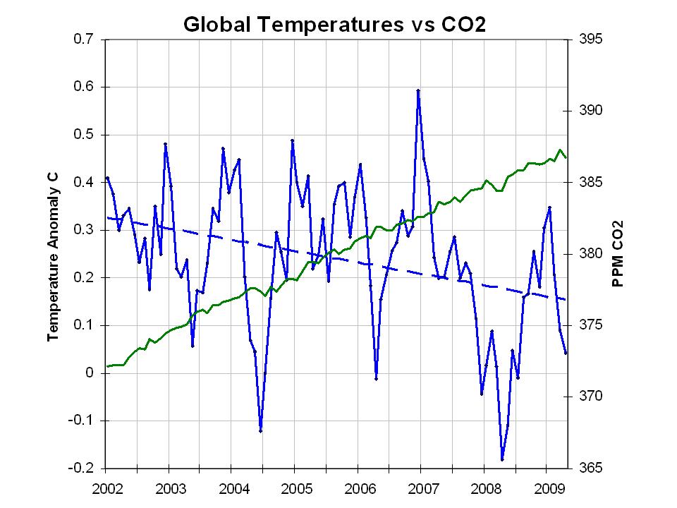
Here's an example of "adjustment techniques":  10 points to anyone who can spot the glaring fabrication here. It seems Icecap.us is the world leader at misleading graphs. |
|
|
|
Post by dmapel on Jun 6, 2009 3:52:13 GMT
Hey soclod,
Uh, I have two guesses:
1) they used a blue colored line for the temperature graph, when everyone knows that according to the warmista dogma, it has to be red
2) they did not employ the standard subterfuge of "adjusting" the temp data so that the line follows the CO2 rise in lock-step
Can I get twenty points for that?
Now why don't you show us how honest and un-biased you are by finding something/anything, in the warmista's shameless propaganda that you are indignant about. Start with Al's blatant scaremongering fictional BS in his Academy Award winning horror film. Are you a scientist, or just a Scientologist?
|
|
|
|
Post by magellan on Jun 6, 2009 5:19:28 GMT
Hey soclod, Uh, I have two guesses: 1) they used a blue colored line for the temperature graph, when everyone knows that according to the warmista dogma, it has to be red 2) they did not employ the standard subterfuge of "adjusting" the temp data so that the line follows the CO2 rise in lock-step Can I get twenty points for that? Now why don't you show us how honest and un-biased you are by finding something/anything, in the warmista's shameless propaganda that you are indignant about. Start with Al's blatant scaremongering fictional BS in his Academy Award winning horror film. Are you a scientist, or just a Scientologist? 1) The chart is not using the Excel AGW plugin to give the true visual relationship between CO2 and temperature.  2) Socold doesn't like the default Excel scaling or that the CO2 axis starts at 365; it should be off the chart so nobody can see it. 3) The negative correlation figure is not shown. |
|
|
|
Post by socold on Jun 6, 2009 16:20:51 GMT
Noone has got it yet. I'll give a hint (admittedly large): How much temperature rise per doubling of co2 does the graph suggest AGW expects?
|
|
|
|
Post by dmapel on Jun 6, 2009 16:25:24 GMT
Who really cares?
Now why don't you show us how honest and un-biased you are by finding something/anything, in the warmista's shameless propaganda that you are indignant about. Start with Al's blatant scaremongering fictional BS in his Academy Award winning horror film. Are you a scientist, or just a Scientologist?
|
|
|
|
Post by socold on Jun 6, 2009 16:40:21 GMT
Who really cares? Now why don't you show us how honest and un-biased you are by finding something/anything, in the warmista's shameless propaganda that you are indignant about. Start with Al's blatant scaremongering fictional BS in his Academy Award winning horror film. Are you a scientist, or just a Scientologist? That's the thing, it's very easy for me to find distortions of statistics and graphs on skeptic blogs. I only have to go to icecap.us or iceagenow.com to guarantee I will find a post containing fallacious argument or blatent WW2 style propaganda distortions of fact of some form or other. And they seem to regurgitate/fabricate stuff daily, so it's a whole stream of nonsense in real-time. On the otherhand I am hard pressed to find an AGW blog that perform such actions. Perhaps blogs like realclimate do contain statistical errors that are beyond my understanding, but I can only spot what I can. Very basic graph distortions like the one presented above are obvious for me to spot, and indeed I suspect anyone. |
|
|
|
Post by dmapel on Jun 6, 2009 17:03:17 GMT
OK, soclod. That's your story and you are sticking with it.
|
|