|
|
Post by acidohm on Oct 24, 2017 19:41:30 GMT
Besides the usage of a ridiculous movie to highlight his points and the discredited "hockey stick" temperature data, the "blue blob" south of Greenland isn't there right now!  Yes, but what I see as the cause is still there. That little blue bit of the Labrador coast is where the lab current intersects the gulf stream. Either...the GS is losing momentum allowing lab c the upper hand, or lab c has changed in some way creating greater interference. Something that can be seen on enso update 4 week anomaly chart is hudson bay and it's strait have dropped in temperature quite alot. As this water makes its way into the atlantic, might we see a decrease in ssta in the cold blob area??? |
|
|
|
Post by acidohm on Oct 24, 2017 19:43:08 GMT
Also, but further north....the last time the waters off Svalbaard were this anomalously warm, was the beginning of the last century....!!
|
|
|
|
Post by acidohm on Oct 24, 2017 21:44:26 GMT
It's good to see expert opinion and some general facts about amoc etc. Couple of points, this chap has greenland data to 2014....need current data (appreciated vid is prob 2 years old or So??) Secondly, the cold blob has grown substantially in the past before greenland ice has really begun melting. So how can it be ice related?? |
|
|
|
Post by sigurdur on Oct 24, 2017 23:48:38 GMT
There are a lot of unknowns. The ice related hypothesis has not stood as an effective hypothesis when examining the last two years. Einstein's saying one experiment could prove him wrong applies.
|
|
|
|
Post by nautonnier on Oct 25, 2017 11:45:47 GMT
Remember that these maps are 'SST anomaly maps'. So when the Gulf Stream/North Atlantic Drift shows red in the maps it means that the current is warmer than usual. The blue means colder than usual - there may be an extremely cold current flowing past Labrador but if it is 2degC warmer so just very cold - not frigid - the map would show it as a 'warm' anomaly. There are times when the actual SST maps are more useful. So see the actual SST map below  from: www.weather.unisys.com/surface/sfc_daily.php?plot=ssd&inv=0&t=cur&inv=0The Gulf Stream appears to be alive and well - but where it normally would be called the North Atlantic drift it does appear to have deviated more eastward than normal. |
|
|
|
Post by acidohm on Oct 25, 2017 12:29:16 GMT
Remember that these maps are 'SST anomaly maps'. So when the Gulf Stream/North Atlantic Drift shows red in the maps it means that the current is warmer than usual. The blue means colder than usual - there may be an extremely cold current flowing past Labrador but if it is 2degC warmer so just very cold - not frigid - the map would show it as a 'warm' anomaly. There are times when the actual SST maps are more useful. So see the actual SST map below  from: www.weather.unisys.com/surface/sfc_daily.php?plot=ssd&inv=0&t=cur&inv=0The Gulf Stream appears to be alive and well - but where it normally would be called the North Atlantic drift it does appear to have deviated more eastward than normal. Nullschool shows lab current 0.7°c below average?? I reckon it's about to get colder as hudson bay is very chilly and a primary contributor to the lab c. Atlantic cold anomaly has grown in the last week or so. |
|
|
|
Post by missouriboy on Nov 1, 2017 16:45:26 GMT
Acid - Got this in my email today. Wonder if there are any surprises. New Release of the RAPID 26N time series SA Smeed, David A. <das@noc.ac.uk> Reply| Today, 4:59 AM Dear Colleagues, You are receiving this email because have previously downloaded the RAPID 26°N MOC time series. We are pleased to inform you that the time series has been updated and new data files are now available for download from www.rapid.ac.uk/rapidmoc/The updated time series covers the period form April 2004 to February 2017. Some small changes have been made in the calculation of the MOC and these are described in the ‘Readme' file. The full doi for this data set is: 10.5285/5acfd143-1104-7b58-e053-6c86abc0d94b. Please see the section in the Readme file about citing the data in your publications. Do please let me know if you have any questinos or comments about the RAPID 26°N time series. David Smeed ----- Dr D.A. Smeed National Oceanography Centre, Southampton, SO14 3ZH. UK t: +44 23 8059 6407 www.noc.ac.uk/people/dasRAPID - monitoring the AMOC at 26°N www.rapid.ac.uk/rapidmoc |
|
|
|
Post by acidohm on Nov 1, 2017 20:10:35 GMT
Acid - Got this in my email today. Wonder if there are any surprises. New Release of the RAPID 26N time series SA Smeed, David A. <das@noc.ac.uk> Reply| Today, 4:59 AM Dear Colleagues, You are receiving this email because have previously downloaded the RAPID 26°N MOC time series. We are pleased to inform you that the time series has been updated and new data files are now available for download from www.rapid.ac.uk/rapidmoc/The updated time series covers the period form April 2004 to February 2017. Some small changes have been made in the calculation of the MOC and these are described in the ‘Readme' file. The full doi for this data set is: 10.5285/5acfd143-1104-7b58-e053-6c86abc0d94b. Please see the section in the Readme file about citing the data in your publications. Do please let me know if you have any questinos or comments about the RAPID 26°N time series. David Smeed ----- Dr D.A. Smeed National Oceanography Centre, Southampton, SO14 3ZH. UK t: +44 23 8059 6407 www.noc.ac.uk/people/dasRAPID - monitoring the AMOC at 26°N www.rapid.ac.uk/rapidmocYes I wondered if you received it too.... I'd be awfully grateful if you could unlock its secrets if you get the chance!! |
|
|
|
Post by Ratty on Nov 1, 2017 23:34:26 GMT
Acid - Got this in my email today. Wonder if there are any surprises. New Release of the RAPID 26N time series SA Smeed, David A. <das@noc.ac.uk> Reply| Today, 4:59 AM Dear Colleagues, You are receiving this email because have previously downloaded the RAPID 26°N MOC time series. We are pleased to inform you that the time series has been updated and new data files are now available for download from www.rapid.ac.uk/rapidmoc/The updated time series covers the period form April 2004 to February 2017. Some small changes have been made in the calculation of the MOC and these are described in the ‘Readme' file. The full doi for this data set is: 10.5285/5acfd143-1104-7b58-e053-6c86abc0d94b. Please see the section in the Readme file about citing the data in your publications. Do please let me know if you have any questinos or comments about the RAPID 26°N time series. David Smeed ----- Dr D.A. Smeed National Oceanography Centre, Southampton, SO14 3ZH. UK t: +44 23 8059 6407 www.noc.ac.uk/people/dasRAPID - monitoring the AMOC at 26°N www.rapid.ac.uk/rapidmocWhat are you waiting for ??  |
|
|
|
Post by missouriboy on Nov 2, 2017 14:54:44 GMT
Acid - Got this in my email today. Wonder if there are any surprises. RAPID - monitoring the AMOC at 26°N www.rapid.ac.uk/rapidmocWhat are you waiting for ??  A bank draft (positive in my favor).  |
|
|
|
Post by missouriboy on Nov 2, 2017 15:55:44 GMT
Acid - Got this in my email today. Wonder if there are any surprises. RAPID - monitoring the AMOC at 26°N www.rapid.ac.uk/rapidmocYes I wondered if you received it too.... I'd be awfully grateful if you could unlock its secrets if you get the chance!! OK ... first look. It's amazing what sometimes pops out after a long separation. The graph displays 13-Month centered normalized deviations from the 2004-2017 normal for the four major RAPID components ... remembering that the MOC is derived from the other three, since array measurements occur at 26 N Latitude. I did not review my definitions in depth ... but, based on memory ... 1) the Gulf Stream is the northward-flowing, upper-column, transport component measured offshore of Miami, FL, 2) the Ekman is western-basin, wind-blown northward surface flow (about 1/10th the magnitude of the GS), 3) the Upper Mid-Ocean is the deeper (~1100-3500 m?) southward-flowing component of the North Atlantic gyre (data file values are negative). The MOC (Meridional Overturning Circulation) is the derived northward-flowing surface component (aka NAD) that breaks off from the gyre at about 40-45 W Longitude. I found the time series comparison of these components to the solar geomagnetic index "interesting". Remembering that the Rapid Index values DO NOT represent positive and negative flow (they are like the NAO, representing standardized deviation from the 13-year normal transport), we see that the MOC appears to have taken a real "hit" during the the solar cycle minimum between SC23 and SC24. During the same period, the northward Ekman flow seriously declined and the southward Mid-Ocean flow stepped up. The Gulf Stream showed a less significant decline (w/o actually conducting a significance test). The second graph shows the ARGO annual temperature deviations at 45-50 N Latitude, west-east across the basin. A 2008-2012 temperature decline is evident in what would be the northward-flowing corridor of the MOC (NAD). So Acid, was it the Labridor that slammed the MOC in these years? Do we have other data that would show this? AND how would a decline in geomagnetic activity empower this result (if in fact it does)? I should note that the MOC has not returned to its 2005-06 highs in the lower geomagnetic environment of today. Graph 3 (ARGO) shows that while northward heat transport may have stepped up in 2016-17, most of the heat south of this line appears to be bottled up in the western basin. Further north (50-60 N Lat.) ARGO shows little heat recovery in the upper oceanic layers (Graph 4). Graph 5 shows why we should all be careful of our correlations. Although one might wonder if the reverse could be true. Citation as per request: The citation that should be used in journals is: Smeed D.; McCarthy G.; Rayner D.; Moat B.I.; Johns W.E.; Baringer M.O.; Meinen C.S. (2017). Atlantic meridional overturning circulation observed by the RAPID-MOCHA-WBTS (RAPID-Meridional Overturning Circulation and Heatflux Array-Western Boundary Time Series) array at 26N from 2004 to 2017. British Oceanographic Data Centre - Natural Environment Research Council, UK. doi: 10.5285/5acfd143-1104-7b58-e053-6c86abc0d94b 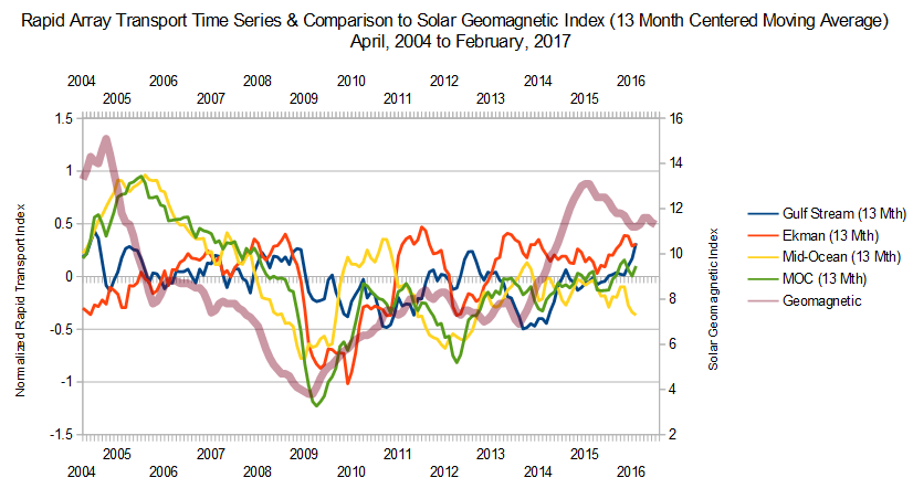 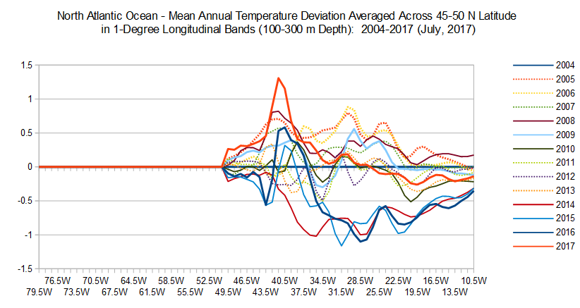 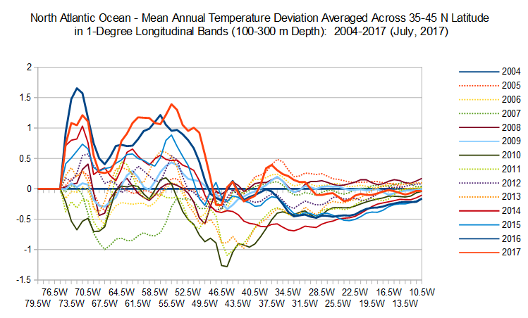 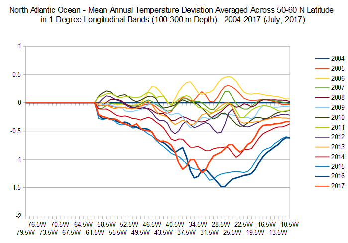 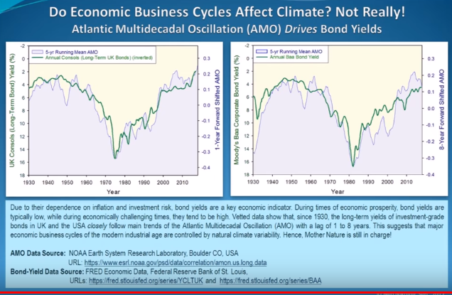 |
|
|
|
Post by acidohm on Nov 2, 2017 21:01:53 GMT
What are you waiting for ??  A bank draft (positive in my favor).  This will provide some info in critical areas but is too new to give us anything but a situation report now i fear... Great analysis Missouriboy thankyou 🖒🖒 perhaps once we get to similar stage in the next solar cycle we can draw more conclusions on any correlations. Really doesn't seem to wanna reverse the slowing trend yet tho...surface anyway.. |
|
|
|
Post by missouriboy on Nov 3, 2017 18:15:44 GMT
Declines in Deep Water Southward Flow & Increases in Shallow Water Southward Flow Since 2007-08The following video (toward the end) talks about 9-year pulses of Atlantic heat into the Arctic together with the bottom-up melting that that entailed. The last big pulse was in 2008. www.youtube.com/watch?v=pZXhi_sSlkM&t=138sA look at the RAPID transport data for the southward flow components by depth (see graph) shows that deep (3000-5000m) southward flow declined by about 50% from 2006 to 2010 and shows little recovery since. Shallow southward flow (0-800 m) shows the opposite ... an increase i southward flow of similar magnitude from 2006 to 2010, with little change since. There may be some reversal since 2013. We know there was extensive ice melt in the Arctic during these years. Did the increase in freshwater melt enhance the shallow water outflow and cut down the deeper water outflow? Sure looks possible. Is there a better explanation? More southward flow in the upper layers might mean less water diving below the Gulf Stream and more interfering with it. Your bat Acid!  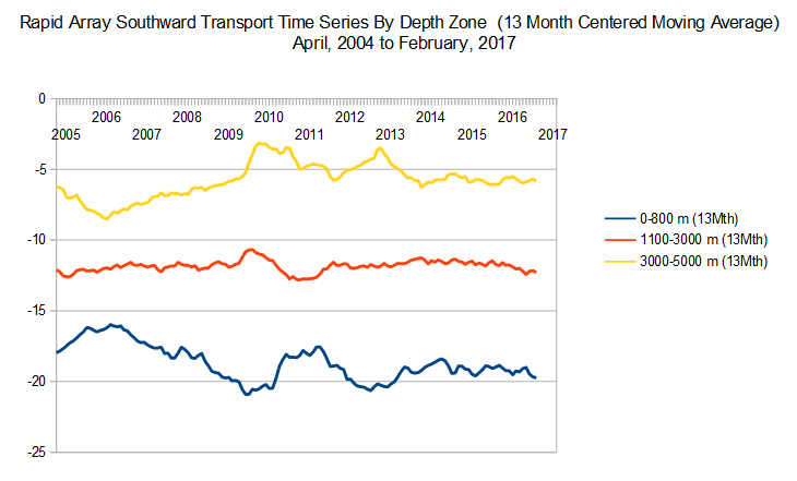
|
|
|
|
Post by nonentropic on Nov 3, 2017 18:39:10 GMT
MB what are the units?
I know its interesting to put interpretation on stuff but actually we have no idea if this means warming or cooling or whatever.
You do hit the data in a very open way.
|
|
|
|
Post by missouriboy on Nov 3, 2017 20:27:17 GMT
MB what are the units? I know its interesting to put interpretation on stuff but actually we have no idea if this means warming or cooling or whatever. You do hit the data in a very open way. Sorry about that. They are volume per unit time ... but I need to review that database notes again. Essentially the top 800 meters transports on avg. 3-4 times the net transport at 3-5000 meters. Deep water volumes have declined in comparison to surface volume over the 13-year period suggesting a decline in density-based(?) down welling due to fresher waters melted out of the arctic in the 2007-12 period. Those fresher waters are being discharged higher in the water column. Trend appears terminated in 2013 with a small drift back through early 2017. Refreeze should result in decline in surface flow and perhaps less interference with the Gulf Stream. The GS seems to show perhaps a slight decline over the 13-year period. And, it the Hadley cells are powering down slightly, then one might expect spinn-offs in circum-gyre flow strength. |
|