|
|
Post by atra on Jul 17, 2009 19:33:07 GMT
Very cold water on the Atlantic coast of north east NA = Big Red Dots.
|
|
|
|
Post by socold on Jul 17, 2009 19:41:06 GMT
NOAAs ocean data is crap. Red dots all over where the SSTs show blue throughout the month of June. Ex. Between southern Africa and South America, off the Pacific coast of Russia, the entire Indian Ocean red dots, what? That graph isn't June, that's just one day in June. |
|
|
|
Post by atra on Jul 17, 2009 20:23:10 GMT
NOAAs ocean data is crap. Red dots all over where the SSTs show blue throughout the month of June. Ex. Between southern Africa and South America, off the Pacific coast of Russia, the entire Indian Ocean red dots, what? That graph isn't June, that's just one day in June. I know. I was just posting it as an example. Looking at the months worth of SST maps there are many areas of blue that aren't consistant with the dots. |
|
|
|
Post by greenarrow on Jul 17, 2009 20:24:18 GMT
Hay, you guys are good. Ya thoses look like the maps. He said that one he used was for June.
Should I take it with a grain of salt.?
|
|
|
|
Post by socold on Jul 17, 2009 21:43:28 GMT
The NCDC global maps have the 0C anomaly defined as the average temperature for the period 1961-1990. So all a red dot means is that the temperature at that location is warmer than the 1961-1990 June average at that location. There are so many red dots in the June map partly because climate has warmed slightly higher than the 1961-1990 average, but primarily because of contribution from El Nino conditions which temporarily make sea surface temperature warmer. The opposite effect occured in January 2008 in which there was a strong contribution from La Nina conditions which temporarily make SST cooler. There are a lot more blue dots as a result:  |
|
|
|
Post by magellan on Jul 18, 2009 0:53:29 GMT
Did you notice that UAH shows more warming over the US than GISTEMP? Is that the kind of contradiction you mean? I was of course talking about station data. I wanted an example of station data showing a negative anomoly in a region (eg state) for a month in which GISTEMP has marked that state as having a positive anomoly. It's no good to simply tell me that "everyone knows" it was cold in XYZ last month and therefore a positive anomoly there in GISTEMP is wrong. To accept anything of the kind I would need to see the numbers to demonstrate how cold it actually was, not simply be told how cold people think it was. Did you notice that UAH shows more warming over the US than GISTEMP? Is that the kind of contradiction you mean? I am concerned with accuracy and precision, not whether they contradict  Both can be correct at the same time yet contradict depending on what is and how something is being measured, however as there is a ~.4 decC discrepancy in June, should be cause for skepticism, but zombies do not have the ability to reason. As you are not a zombie, I would expect at least curiosity. I was of course talking about station data. I wanted an example of station data showing a negative anomoly in a region (eg state) for a month in which GISTEMP has marked that state as having a positive anomoly. Huh? If one region (eg state) is -.2 for UAH and +.2 for GisTemp, the total discrepancy is .4. If UAH is 0 and Gistemp is +.4, the discrepancy is .4. What difference does the sign make? If you are referring to GisTemp exclusively compared to raw data, it is derived from NOAA which does not adjust for UHI (prove me wrong  ) In fact, GisTemp adjusted NOAA upward for June 2009. Explain that one. Which is heavier, a pound of feathers, or a pound of lead? GisTemp extrapolates data up to 1250 km thereby disqualifying the resulting value as being referred to as "data". If you think that is a sound scientific method for measuring temperature, I've got some ocean front property to sell you in Arizona. See any problems? I doubt it. bobtisdale.blogspot.com/2009/06/part-2-of-comparison-of-gistemp-and-uah.html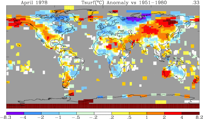 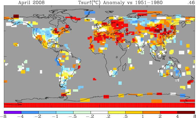  Hopefully you know what a discrepancy is, and that divergence does not mean the data are necessarily moving in opposite sign. |
|
|
|
Post by socold on Jul 18, 2009 2:27:40 GMT
however as there is a ~.4 decC discrepancy in June, should be cause for skepticism, but zombies do not have the ability to reason. As you are not a zombie, I would expect at least curiosity. There is no discrepancy in June so there is no cause for skepticism. Satellites are not measuring surface temperature, they are measuring lower troposphere temperature. The two do not follow the same values from month to month. It's one of these cases again where the period is too short. If such a discrepancy continued for say 2 years that would be a cause for skepticism, but not 2 months. |
|
|
|
Post by jimg on Jul 18, 2009 4:28:54 GMT
GISTEMP is not "measuring" surface temp either.
It is using the temperature data as "seed values", putting them into a model, that runs for "just the right amount of time", not too short, not too long.
So, what precision are you referring to?
The precision of inferred measurements?
|
|
|
|
Post by neilhamp on Jul 18, 2009 6:47:08 GMT
HadCRU seems to agree quite closely with GISS June figures shown below We await their June figure Year HadCru GISS 1998 0.6 0.68 1999 0.26 0.34 2000 0.23 0.34 2001 0.42 0.46 2002 0.48 0.45 2003 0.44 0.38 2004 0.35 0.32 2005 0.51 0.59 2006 0.44 0.52 2007 0.38 0.51 2008 0.31 0.35 2009 0.63 |
|
|
|
Post by jurinko on Jul 18, 2009 8:15:33 GMT
US GISS fits with US UAH, because GISS subtracts cca 0.4 deg C from the flawed NCDC data to get back to raw data.
It is also clear that GISS creates huge positive anomalies from the sparsely covered areas like Siberia, Central Africa or Arctic above Canada by special smoothing Al Gore-ithm.
GISS = Gore Institute for Swindle Science.
|
|
|
|
Post by glc on Jul 18, 2009 8:39:10 GMT
US GISS fits with US UAH, because GISS subtracts cca 0.4 deg C from the flawed NCDC data to get back to raw data.
What exactly do you mean by this? Do you mean it always subtracts 0.4? If so, how does this help the GISS trend "fit" the UAH trend. I assume it's the trend you are referring to because there is a huge difference, of course, between the raw surface temperatures and raw lower troposhere temperatures.
|
|
|
|
Post by jurinko on Jul 18, 2009 10:48:40 GMT
Raw USHCN data -> NCDC adjusted data -> GISS unadjusts NCDC data -> adjusts by own procedure. NCDC adjustment  GISS adjustment gradually removed some temperature starting at 60ties at 0 and subtracting some 0.4 C by 2000. I can not find it now. Oh, and concerning the June 2009 "highest SST ever", here is the difference between NCDC SSTs and GISS SSTs:  NCDC adjusts SST removing the "cooling bias" introduced by satellites. Tar and feather, anyone? |
|
|
|
Post by socold on Jul 18, 2009 11:03:04 GMT
So we have the situation where UAH show more warming in the US over the last 30 years than GISTEMP does.
Yet we are regularly fed the idea by skeptic blogs that the GISTEMP warming in the US is exagerated and false.
And what does this say of UHI impact on the GISTEMP record?
|
|
|
|
Post by socold on Jul 18, 2009 11:21:29 GMT
|
|
|
|
Post by glc on Jul 18, 2009 12:34:36 GMT
GISS adjustment gradually removed some temperature starting at 60ties at 0 and subtracting some 0.4 C by 2000. I can not find it now.
I'm still not clear what you mean. For a start the USHCN graph appears to be in deg F not deg C.
You haven't explained what the GISS adjustment is. You've just provided some graphs, a sequence of events and a bit of arm waving.
Since 1979, GISS shows less warming than the satellites over the US. Are you saying it should show more?
|
|


 Both can be correct at the same time yet contradict depending on what is and how something is being measured, however as there is a ~.4 decC discrepancy in June, should be cause for skepticism, but zombies do not have the ability to reason. As you are not a zombie, I would expect at least curiosity.
 ) In fact, GisTemp adjusted NOAA upward for June 2009. Explain that one.
