|
|
Post by socold on Jul 29, 2009 18:37:26 GMT
All 1961-1990 baseline except last which is 1971-2000 Hadcrut3 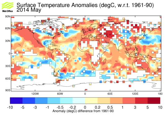 GISTEMP  NCDC  JMA (1971-2000 baseline)  |
|
|
|
Post by northsphinx on Jul 29, 2009 19:04:20 GMT
Why on earth is not a decent map projection used? Since the issue is about earth surface should a map projection that keep the area true be very useful. As en.wikipedia.org/wiki/Gall-Peters_projectionMissing data from Africa at true area relation will make a big difference |
|
|
|
Post by woodstove on Jul 29, 2009 19:54:01 GMT
Hadcrut and GISS, with regard to the northeastern United States, are wrong.
Not even in the ballpark.
These are well-paid professionals disseminating misinformation.
|
|
|
|
Post by jurinko on Jul 29, 2009 20:53:02 GMT
June in my country was definitely under 1960-1990 baseline, contrary to those charts made in fiery colors.
|
|
|
|
Post by nonentropic on Jul 29, 2009 23:13:26 GMT
Great to see that the UK was well above average temp this year.
God help northern Europe if the temp were to return to normal that is 2C lower.
|
|
|
|
Post by sigurdur on Jul 30, 2009 0:05:33 GMT
The anomaly is flat out wrong for the midwest as well. Try -2.6 for June, rather than the paltry -1. And we won't even talk about May.....at 5.6 below the anomaly. OH well, pipe dreams at best again.
|
|
|
|
Post by sigurdur on Jul 30, 2009 0:07:52 GMT
And one has to wonder, what would the anomaly show for a 1980-2008 base perioid?
Anyone care to show us those maps?
|
|
|
|
Post by sigurdur on Jul 30, 2009 0:14:59 GMT
OK.....how do you insert an image again?  |
|
|
|
Post by magellan on Jul 30, 2009 0:36:57 GMT
Has anyone noticed the increased tendencies by warmologists to rely more and more on NOAA raw data, and it's offspring?
UHI infested, parking lot inspired manipulated divergence......
|
|
|
|
Post by poitsplace on Jul 30, 2009 3:54:16 GMT
OK.....how do you insert an image again? You need to have the image hosted elsewhere first. Just highlight the URL in the text and hit the picture frame looking button (between the URL (globe) button and email button) I'd also suggest providing a version of reduced size if it's a large picture. Insert the small image in the message...then just include the URL of the large one underneath |
|
eric
New Member

Posts: 16
|
Post by eric on Jul 30, 2009 3:55:43 GMT
For what it's worth, I asked a week ago about the UK anomaly on the Hadcrut map (+.5) compared to the comments on this board, but all I got was a response that Hadcrut was a global anomaly... I clearly should have posted an image to get a more robust response.  |
|
|
|
Post by glc on Jul 30, 2009 8:30:44 GMT
For what it's worth, I asked a week ago about the UK anomaly on the Hadcrut map (+.5) compared to the comments on this board, but all I got was a response that Hadcrut was a global anomaly... I clearly should have posted an image to get a more robust response.
What about it? That would be about right. UK temperatures in June/July have been around half a degree warmer than normal (1971-2000). You are confusing lack of sunshine with cool weather. It's not been sunny but it's certainly not been cold either - particularly at night where we've often had a strong "water vapour" effect.
|
|
|
|
Post by jurinko on Jul 30, 2009 9:32:21 GMT
|
|
lads
New Member
Posts: 13
|
Post by lads on Jul 30, 2009 15:22:05 GMT
Why on earth is not a decent map projection used? So you can be sure those charts are produced by incompetent folk. There's a big red dot around Lisbon, where according to the local Meteorologic Institute late Srping/early Summer have been the coldest in decades. |
|
|
|
Post by socold on Jul 30, 2009 19:27:56 GMT
This is what I had hoped for, some testable allegations by the skeptics against the surface records which we can actually put to test. Side question to begin with: "Why on earth is not a decent map projection used?"Answer: That's a subjective opinion. I am sure faced with an equal area projection many people would say "what is this strange distorted world map? why can't they use a decent one instead?" For the person who answered, rather foolishly "So you can be sure those charts are produced by incompetent folk"" you've also just smeared Roy Spencer. I am sure I've seen UAH maps which are not equal area too. Probably for the same reason. "Woodstove: Hadcrut and GISS, with regard to the northeastern United States, are wrong."And they don't show enough warming in the South of France, sure. This is just an artifact of the GISTEMP and Hadcrut maps being smoothed (the presented map, not the data). This causes some areas to become cooler (south of france) and others warmer (north east US). The GISTEMP and Hadcrut maps with less smoothing show the north east US colder than the 1960-1990 mean: data.giss.nasa.gov/cgi-bin/gistemp/do_nmap.py?year_last=2009&month_last=06&sat=4&sst=0&type=anoms&mean_gen=06&year1=2009&year2=2009&base1=1961&base2=1990&radius=250&pol=reghadobs.metoffice.com/crutem3/diagnostics/monthly/anomaly.pngjurinko: June in my country was definitely under 1960-1990 baseline, contrary to those charts made in fiery colors.You'll have to say what your country is before I can check this one. Sigurdur: The anomaly is flat out wrong for the midwest as well. Try -2.6 for June, rather than the paltry -1. And we won't even talk about May.....at 5.6 below the anomaly. OH well, pipe dreams at best again.They all show lower than -1 Lads: There's a big red dot around Lisbon, where according to the local Meteorologic Institute late Srping/early Summer have been the coldest in decadesSame source agrees with the big red dot around Lisbon:  So to sum up, nice try guys but no cigar. Why am I not suprised? A variety of reasons, one of which is that it just isn't that simple. If the surface records were as obviously wrong as skeptics clearly like to think, it would be an unavoidable problem. Perhaps now we've learnt that skepticism is a two way steet at least. |
|


