|
|
Post by sigurdur on Aug 24, 2013 2:00:19 GMT
Numerouno: The graph is an average of the past three days if memory serves me.
The line in the graph is taking a tumble with a linear trend...no doubt about it.
But the change can be abrupt, even with the 3 day averaging as shown higher up in the graph.
|
|
|
|
Post by magellan on Aug 24, 2013 2:35:02 GMT
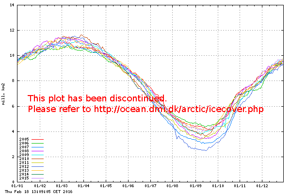
Numerouno: The graph is an average of the past three days if memory serves me. The line in the graph is taking a tumble with a linear trend...no doubt about it. But the change can be abrupt, even with the 3 day averaging as shown higher up in the graph. DMI switched their method of calculating ice extent. Note the large step change down then back up in their soon to be obsolete method from earlier in the month. Both methods use the same satellite product. My guess is they are reviewing the data/algorithms and comparing to other satellite products that don't have the odd linear behavior. Old plot  New plot  |
|
|
|
Post by sigurdur on Aug 24, 2013 2:40:30 GMT
Where did you read about the change Magellan?
|
|
|
|
Post by phydeaux2363 on Aug 24, 2013 3:06:17 GMT
Oh, for Christ sakes. We are less then a month from the minimum. Let's be patient and see what happens. All this back and forth is just adding surplus CO 2 to the atmosphere!!
|
|
|
|
Post by nonentropic on Aug 24, 2013 3:35:52 GMT
That's a straight line in the last section. The rest of the graph has wiggles all the way.
Its cooked!
|
|
|
|
Post by sigurdur on Aug 24, 2013 3:51:11 GMT
That's a straight line in the last section. The rest of the graph has wiggles all the way. Its cooked! I would have to agree. |
|
|
|
Post by icefisher on Aug 24, 2013 4:20:19 GMT
That's a straight line in the last section. The rest of the graph has wiggles all the way. Its cooked! I would have to agree. Another 2nd. The line is still way above 2009/10 even with the adjustment. Everybody else is slightly below 2009 and still above 2010. Its cooked but maybe not as bad as ARGO is cooked. |
|
|
|
Post by magellan on Aug 24, 2013 4:40:38 GMT
|
|
|
|
Post by magellan on Aug 24, 2013 4:46:36 GMT
Even the horizontal move in July doesn't look quite right, but the linear move downward has no variation and that is unusual. I think their methodology is whacked or the satellite is feeding them garbage.
|
|
|
|
Post by cuttydyer on Aug 24, 2013 5:11:40 GMT
Even the horizontal move in July doesn't look quite right, but the linear move downward has no variation and that is unusual. I think their methodology is whacked or the satellite is feeding them garbage. OSI satellite concentration can be viewed here: saf.met.no/p/ice/nh/conc/conc.shtmlThe missing sector that occurred on the 13th is obvious:  There is no such issue with the recent data; I can't see anything obvious with the ice concentration measurement that would have caused the straight line drop away:      |
|
|
|
Post by Andrew on Aug 24, 2013 6:40:51 GMT
Then how come it was created on the 22nd, and my ruler says it has advanced well to the right of the month halfway mark as well?   before you changed your flickr page that you were displaying on the 22nd it was showing a date of the 13th of August as was the original Norwegian data while the older Norwegian version was up to date. Also since I commented, the norwegian page has now been changed so that the old interpretation of the data is no longer available. Seems to me that mysterious forces are at work here, rather like when i showed that a link to a helicopter rescue at sea, provided by you, was in fact just a reconstruction, and the supposedly dramatic video dissapeared within minutes of me commenting on the absence of a swell in what was supposed to be a stormy sea. |
|
|
|
Post by numerouno on Aug 24, 2013 11:03:27 GMT
before you changed your flickr page that you were displaying on the 22nd it was showing a date of the 13th of August as was the original Norwegian data while the older Norwegian version was up to date. Andrew, I have not changed my flickr page since I posted. If I had changed it, there would be another cryptic link to the pic, that I would also have to update in the post. I can't even use the internal Flickr editor for the picture without there being a new cryptilink. When I've been following the graph, it has only been 1-2 days behind. Hey, I remember the helicopter rescue video by the Finnish Coast Guard. That was removed from Youtube because the identity of the patient carried by the helicopter could potentially be told from the video although she had an oxygen mask. Modified, it remained on the newspaper's page. Here it is: www.iltalehti.fi/iltvuutiset/20121130016003977_v0.shtmlYou're being paranoid, I'm afraid.
|
|
|
|
Post by Andrew on Aug 24, 2013 12:53:13 GMT
before you changed your flickr page that you were displaying on the 22nd it was showing a date of the 13th of August as was the original Norwegian data while the older Norwegian version was up to date. Andrew, I have not changed my flickr page since I posted. If I had changed it, there would be another cryptic link to the pic, that I would also have to update in the post. I can't even use the internal Flickr editor for the picture without there being a new cryptilink. When I've been following the graph, it has only been 1-2 days behind. Hey, I remember the helicopter rescue video by the Finnish Coast Guard. That was removed from Youtube because the identity of the patient carried by the helicopter could potentially be told from the video although she had an oxygen mask. Modified, it remained on the newspaper's page. Here it is: www.iltalehti.fi/iltvuutiset/20121130016003977_v0.shtmlYou're being paranoid, I'm afraid. Hmmmmmm. It does appear you are right on all counts. Funny because i went back and forth between the two different graphs and kept on thinking i was seeing dates a week apart....... Jet lag maybe? The link to the original data is still shown at the bottom of the DMI page showing the Norwegian data.  As for paranoia you are the one who tells us we need to be watchful  |
|
|
|
Post by throttleup on Aug 24, 2013 19:46:49 GMT
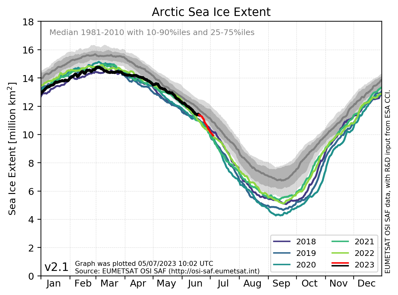
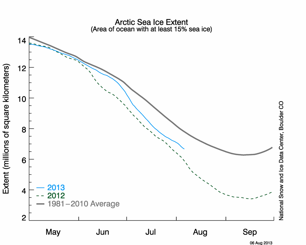
While there is much angst regarding the Arctic DMI plot, there are others as well... not nearly as dramatic...
  
|
|
|
|
Post by numerouno on Aug 24, 2013 21:07:15 GMT
These are 15% concentration data. The DMI 30% chart discards the thin ice dispersed by the long-lasting summer storms.
|
|