|
|
Post by nonentropic on Aug 24, 2013 23:20:17 GMT
So the method is the same so the data is comparable. Don't cherry pick supporting charts numero. Throttle is illustrating some alternative interpretations of what's happening.
If you think they are method week then explain I personally see the suspicious uncharacteristic straight line as a concern on your preferred chart.
|
|
|
|
Post by numerouno on Aug 24, 2013 23:38:57 GMT
So the method is the same so the data is comparable. Don't cherry pick supporting charts numero. Throttle is illustrating some alternative interpretations of what's happening. If you think they are method week then explain I personally see the suspicious uncharacteristic straight line as a concern on your preferred chart. This is no cherry-picking. Comparing the 30% vs 15% concentration serves a useful purpose as it shows the amount of very thin ice. Of course I was being totally serious about drawing the straight line all the time. |
|
|
|
Post by sigurdur on Aug 25, 2013 1:48:09 GMT
Lol numeruno. You needed a sarcasm button. I found it comical when u did this and a few days later it played out. Have any stock tips?
|
|
|
|
Post by throttleup on Aug 25, 2013 17:39:07 GMT
Numerouno,
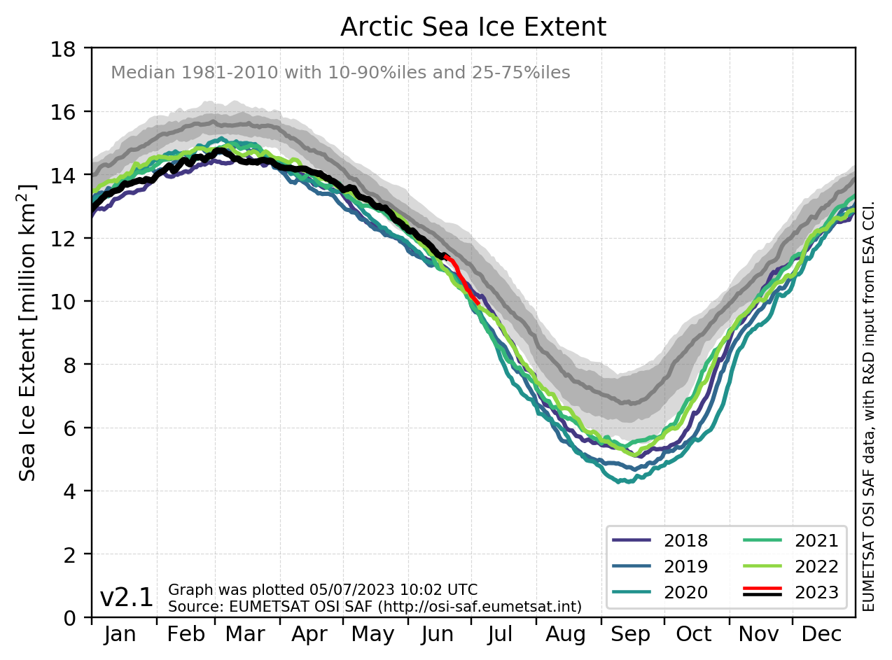
Here ya go! Please annotate this graph with your trademarked "Straight Line Analytically Correct Kinetic Environmental Response" (SLACKER) trend line!
We're saved! Your super trend line will show we just might live to next year AND that Al Gore et al may have been slightly off on their predictions of a total melt-off!
Please tell graywolf! He'll be thrilled to know the world will survive still have lots of ice!
Cheers!
|
|
|
|
Post by cuttydyer on Aug 26, 2013 5:35:47 GMT
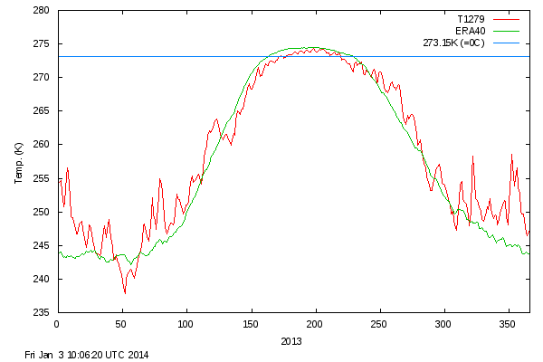
Temperature continues its below average summer trend:  |
|
|
|
Post by sigurdur on Aug 26, 2013 5:36:59 GMT
At least we are close to the mean again. Sure took it long enough.
|
|
|
|
Post by neilhamp on Aug 26, 2013 5:58:38 GMT
Sigurdur
Is that your grandson (future generation soon to be threatened by rising sea levels) you are holding?
|
|
|
|
Post by sigurdur on Aug 26, 2013 6:06:08 GMT
Yes, the child is my Grandson. And a wonderful young boy he is......
He will overcome the dangerous rise of sea levels, the ever changing ice conditions. I have great confidence in his future abilities. And........I just love it that when I have to make a parts run I can stop and see him being they moved close to us.
|
|
|
|
Post by numerouno on Aug 26, 2013 6:26:52 GMT
The big picture. July 2013 was 6th warmest recorded worldwide. Notice the penetration of warm air deep into the Arctic over the North Atlantic.  |
|
|
|
Post by nonentropic on Aug 26, 2013 6:53:43 GMT
so why is it so cold up there?
|
|
|
|
Post by numerouno on Aug 26, 2013 7:27:28 GMT
Basically it is typically colder here than in the world at large because we're up in the north. The Atlantic helps up tremendously. If you want to take a look at the recent situation here you are:  |
|
|
|
Post by cuttydyer on Aug 26, 2013 7:50:41 GMT
The big picture. July 2013 was 6th warmest recorded worldwide. Notice the penetration of warm air deep into the Arctic over the North Atlantic.  Notice how both poles are cooler than average. The slightly larger picture (a decade as apposed to a single month): Northern Hemisphere HADCUT3&4 data:   Northern Hemisphere sea surface temp anomaly data:   |
|
|
|
Post by numerouno on Aug 26, 2013 7:59:34 GMT
"Notice how both poles are cooler than average."
I can see you have the hidden talent to see what the grey colour actually is!
|
|
|
|
Post by sigurdur on Aug 26, 2013 11:57:41 GMT
nummerouno:
Kinda funny how the data is available, but not shown in your map isn't it?
|
|
|
|
Post by glennkoks on Aug 26, 2013 12:44:22 GMT
nummerouno: Kinda funny how the data is available, but not shown in your map isn't it? Sigurdur, I am sure it was an "accidental" oversight. |
|