|
|
Post by Ratty on Nov 15, 2013 11:04:31 GMT
Is the Moon's influence seen in there ... somewhere? Or, are you all just ignoring me?    |
|
|
|
Post by cuttydyer on Nov 15, 2013 11:08:15 GMT
Is the Moon's influence seen in there ... somewhere? Or, are you all just ignoring me? Ratty, Have you read the "moon" post on Jo Nova's blog: Can the Moon change our climate? Can tides in the atmosphere solve the mystery of ENSO? The Moon has such a big effect — moving 70% of the matter on the Earth’s surface every day, that it seems like the bleeding obvious to suggest that just maybe, it also affects the air, the wind, and causes atmospheric tides. Yet the climate models assume the effect is zero or close to it. Indeed, it seems so obvious, it’s a “surely they have studied this before” moment. Though, as you’ll see, the reason lunar effects may have been ignored is not just “lunar-politics” and a lack of funding, but because it’s also seriously complex. Keep your brain engaged… Ian Wilson and Nikolay Sidorenkov have published a provocative paper, Long-Term Lunar Atmospheric Tides in the Southern Hemisphere. It’s an epic effort of 14,000 words and a gallery of graphs. As these atmospheric tides swirl around the planet they appear to be creating standing waves of abnormal air-pressure that slowly circle the planet, once every 18 years. If this is right, then it could be the key to finally understanding, and one day predicting, the mysterious Pacific ENSO pattern that so affects the global climate. Even at this early stage, brave predictions are on the table — the atmospheric lunar tides should favor the onset of an El Nino either during the summer of 2018-19 or possibly the following southern summer. Wouldn’t it be a major step forward if we could predict the extremes? Atmospheric tides* might be seeding the El Niños / La Nina pattern Each summer, there are four stationary high pressure systems in the air at sea level around the Southern Hemisphere. These large regular patterns are spread evenly around the southern half of the planet, spaced at about 90 degrees longitude to each other. Each summer they reform again in roughly the same spot. (See the points marked “H” in Figure 1 below).  Continued: Link: joannenova.com.au/2013/06/can-the-moon-change-our-climate-can-tides-in-the-atmosphere-solve-the-mystery-of-enso/#more-28328 |
|
|
|
Post by nautonnier on Nov 15, 2013 15:46:44 GMT
|
|
|
|
Post by duwayne on Nov 15, 2013 16:19:38 GMT
A month or two of higher anomalies are still within the boundary of the 15 year trend. After Obama Care......no one is going to believe this bunch which is just fine with me as they wouldn't know the truth if it bit them in the ass. That would be true even if it were a blood red 2 to 2.5 wave. This wave is already showing signs of being skinny. Zone 4 appears it may have already topped out and it hit .3 this week. Hardly half way to an El Nino-like sea state much less the kind of staying power needed to result in an official El Nino. ENSO Models are near universal in predicting ENSO 3.4 will top out next month so an El Nino before the end of the year seems unlikely. ENSO Models still insist an El Nino is coming having had one quite consistently out 4 to 9 months now for going on 3 years but they have typically been considerably more accurate on shorter time scales. I don't think we can go by the 50's through 70's for ENSO. While it seems likely we are in a similar ocean oscillation phase but we don't have anything like the solar conditions we had then. If you go back earlier to last couple of decades of the 19th century and first decade of the 20th where solar was similar the ocean oscillation data isn't there. About all we do know is that it was about a degree cooler then and it took a century to get a degree warmer. Bottom line is its now 17 years and counting with no statistically significant global warming, the benchmark that Ben Santer wanted and while solar prediction science is hardly better than a divining stick, it appears its most likely going to get longer because next stop is solar minimum. It seems the really big El Ninos occur about 2 years after solar minimum. 1998 and 2010 followed that pattern. If its solar influenced it could be something related to growing solar activity. I have posted 10 year trend charts that show 10 year trends tend to peak out somewhere around 6 to 7 years after solar minimums. Thus with ocean momentum figured in peak warming might trail the solar awakening with each cycle, beginning to peter out after 4 to 5 years. We are almost 6 years into this cycle and the trend is negative. If thats the peak?  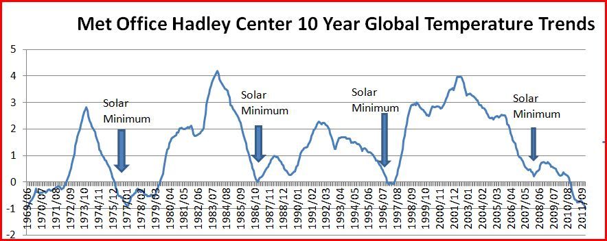 Icefisher, what is plotted on your chart? You make a good point about the reduced Solar activity. On the other hand global temperatures have risen over the past 60 years, so something less than an official El Nino could push temperatures up enough to excite the warmists, at least temporarily. |
|
|
|
Post by flearider on Nov 15, 2013 22:35:02 GMT
come on guys take a look at ocean currents .. and think vodka and ice .. that overly huge ice is now starting to melt where your seeing the cold along south America is a normal path of the ocean cept this time it's got huge amounts of cold water ..which for once hasn't been warmed by the sun because it's failing to do so ..it's the same off Africa a huge upwelling of cold water ..
lets see what it's like in 4-6 weeks that whole area should be below what it should be ..
|
|
|
|
Post by icefisher on Nov 16, 2013 0:38:01 GMT
Icefisher, what is plotted on your chart? You make a good point about the reduced Solar activity. On the other hand global temperatures have risen over the past 60 years, so something less than an official El Nino could push temperatures up enough to excite the warmists, at least temporarily. The chart is a plot of the 10 year Hadcrut3 trend monthly values. So the plot for say the last point on the graph is the decadal trend for October 2003 thru September 2013. It plots out as -.0538 deg centigrade per decade (.54 degree centigrade per century). The data point one month earlier would be September 2003 thru August 2013 and is -.0636. The trend for March 2002 thru February 2012 was the most recent low point (plotted at Feb 2012 on the chart) and the lowest it has been since June 1959 thru May 1969 at -.1043 So the trend has been increasing for about 19 months. I take that as likely an indicator of the approaching solar maximum as is seen in other periods preceding solar maximum. I updated the chart above to the current date so its a little different than the one I posted for your reply. In this updated one I have extended it to the current date and indicated on it the location of the 2010 El Nino which was the strongest El Nino since 1998. I also indicated the date of the explosion of Mt Pinatubo which was the largest explosion since early in the 20th century. It may have chopped off the temperature peak of cycle 22. We can see here also that El Ninos have rather poor effect on the 10 year temperature trend. The 1998 El Nino is buried in the rise to solar maximum from the minimum of May 1996 to the cycle 23 maximum. (One should note that while the cycle 23 maximum is considered to have occurred in March 2000 its not a precise positioning as the cycle had a double peak with the second peak coming around 2002. And we should note the 1999 to 2001 La Nina is not strongly pronounced either.) So I surmise the 1998 El Nino's affect on global warming temperature trends is just a minor part of the solar effect. The solar appears to overwhelm ENSO. I do agree we could have a couple more years of warming influence. We see a small bump coming out of the 2008 minimum, another bump with the 2010 El Nino, and one going on now with the solar max. The ocean oscillation warm phase by my Hadcrut data count ran out in 2010. Solar max is now what appears to be sustaining temperatures. Decline to solar minimum should start by 2015. Accompanied by a La Nina and a continually cooling Pacific Ocean oscillation phase (which by my Hadcrut data count should keep heading that direction until about 2026 or 2027. Now all that said the Hadcrut data count isn't a robust measure its just a easy inductive application that has been consistent through the 150 year Hadcrut dataset). As to exciting warmists, well they can be excited by just about anything. It would not shock me if the 10 year trend poked its head slightly above zero in the next couple of years from natural variation and the solar max but I don't expect to see anything that should make warmists excited as they sorely need to hit .2degC/decade warming and either keep it there but realistically the need a lot more juice than that to account for natural variation. As it stands they seem to think we are still at solar minimum and that when the next solar minimum comes we will be flatlining, uh. . . .still? Since more than 90% of the CO2 emissions of the industrial age has occurred during the period covered by the chart below such an outcome seems implausible without some dramatic solar variation. Spencer and Christy have come up with a climate sensitivity of 1.3 degrees per doubling of CO2. The warm phase of the PDO combined with the solar grand maximum is concurrent with that estimate. The following chart does not dispute that. Its my opinion though that the first half of the 20th century does call it into question. But it might not show yet because the other shoe has yet to drop . . . .you know what those pesky warmists call "feedbacks". . . .like an end to warming feedbacks (which at times they have allowed and even often claimed could go on for a 100 to a 1,000 years or more). All that tells me is that its inconsistent to then argue that the sun does not control all this on the basis that the solar grand maximum peaked in the late 1980's. Finally, I am not going to start trying to predict ENSO. Just that the 2010 ENSO started with a huge blob of the dark blood red color in the west and La Ninas tend to start with a huge blob of blue in the east. 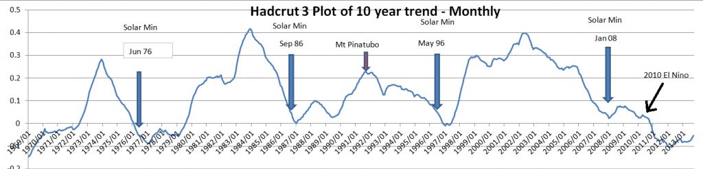 |
|
|
|
Post by Ratty on Nov 16, 2013 9:00:34 GMT
Thanks Nautonnier. I'll have a read and try to make widen my knowledge.  |
|


